
30
Sharing my go-to media queries!
Hi! In this blog I'm going to talk about what are my go to media query combinations to get my projects as responsive as I can while learning how to use them.
If you're a code newbie like I am, let's learn together! If you're more advanced, let me know what's you go to resources because I want to learn more!

Best I can describe it in layman terms is that media query is a CSS technique or a way for you to manipulate elements/media on the DOM inline with a set breakpoint where those design elements will behave differently per breakpoint you set.
YES! You can manipulate elements on the DOM with it!
A couple of ways to do so is through HTML, CSS or JavaScript.
My go-to route is CSS, but can definitely use combination of all.
I use all of them on the projects I'm working on and I am currently updating my old projects using these.
SIZES MAY VARY DEPENDING ON WHAT DEVICES YOU WANT TO FOCUS ON

/*low resolution tablets, mobiles (portrait)*/
@media (min-width: 320px) and (max-width: 480px){

}


/*low resolution tablets, mobiles (landscape)*/
@media (min-width: 481px) and (max-width: 767px){
}


/*tablets, ipads (portrait)*/
@media (min-width: 768px) and (max-width: 1024px){

}


/*tablets, ipads (landscape)*/
@media (min-width: 768px) and (max-width: 1024px) and (orientation: landscape){

}
Want to see it in action? Let's us one of my web apps as example.
ALL SCREENGRABS AND TOGGLED MOBILE VIEWS BELOW ARE FROM USING THE CONSOLE FROM MY BROWSER.
ALL SCREENGRABS AND TOGGLED MOBILE VIEWS BELOW ARE FROM USING THE CONSOLE FROM MY BROWSER.
By default, of course we'll start off with the desktop version of our webapp.

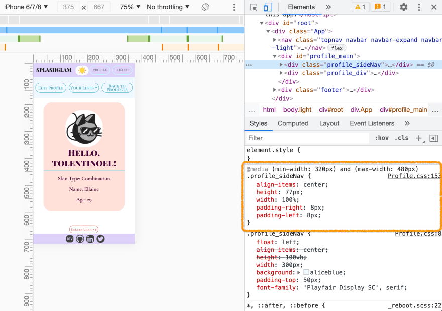
NOW, ADDING OUR PORTRAIT LOW-RES MOBILE & TABLET MEDIA QUERY
@media (min-width: 320px) and (max-width: 480px){
}
WE CAN SAY THE SAME FOR LANDSCAPE, KEEPING THE SAME VALUES
@media (min-width: 481px) and (max-width: 767px){
}
WHAT ABOUT PORTRAIT TABLETS YOU SAY?
@media (min-width: 768px) and (max-width: 1024px){

}
YES-CAN-DO FOR IPADS AND TABLETS ON LANDSCAPE TOO!
@media (min-width: 768px) and (max-width: 1024px) and (orientation: landscape){
}
As you noticed values are the same from portrait to landscape.
You might be wondering why declare if its the same values?
I have learned during this process to do mobile first when it comes to formulating media queries and go by element/component. For me, it's easier to follow and has less clutter on my workflow.
I saw great anatomy breakdown for the role of each of those sizes from CSS-tricks guide to media query. I am showing how mines turn out for the hopes that I can help another codenewbie like me that is starting out to learn media query.
Hope this helped anyone seeing the differences it made on my app!
Until the next!
30