22
CSS transform guide - How to use CSS transform ? What is CSS transform ?
If you struggle with CSS transform or don’t know what it is. This article is for you. In this article you’ll not only learn what is CSS transform and how to use it. But you even see its properties and learn how you can make 3d objects. The video is very simple covering the topic for you. And at the end of the video you get 3 designs which are very amazing to make. I bet if you make those 3 design, you’ll not feel you don’t know about transform anymore.
You can watch video tutorial for better understanding with live example.
Before we start, if you don't know me. Well, I am Kunaal from India manage Modern Web YouTube channel. I make content on web development to master your web dev skills, I made tutorials on Fullstack Ecom website,Personal Portfolios, Fullstack Blogging website, Amazing Headers Animations and much more. If that excites you, you can visit my channel.
So without wasting more time lets start.
Well,CSS transform is used to change shapes, scale the element, rotate it and much more. Let's see some transform properties.
.element{
    transform: value;
}
This is how we use css transform. Let's see some of it's value.
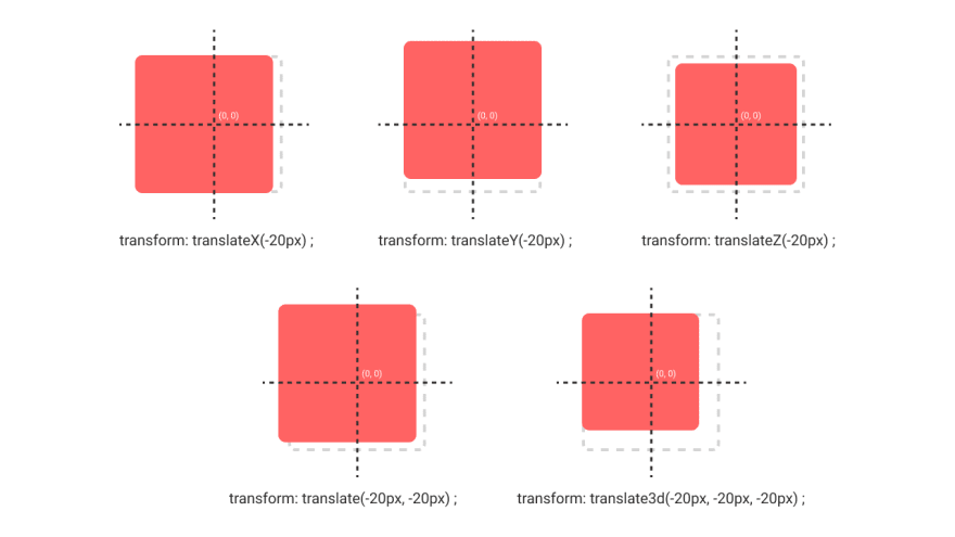
The first property of it is translate. Translate value is used to change element's position.
| Value | Description |
|---|---|
| translateX(px) | it is used to place element in X axis |
| translateY(px) | it is used to place element in Y axis |
| translateZ(px) | it is used to place element in Z axis |
| translate(x,y) | This is a short form for translateX and translateY |
| translate3d(x,y,z) | This is a short form for translateX, translateY and translateZ |

Scale is used to scale element in x, y, z axis.
| Value | Description |
|---|---|
| scaleX(px) | it is used to scale element in X axis |
| scaleY(px) | it is used to scale element in Y axis |
| scaleZ(px) | it is used to scale element in Z axis |
| scale(x,y) | This is a short form for scaleX and scaleY |
| scale3d(x,y,z) | This is a short form for scaleX, scaleY and scaleZ |

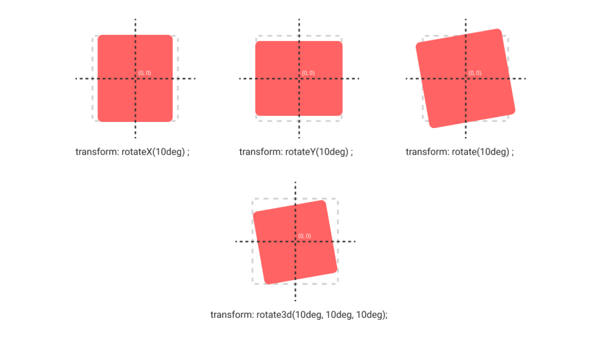
Rotate value is used to rotate element's position.
| Value | Description |
|---|---|
| rotate(deg) | It is used to rotate element in 2d dimension |
| rotateX(deg) | it is used to rotate element in X axis |
| rotateY(deg) | it is used to rotate element in Y axis |
| rotate3d(x,y,z, angle) | This is used to rotate element in 3d dimesion |

RotateX and RotateY value will behave like scale why is that we will talk at last.
Skew value is used to slant the element.
| Value | Description |
|---|---|
| skewX(deg) | it is used to skew element in X axis |
| skewY(deg) | it is used to skew element in Y axis |
| skew(deg) | it is a short form for skewX and skewY |

So these was some CSS transform properties. But we donhave some more properties.
Well, all the things we learnt till now in this article was a value of transform property. But transform-origin is a property itself. And its value could be a numerical value like 100px | 10% or can simply be the corners name.
Well, up until now, all the transform was happening from the elements centre, because it was the origin of the elements. But what if I want to rotate the div from top left side. Fir exactly this purpose, we have transform-origin.

It let's you define the origin of transformation of the element.
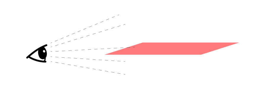
And the last we have perspective. Remember rotateX and rotateY was behaving like scale that was because of this perspective.
Perspective is a viewpoint or viewing angle. And this define a viewing angle which make the element 3d.

So if we rotate that div along X axis using perspective property like this.
.parent{
   perspective: 1000px;
}
.element{
   transform: rotateX(10deg);
}
You'll see something like this.

Now, it is 3d, right? So this was perspective. Remember we give this property to the parent element. because we set this to the element itself it will not affect because of the same viewing angles. And also the lesser the value of perspective, closer the element to the screen.
So, that's it. That was all about CSS Transform. If you liked the article and found it helpful, make sure sure to follow me and you can also show your appreciation by simply subscribing my youtube channel. I make awesome web dev content though 😉

So, As I decided to make advance CSS series, then I will do it on my style. And according to me its not enough that I'll tell you how to use it. You also have to practice it. For that, I made 3 designs for you that you can make using CSS Transfom for practice.
Well, make sure you code the above designs, it will motivate me to continue this CSS series. And make sure to submit it to me by tagging me on my instagram @modern_web_channel
If you stuck anywhere, or have any doubt feel free to ask me.
Thanks for reading 😊
22
