31
How to build a chat app that looks like WhatsApp with the TalkJS API
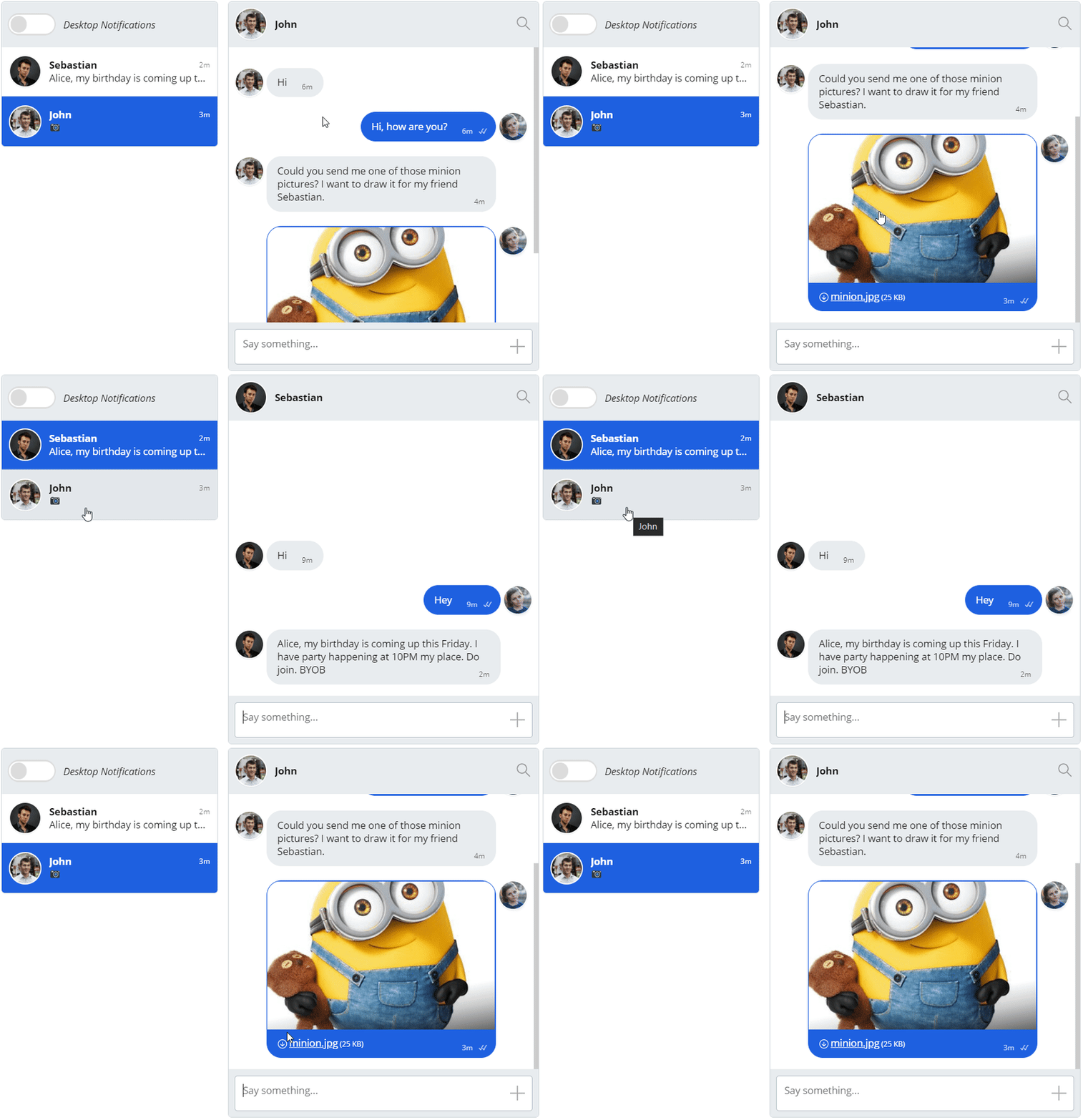
Today, we'll show you how to create a chat UI similar to WhatsApp using the TalkJS Chat API. We'll start with the TalkJS Default Theme and customize it by using the TalkJS Themes. Here is the current look of the TalkJS Inbox with the default style. First, we'll list all changes that we need to make for it to look more like WhatsApp. Once that is done, we will see how these changes can be done in the Theme Editor on TalkJS.

For this article, we’ll have a checklist of the things we want to do and then we’ll tackle each of them one by one.
- Change the chat header color to green (#009688)
- Change the user message color to #CFE9BA and the other person’s message to white (#FFFFFF)
- Change the chat background color to #E5DDD5
- Remove the user’s avatar from within the chatbox
- Change the style of the message body to be more of a rounded rectangle with a slight box-shadow. Also increased the font-weight a little to match that of WhatsApp’s chat.
- Change the highlight colors to the traditional green in WhatsApp (#009688). Change the text color of the active highlighted item to white
- Remove the background from the message input field
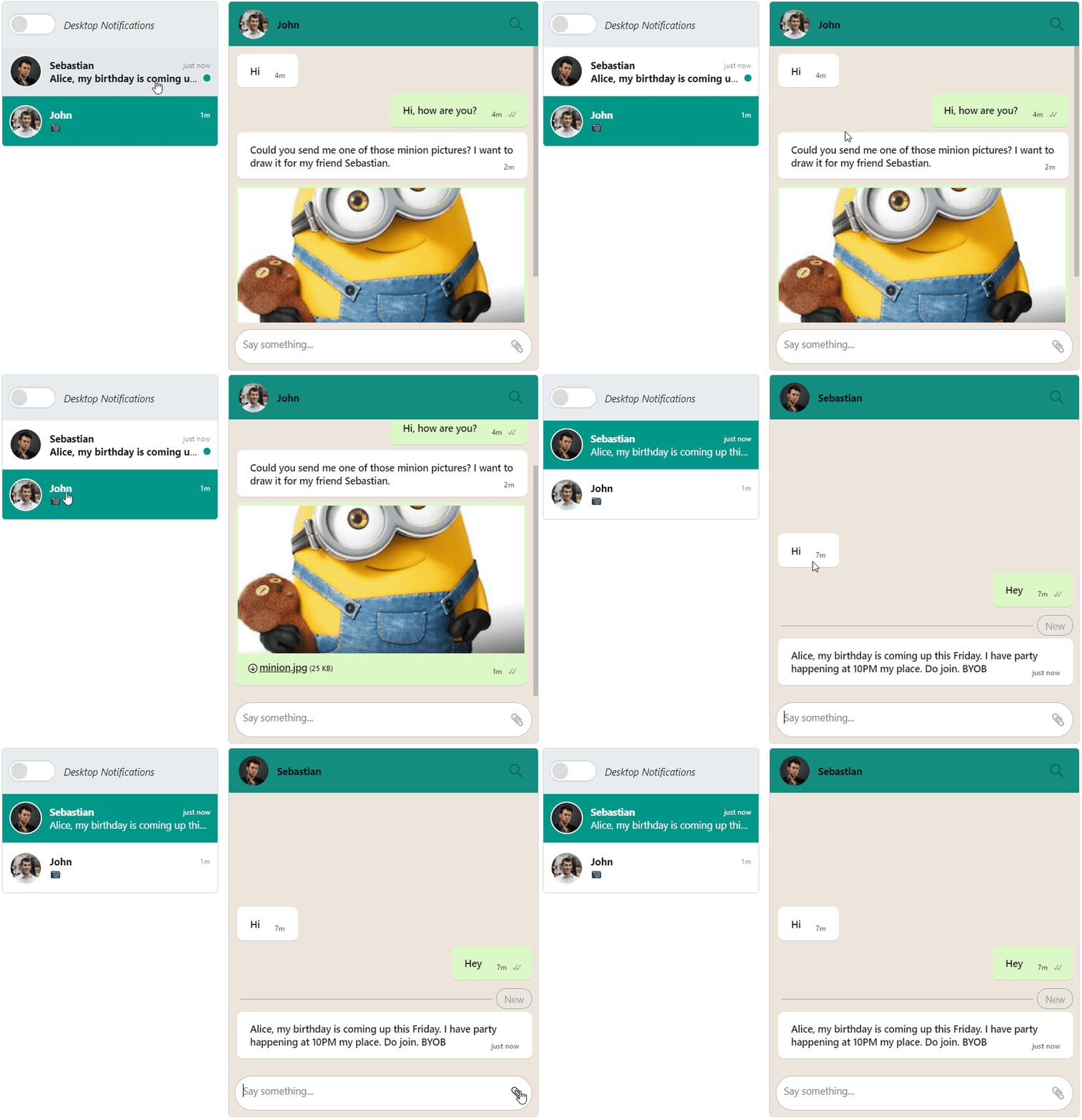
Once we’re done with all of the above, the inbox should look something like this. As you can see, it is almost as good as a regular WhatsApp chat.

If you have previous experience with frontend web development, you must be familiar with stylesheets. With TalkJS, we have a styling dashboard where you can edit a limited set of fields (for now) to play around with the TalkJS Chat theme. This is very useful even if your experience is limited because it comes as a combination of text fields and stylesheets.
To apply a theme, we are going to have a role called ‘default’ in the ‘Roles’ section of the TalkJS dashboard. Once we have the role set up, you can scroll down to see a section called ‘UI Theme’. Currently, it will be in the default theme. After we set up a new theme in the Theme Editor, it will come up in the list of themes and we can simply select it to apply it to our Inbox. It also allows you to edit the themes live and reload the page to view the changes directly. Now let’s start by editing the styles for the Inbox.
Click on ‘Create new theme’ in the Theme Editor section and set a new name for your theme. The first thing that we need to do is remove the avatars from the chat. WhatsApp doesn’t show the avatars on every message, but only at the top. For this, we need to do the following. Set the showAvatars property to false on line number 54 and delete lines 58 to 62.
We will first edit the message-row class to decrease the distance between two consecutive messages. Edit the margin-bottom and margin-top attributes and set them to the following values.
.message-row {
    margin-bottom: 0.1rem;
    margin-top: 0.2rem;
    display: flex;
    /* Align the avatar and the message centrally, but if the message's height
       is greater than the avatar we will align it to the top
       -- See Avatar.template for how this is achieved */
    align-items: center;
}
Next, we will edit the message class, for both the persons, the one who initiated the chat and the one who they’re talking to.
.message {
    overflow: hidden;
    border-radius: 8px;
    position: relative;
    background-color: white;
    width: -moz-fit-content;
    width: fit-content;
    max-width: 500px;
    padding: 4px;
    font-weight: 500;
    box-shadow: 0 1px 0.5px rgba(0, 0, 0, 0.13);
    margin-bottom: 10px;
}
This class is for the general chat message. We also need to change some properties of the chat message that is initiated by the current user. This one has a different color, so we need to add that property to the following class. All the other lines in here can be deleted.
.by-me .message {
    background-color: #cfe9ba;
}
Once these changes are done, you will see that the chat messages are starting to look more like that from WhatsApp.
We need to change only one field over here and that is the background-color. Change it to the following value.
.header {
    display: flex;
    align-items: center;
    height: 4.5rem;
    background-color: #009688;
    flex-shrink: 0;
}
This will give the chat header the distinctive green color that we have on WhatsApp.
Remove the properties for border-style, border-width, and border-color. This should remove the white border for the user avatars on the chat header.
Click on the layout section at the left side menu. This provides an easy-to-use interface for some of the components which are either not configurable in the CSS or sometimes override the CSS styles. Click on the Global sub-section and change the font-family to "Segoe UI", "Segoe UI", Tahoma, Geneva, Verdana, sans-serif. Now, open up the Chatbox sub-section and set the backgroundColor to #E5DDD5. Next, open the Inbox feed panel sub-section and set backgroundColor to #FFF (white).
For the message field sub-section, we need to change two properties. First, set the borderRadius to 4rem and then the color to #000 (black). In the highlights subsection change the backgroundColor to #009688 and color to #FFF (white). Open up the panel footers section and change the backgroundColor to transparent. Lastly, in the notification toggle section, change the borderColor to #009688.

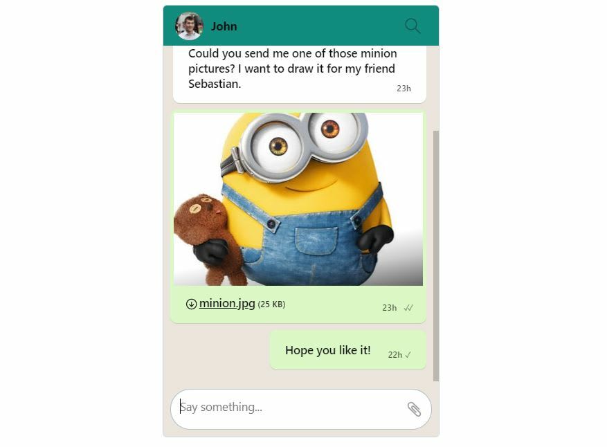
If you’ve followed all of that correctly, you should have a chat inbox that looks like this, except for the messages obviously. Even the Desktop Notifications toggle has the color scheme used in WhatsApp. If you change the Inbox style of the TalkJS chat to a Chatbox with this theme, it would look similar to the mobile UI of WhatsApp (It’s worth mentioning that you can deploy a TalkJS chat in your mobile app). You don’t need to make any additional styling changes. If you want to reduce the width, just head over to the Chatbox section in the layout menu and change the maxWidth to a value that you like. We have set it to 320px below.

You see how easy it was to theme our chat UI to look like WhatsApp. What’s more interesting is the fact that we never really did a lot of coding to achieve this. The Theme Editor in TalkJS allows users to come up with new themes or edit the existing ones through a very intuitive interface using form based input. The changes are saved automatically and you can see the changes immediately.
31
