26
Creating a Component Library with Bit
Designing a component library is no easy task. It entails a long list of decisions that can become quite overwhelming. Failing to make the right decision can result in a library that no one actually uses.
This blog will help you on your journey to building your own component library. It will discuss all major crossroads and provide concrete recommendations.
Component libraries form the foundation of the organization's frontend apps. They must be flexible to provide a proper solution to a wide range of predicted and unpredicted use cases.
To achieve that flexibility, build your library as a modular system, where each of its components is published individually as a single package. This will allow consumers of that library to pick and choose the components and component versions they need. It will provide them with a tailor-made solution and decrease the likelihood of new updates breaking their projects or modifying their UI/UX in unwanted ways.
‘Multiple packages’ may seem to automatically translate to a monorepo architecture. However, monorepos are notorious for being over-complicated and cumbersome. It could be that they are simply not the right solution.
A component library grows as the organization grows. The number of components that it offers, and the number of frameworks and technologies that it needs to support — all grow as well.
Your monorepo, at some point, will no longer have just a single development environment and will most probably have more than just a single team working on it.
Maintaining the dependency graph for each component (package), maintaining different development environments for different component types, and maintaining different permission levels for different teams (all in the same repository), leads to tremendous overhead and requires additional tools.
There’s a better option — Bit.
Bit version controls, manages, builds, pushes, and publishes each component in a Bit workspace, *independently. *It is packed with features that make developing independent components, simple and fast:
It renders each component in isolation
It tests and builds each component in isolation (to validate that it is not coupled to its workspace)
It auto-generates each component’s dependency tree
It auto-generates each component’s package (incl. thepackage.json )
It runs tests and builds on every dependent of a modified component, in-and-across projects (so that each component is both autonomous and in sync with its dependencies)

Bit’s independent components are individually pushed to remote hosting and are published to a package registry (as standard packages). I’ll discuss this workflow in the next sections.
The frameworks/technologies that will be used to build your component library are pretty much already determined by your organization's existing projects or your team’s set of skills. Oftentimes, that means more than just a single framework.
When working with Bit, a single workspace can manage different development environments for different components, and unlike monorepos, it is not something you would have to struggle with as Bit is designed to work with multiple development environments.
Developing components of different frameworks in the same repository makes it easier for code to be shared between these different component types. Shared code can be, styles (e.g, CSS modules), logic, and even HTML markup.
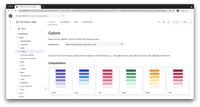
This file contains bidirectional Unicode text that may be interpreted or compiled differently than what appears below. To review, open the file in an editor that reveals hidden Unicode characters.
Learn more about bidirectional Unicode characters
| import React from 'react'; | |
| import colors from '@learn-harmony/design.styles.colors.colors/colors.module.scss'; | |
| export const Purple = () => { | |
| return ( | |
| <div> | |
| <div className={colors.p70} /> | |
| </div> | |
| ); | |
| }; |
For the sake of simplicity, I’ll use Bit’s React workspace template. This will also provide me with Bit’s pre-configured component development environment for React.
Bit’s React dev environment includes TypeScript, Jest, ESLint, Webpack, and more. Its configurations are completely extensible and customizable (you can, and should, create your own customized environment and share it with others as an independent component, but that’s beyond the scope of this blog).
To install Bit and initialize a new workspace, run:
# install Bit's version manager, BVM
$ npm i -g [@teambit/bvm](http://twitter.com/teambit/bvm)

# install Bit using BVM
$ bvm install

# initialize a new workspace using Bit's React template
$ bit new react-workspace my-component-library
That will create the following files and directories:
.bit — the local storage for each component’s repository
.bitmap — a mapping of files to component IDs. That enables Bit to source-control and manage groups of files as discrete components.
workspace.jsonc — the workspace configuration file. That is where the workspace itself and the components managed by it, will be configured.
Since we’re using the React component dev environment, we might as well make use of its component templates (which are also customizable).
To do so, run:
# enter into the workspace directory
$ cd my-component-library

# create a React component named 'button' and namespaced 'inputs'
$ bit create react-component inputs/button
This will create for us the following files:
├── my-component-library
    └── my-scope/inputs/button
       ├── button.composition.tsx   # component simulated previews
       ├── button.docs.mdx          # component documentation
       ├── button.module.css        # styles
       ├── button.spec.tsx          # tests
       ├── button.tsx               # implementation file
       └── index.ts                 # the component's entry file
The generated component is tracked and managed with Bit. That can be seen in the workspace .bitmap file.
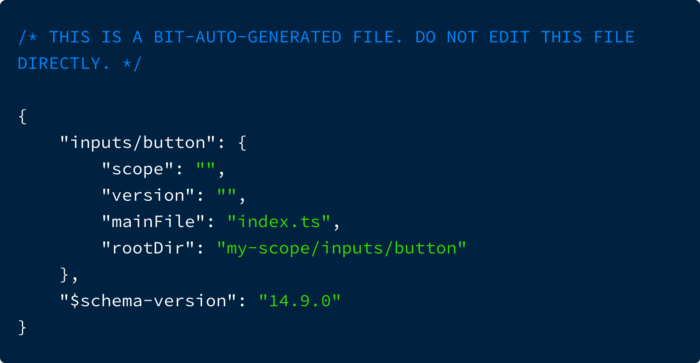
You can explore it in Bit’s workspace UI, by running Bit’s dev server:
$ bit start


ENVIRONMENT NAME        URL                               STATUS
teambit.react/react     [http://localhost:3100](http://localhost:3100)             RUNNING

You can now view 'my-component-library' components in the browser.
Bit server is running on [http://localhost:3000](http://localhost:3000)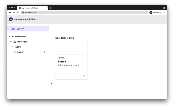
Interface inventory with Bit
In an ‘interface inventory’, components from all the organization’s frontend apps are collected and presented in a single canvas. This process helps in determining which components should be part of a component library. It also helps in detecting inconsistencies between UIs that use just about the same components — but not exactly.
An interface inventory is done by taking snapshots of different components and not by collecting their actual code — but that doesn’t have to be the case.
Components can be “harvested” using Bit and organized into different scopes (component hosting) and namespaces. That can be done by initializing a Bit workspace on an existing project, and by using Bit to version and push these components to remote component hosting.
$ bit init --harmony
$ bit add <path-to-component-dir>
Common components pushed as independent components can be the starting point of your library.
Components are documented using technologies that are relevant to them. For example, a React component (that uses Bit’s React dev environment) can be documented using JSX and even MDX (as well as standard markdown).
That not only makes it easier for a maintainer of a component to write the docs (as he/she is already proficient with the technologies) but it also makes it possible to embed the component in the documentation.
The example below shows a Bit-flavored MDX documentation that integrates JSX with markdown and uses Bit-specific frontmatter (metadata) properties to add tags and a description to it.
Notice how it renders the documented component in a live playground embedded in the docs.
---
description: 'A basic button component.'
labels: ['react', 'input']
---

import { Button } from './button';

This a basic button with a *'loading'* state.

### Using the button
```js
<Button>Submit</Button>
```### Live example: Setting the button to 'loading' state
Add and remove `isLoading` to change its state.```js live
<Button isLoading>Submit</Button>
```The docs file is loaded by Bit and rendered on the component’s ‘Overview’ page.
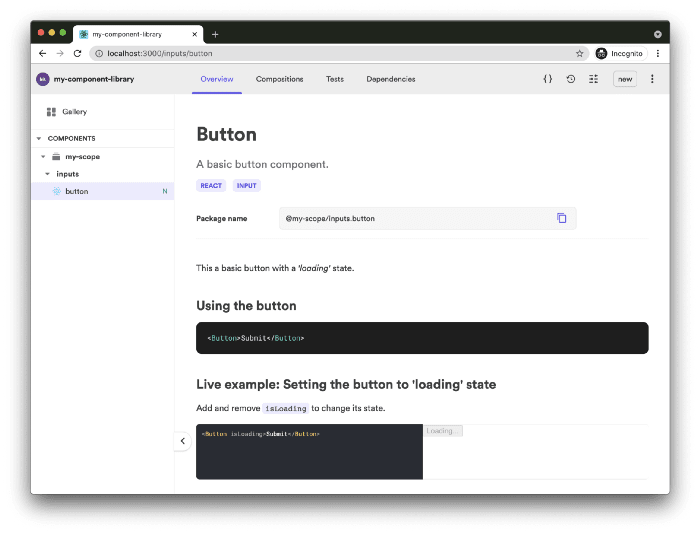
See an example in a remote scope as well: https://bit.dev/our-org/my-scope/inputs/button
A component’s documentation is not only used to explain it to its consumers but also, to make it discoverable for those who aren't yet aware of it (for example, by being indexed to Bit Cloud’s search or even just by presenting it to those who’re manually browsing components).
Before a component is tagged with a new release version, it is tested and built. Once that build is done, the generated artifacts are versioned along with the source files and configurations.
These generated artifacts are the component’s compiled code, node package, [bundled] component preview, [bundled] docs, build logs, and more — whatever is deemed valuable for other consumers and maintainers of that component.
The build process can also be customized and extended.
Components authored in a Bit workspace are created to be completely portable, and thus independent. To address that, the build process starts by creating a component ‘capsule’ which is an isolated instance of a component, generated in a separate directory in your filesystem.
Running the build in an isolated environment validates that a component is not coupled, in any way, to its workspace (a component that is not isolated may be able to use files and packages in the workspace. For example, we may get false-positive results when testing for dependency-graph issues).
Once a component was built successfully (and tagged with an incremented version number), all its dependent components are rebuilt (and tagged) as well.
That means:
Components can stay independent and in sync with their dependencies
The chance for breaking changes in other components and apps is drastically reduced as errors are immediately expressed
There are no redundant builds
When using Bit with Bit.dev, this propagation of CIs is not limited to just the workspace but traverses remote scopes (remote component hosting).
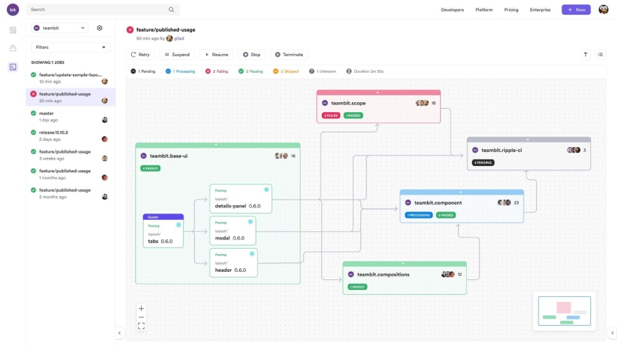
The “ripple effect” of component CIs
As mentioned at the beginning of this article, versioning (and publishing) components individually allow consumers of that library to pick and choose the components that best fit their project (and the current state of their project. )
Independent components are versioned using the semantic versioning specification (major.minor.patch ).
The major will be incremented when backwards-incompatible changes are introduced to the component’s API
The minor will be incremented when new backwards-compatible functionality is introduced to the API
The patch will be incremented when bug fixes are introduced that do not affect the component’s API
$ bit tag inputs/button 0.1.0 --message "first release version"

    ...
    new components
    (first version for components)
         > inputs/button@0.1.0
As mentioned earlier, tagging will also execute the component build.
How does semantic versioning translate specifically to UI components where changes may also affect the coherence between components’ look and behavior? In other words, how should a component be versioned when introducing internal changes that do not affect its API but change its look or behavior in a way that makes it inconsistent with the rest of the consumer’s current UI?
The answer (partly) lies in the decoupling of the theme from the UI components. A component library that has its components loosely coupled to a specific theme will use a theme provider component to style other components in that library using their APIs.
If a component was changed in a way that does not enable the theme-provider to fully style it, then the component’s API was changed in a backward-incompatible way.
This [imperfect] correlation between API and style is what we need to semantically version UI components in a way that makes sense in terms of UI consistency as well as API functionality.

Having said all that, there might be cases where a component is changed in a way that affects the page’s layout or simply diverge from the common look and feel in a way that is technically consistent with the theme provider. In these cases, it makes sense to either increase the major or even deprecate the component altogether and create a new one.
Once a component is built and tagged with a release version, it is ready for ‘export’. The export process pushes the component to remote hosting, and publishes its package (that was generated as part of the build) to the package registry that was configured for it (the default registry is Bit Cloud).
For example, the following workspace configuration file defines my-org.my-component-library as the scope for these components (the remote scope is hosted on Bit Cloud but can be changed to be self-hosted).
"$schema": "[https://static.bit.dev/teambit/schemas/schema.json](https://static.bit.dev/teambit/schemas/schema.json)",
"teambit.workspace/workspace": {
  "name": "my-component-library",
  "icon": "[https://static.bit.dev/bit-logo.svg](https://static.bit.dev/bit-logo.svg)",
  "defaultDirectory": "{scope}/{name}",
**  "defaultScope": "my-org.my-component-library"**
  },
  //...
All newly tagged components will be ‘exported’ (pushed & published) by running:
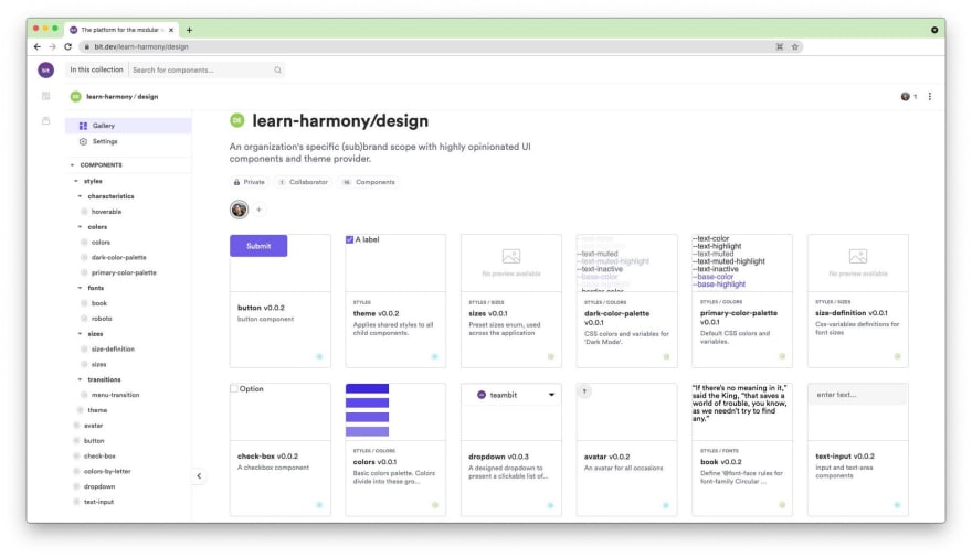
$ bit exportRemote Bit scopes are remote hosting for components. Multiple components relating to the same feature are usually hosted on the same scope, with their own set of permission levels. That creates a one-to-many relation between teams and scopes, where one team has multiple scopes and one scope has just one team.
Since exported components are independent, they can be consumed by components in other scopes. That enables other teams in an organization to extend the organization’s component library to create their own flavor of it (in order to address their specific needs).
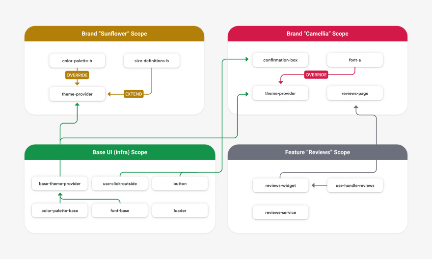
Getting adoption for your library starts by offering flexibility in the way that it is used.
Consumers of that library are not forced into using an entire pre-determined set of components, they can pick and choose the components they need. They can also extend some components to form their own “library” that addresses their product’s/sub-brand’s needs. Moreover, they are not forced into upgrading all components simultaneously but are able to do so gradually, as their own projects evolve.
When using Bit with “Ripple CI”, component CIs run on every dependent of a modified component. That means, other teams in an organization will have their own composite components (that use the updated component), tested before they are integrated into their project/other larger composite components.
Being able to rely on the infra team to deliver components that will not break your project is crucial to driving adoption.
“Ripple CI” [also] provides you with component usage information as it reveals your component dependents. It shows you which scope/team is using which component, and for what purpose (what sort of composition).
It is not only a guide to who you should communicate with to promote your library but also a way for you to understand which components require modification, which are missing (and being rebuilt by other teams as new composite components), and which are simply redundant. All that will help you in building a better component library (a crucial part of getting adoption).
Each remote scope displays the exported components in a UI that is almost identical to the local workspace UI. It displays component previews, documentation, and even a dependency graph that reveals other components that are used as building blocks.
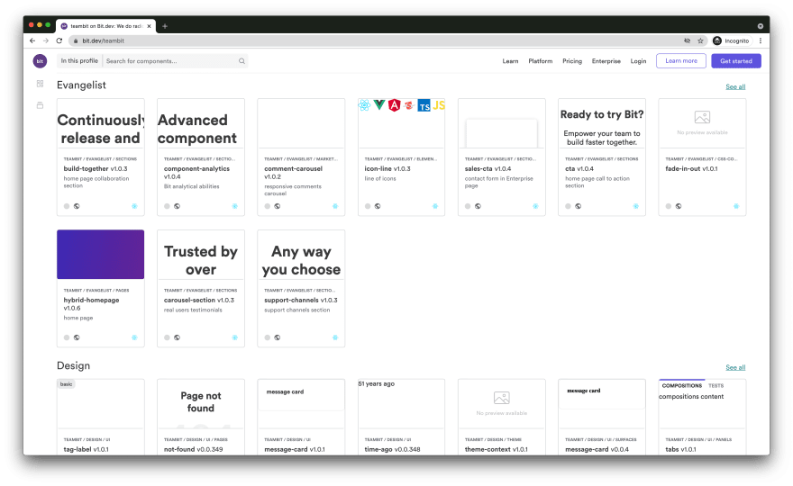
Components that are exported to remote scopes hosted by Bit Cloud, can be found by using Bit Cloud’s search capabilities — making it harder to miss a useful component.
This was a very shallow and brief presentation of Bit as a tool for developing, versioning, and sharing components, or more specifically, in our case, reusable components.
To learn more about Bit, see here.
26
