
52
Productivity with styled-components
two best practices to improve your project with this phenomenal library
The styled-components is a library for styling your application through JavaScript and is mainly used in the styling of React and React Native projects.
When we think about styling something, we should also be thinking about how to organize these styles, and for those just starting out in the frontend development world, these two practices are fundamental to writing and maintaining good code:
Whenever possible, create isolated styles.
Through this practice we have access to your component styles faster and this generates more productivity and makes maintaining your styles much easier.
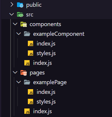
A widely used practice in the market is to create the styles file together with the main file (
index.js) of your component / page.Naming your file
styles.js or styled.js is also good practice. These two names are used a lot.As an example, this is the structure of the style files I used in a template for React, on my GitHub:
Although styled-components is well known and adopted, it is common to see many grouping components that should have semantic scope being created as a simple
div. It is extremely important that we do not forget to use tags correctly and consciously.This is an example of how we create and export a styled component with styled-components:
export const ExampleComponentContainer = styled.div``;We can access all other tags as styled properties, like:
among others.
styled.header, styled.nav, styled.section, styled.article, styled.aside, styled.footer,among others.
You can access the template mentioned above by clicking here:
 coderamos
/
template-reactjs
coderamos
/
template-reactjs
This project contains the basic structure for React projects. It also includes my settings for babel-plugin-root-import, eslint-plugin-import-helpers, prop-types, react-router-dom, styled-components and more...
Comment there what you think of this file structure :)
52