
27
Responsive Fonts in CSS
CSS provides a wide range of units to choose from while developing web applications.
Many properties such as padding, margin, font-size, width, height, etc., take length as values followed by a unit.
Many properties such as padding, margin, font-size, width, height, etc., take length as values followed by a unit.
A good developer should be able to decide how and when to use these units.
We will discuss some of the common units in CSS that are used with fonts, and also understand how to make font-sizes responsive.
Find the demo site for the examples explained in this post here
This post assumes that you are familiar with the basics of HTML and CSS.
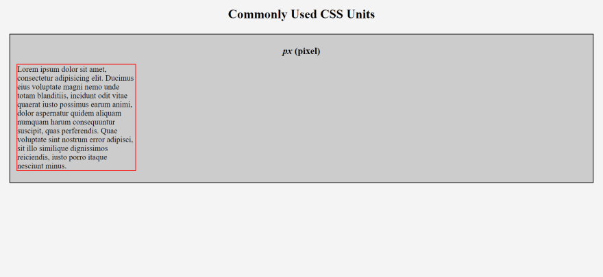
font-size.Let's use the image below to understand px better.
 div.pixel p {
    font-size: 20px;
    width: 300px;
 }
- The
<p>has afont-size: 20px. Now look at this image below that shows the same paragraph in a device with smaller screen size.
- Notice how the
font-sizeremains20pxeven when the viewport size decreases.
This is the issue with using pixels for any of the properties that takes a length. It is non-responsive, and does not scale according to the viewport size.
- Check out the pen for the above code here:
r in rem stands for root.
-
1 rem unit is the font-size of the root element, i.e.
<html>.
Let's understand rem with an example. Consider the code below.
 div.rem p {
     font-size: 2rem; /* 2 * 16 = 32px */
 }
- Check out the pen for the above example here:
<html>, it will have a font-size of 16px.
- The font-size of
<p>, in the above example, would be 2 times the size of the root element. That is: 2 * 16 =32px.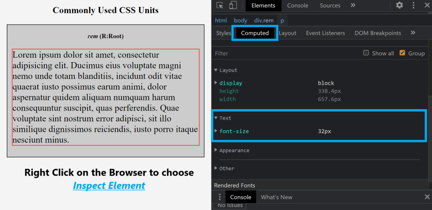
Another example could be overriding the default 16px of the root element.
 html {
     font-size: 20px;
 }
 div.rem p {
     font-size: 0.5rem;  /* 0.5 * 20 = 10px */
 }
- Check out the pen for the above example here:
- Go to your
browser settings - Under
appearance, selectFont size - Try changing the
Font sizeof your browser, and look at the computed result for the tag who's unit length is defined usingrem
- You will see that the font-size becomes responsive, and changes according to the chosen font size of the browser.
NOTE: If you override the default font-size of root element, changing the font-size of the browser will have no effect on the font-size of the content defined.
- Font-size defined using rem will be relative to the manual value that overrides the default root font-size.
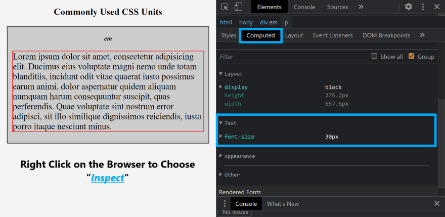
Let's use the same paragraph example and follow the code below.
 div.em {
     font-size: 15px;
 }
 div.em p {
     font-size: 2em; /* 2 * 15 = 30px */
 }
- Check out the pen for the above example here:
<div> is the parent of the <p>, the font-size of the content within <p> would be twice that of font-size defined for <div>.`
- That is, 2 * 15 =
30px would be the font-size of`.
This is the HTML code
 <div class="em">
    <ul>
       <li>1. Lorem</li>
       <ul>
           <li>1.1. Lorem</li>
           <ul>
               <li>1.1.1. Lorem</li>
           </ul>
       </ul>
    </ul>
 </div>
This is the CSS code
 div.em {
    font-size: 20px;
 }
 ul {
    font-size: 2rem;
 }
Guess what would happen to the content within <li>. What would be the font-size?

Unexpected right?
This is when em gets tricky and out of hand.
- When you have multiple nested elements, you need to be careful with the lengths you assign.
- Check out the pen for the above
<ul>example here:
NOTE: If you override the default font-size of root element, changing the font-size of the browser will have no effect on the font-size of the content defined.
- Font-size defined using em will be relative to the parent of that element. If the parent is the root, then the font-size of the element will be relative to the overridden font-size of root.
- For e.g. say you have a
<p>element within a<div>, and the font-size of<div>is 12px,<p>is2em. - And you declare padding for
<p>as 2em. Then, the padding of<p>would be48pxand NOT24px. - This is because the other properties multiply the value of font-size of the element itself.
- So keep this in mind when you use em as the unit for font-sizes.
Using a similar scenario like we did for em, let's assume we have a <p> within a <div>.
 html {
    font-size: 20px;
 }
 div.percentage {
    font-size: 150%;
 }
 div.percentage p {
    font-size: 200%;
 }
- Find the pen for the above code here:
Let's see what the font-size of <p> will be.
- The font-size for
<p>depends on<div>, and the font-size of the<div>depends on it's parent. (In this case:<html>) - Since the font-size for
<html>is 20px, the font-size of<div>should be 1.5 * 20 =30px. - And the font-size of
<p>would be 30 * 2 =60px.
Look at the image below to see the results of the above code:

-
NOTE: If you override the default font-size of root element, changing the font-size of the browser will have no effect on the font-size of the content defined.
- Font-size defined using % will be relative to the parent of that element. If the parent is the root, then the font-size of the element will be relative to the overridden font-size of root.
We have seen four different units that can be used with fonts in CSS.
As stated previously, there are many more units to explore and use. But the above explained ones are most commonly used by developers.
As stated previously, there are many more units to explore and use. But the above explained ones are most commonly used by developers.
Find the demo site for the examples explained in this post here
Moreover, it does not get exponentially multiplied (unlike em) when you define font-size for nested elements.
em can be used when you want the child element to inherit font-size and behave like the parent. Just beware of the inheritance.
As for %, it is very similar to em. But the main difference is that em scales faster than %.
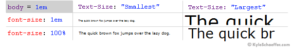
- There will hardly be any difference between em and % when users set the browser text size to “medium”.
- But as you can see in the picture above, when browser text-size is set to smallest, then em is hardly legible when compared to %.
- And when browser size is set to largest, em is displayed much larger than %.
Most people use px as well for font-size. But I do not recommend using it at all as it's not user friendly and not responsive.
In general I would suggest,
rem > percentage > em > px
Thank you for reading this blog post.
I hope you were able to understand the common units for font-sizes in CSS, and I am sure this would be very helpful while developing responsive websites in the future!
Do give this post a like, pin or save it, and share it with your dev friends!
27