38
The master guide to smooth, realistic shadows in CSS
In this article you will get to know about smooth CSS Shadows and a easy way to use them. But first of all
What are shadows?
When light falls upon an object shadow is formed. The shadows we see around us works on the same principle but they are really complex and realistic as they are not in a specific shape or length or size. They can take any shape and can fall in any direction. In order to create shadows in websites using CSS we use
When light falls upon an object shadow is formed. The shadows we see around us works on the same principle but they are really complex and realistic as they are not in a specific shape or length or size. They can take any shape and can fall in any direction. In order to create shadows in websites using CSS we use
box-shadow property.But if you are trying to create real shadows through
box-shadow property, well, You can't.Why?
In order to know 'Why?' you have to understand how box-shadow property works.
In order to know 'Why?' you have to understand how box-shadow property works.
box-shadow property simply produces a blurred silhouette of an object. You can change its length, color, blur, spread and offset nothing more. Then there's probably no way to create the Natural Super complex real Shadows through box-shadow property.But unexpectedly there's a way!
If we will use a simple technique, we will be able to get more controls and expand our range of options. This technique is using 'layered shadows'. We can define multiple shadows in a simple
If we will use a simple technique, we will be able to get more controls and expand our range of options. This technique is using 'layered shadows'. We can define multiple shadows in a simple
box-shadow property by using commas and gradually increasing the blur-radius, offset to make shadows more realistic. Here's an example:As you can see the difference in shadows. You can customize it more to generate more variants of shadows i.e. Sharp shadows, Dreamy shadows, long shadows etc.
/* Normal box-shadow */
.box {
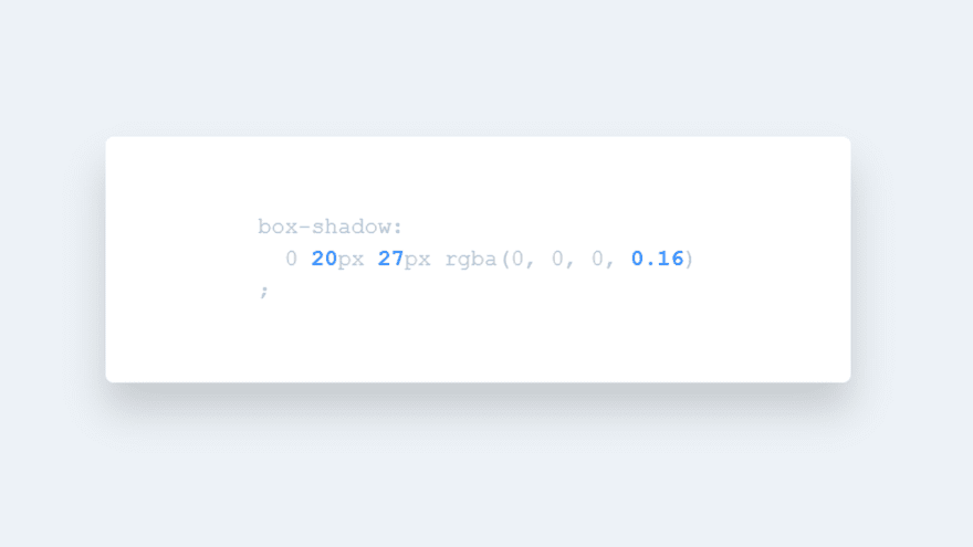
    box-shadow: 0 3px 3px rgba(0,0,0,0.2);
}

/* Layered Box-shadow */
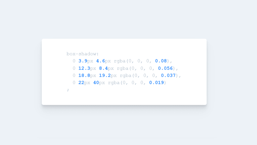
box-shadow:
     0 3.9px 4.6px rgba(0, 0, 0, 0.08),
     0 12.3px 8.4px rgba(0, 0, 0, 0.056),
     0 18.8px 19.2px rgba(0, 0, 0, 0.037),
     0 22px 40px rgba(0, 0, 0, 0.019)
;
More Layers == More Customization == More Realistic shadows
You can also generate Sharp shadows by gradually decreasing the alpha values (opacity) and increasing the blur strength to create Sharp shadows. You can use the same principle to create Diffused shadows.
We can also create Short as well as long shadows by just playing with opacity and spread. To create long shadows we can gradually increase the y-offset values.
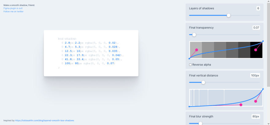
However creating these kind of shadows is a real mess for some people, specifically for those people and for making our life more easy there is website which can help them in Creating realistic shadows i.e. https://shadows.brumm.af/ by Philipp.

Through this website you can create as many layers as you want and edit them in real time, Saving a lot of time and efforts.
A post by Devang. Hope it helps!
Check out my portfolio: here
Check out my portfolio: here
38


