


19
The ONE star rating system — the future of rating
Recently, a lot of folks tried their best to provide star rating system. Now it's time to bring THE "star rating" that will change the world!
I called it: The ONE star rating
5 star rating system - ACTUALLY accessible, no JS, no WAI-ARIA and Semantic HTML! ⭐⭐⭐⭐⭐ [Easily converted to any framework too!]
InHuOfficial ・ Jul 2 ・ 7 min read
#a11y
#css
#html
#webdev
Implementing a Star Rating component in Vanilla JS
Lakshya Thakur ・ Jul 2 ・ 4 min read
#javascript
#webdev
#uiweekly
Scalable "star rating" without JS (and no SVG or image for the star)
Temani Afif ・ Jul 4 ・ 4 min read
#css
#html
#webdev
#beginners
Star[Rating] Wars - The MadsAfif Menice [An even better star rating system and a comparison]
InHuOfficial ・ Jul 5 ・ 6 min read
#webdev
#html
#css
#javascript
Why having multiple stars when we can do the job with only one star? A unique star that can hold all the information. Let's think outside of the box and build the future of rating systems.
See it in play:
Thanks to my geometry superpower, I divided the star into 5 parts and the number of selected parts will define the rating. So we have our 1 to 5 rating system with only one star!
It's compact: All the information hold in a small space. The space needed for one star.
It's outstanding: Everyone is getting bored with the old school star rating. This one will impress your visitors and they will want to rate you with a 5/5!
rtl or ltr ??: stop thinking about that. We no more have a straight direction but a circular one. Do we have direction with clocks? no we don't! Same thing here, it's a universal circular direction.And let's not forget all the other advantages:
✔️ No JavaScript.
✔️ No complex HTML code.
✔️ A small CSS code.
✔️ No SVG, No images.
✔️ Works with keyboard navigation.
✔️ No complex HTML code.
✔️ A small CSS code.
✔️ No SVG, No images.
✔️ Works with keyboard navigation.
I kept the same HTML code of my previous implementation. The inputs and one extra element.
I first start by placing all the inputs (and the extra element) above each other inside a square element.
grid-area:1/1, I can have all the elements above each other without the need of using position:absolute
width:100%;height:100% to the inputs so they cover the whole area and I make them invisible (but still interactive)Then, I create the star shape using the
<i> element and clip-path. That shape will have 3 background layersconic-gradient with a 72deg step (360deg/5) controlled with the variable --p.--l. Yes, this one will respond to the hover effect.Now the real trick is the position and shape of our inputs.
Each one is clipped to the top part of the star like below:
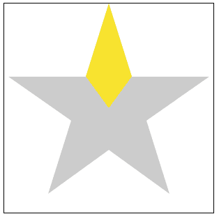
At this step all of them will define the same part of our star. We have to rotate them so each one will get on the top of a different part.
.stars input:nth-of-type(2) {transform:rotate(72deg)}
.stars input:nth-of-type(3) {transform:rotate(144deg)}
.stars input:nth-of-type(4) {transform:rotate(216deg)}
.stars input:nth-of-type(5) {transform:rotate(288deg)}
Now each input is placed on the top of one part of the star and clipped to that part.
I think everyone know the rest of the story. On
:hover or :checked I change the variables I described previously and we have our ONE star rating.That's it! With a simple code, we get an innovative star rating. You can easily adjust the size, the circular direction and it does work with default values:
19