29
How to position items within a container using Flex Box ?
<div class="container">
    <div class="item">A</div>
    <div class="item">B</div>
    <div class="item">C</div>
</div>.container{
width: 720px;
height: 480px;
background-color: blue;
}
.item{
font-size: 18px;
text-align: center;
padding: 5px 10px;
border: 1px solid green;
background-color: orange;
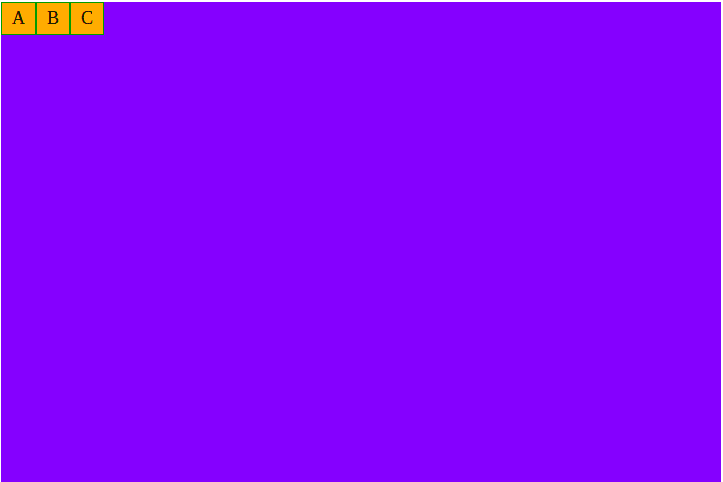
}.container{
display: flex; /* flex box applied here */
width: 720px;
height: 480px;
background-color: blue;
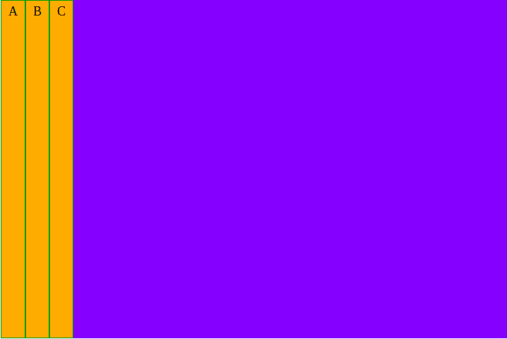
}We can now add a ‘flex-direction’ property to the container and assign one of the following values:
flex-direction: row; - Aligns items horizontally, left to right. 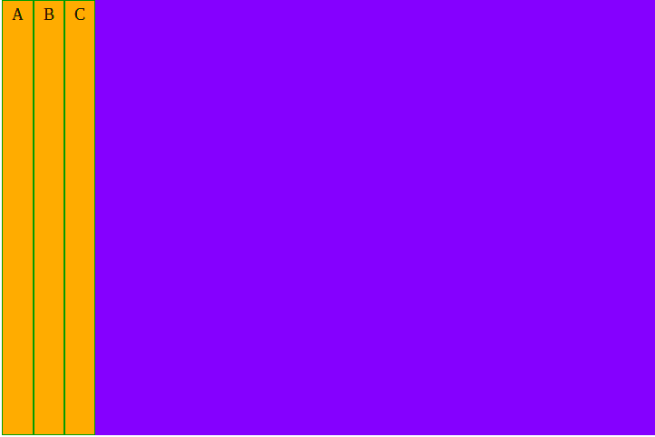
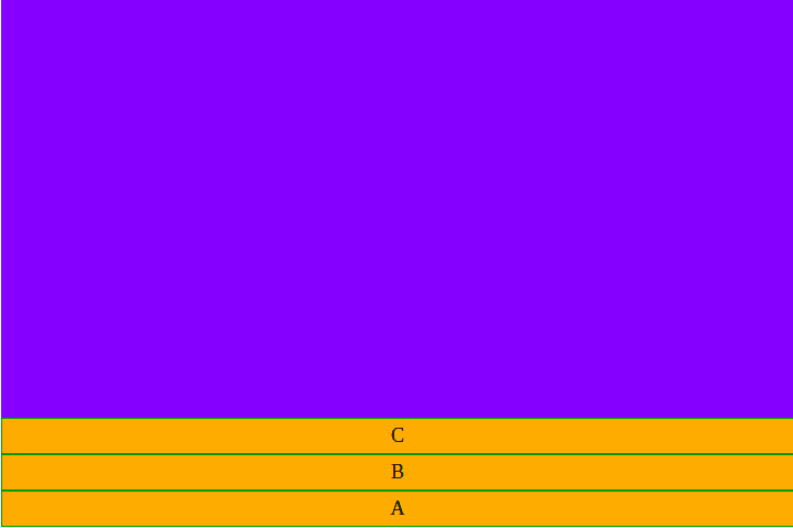
flex-direction: column; - Aligns items vertically, top to bottom.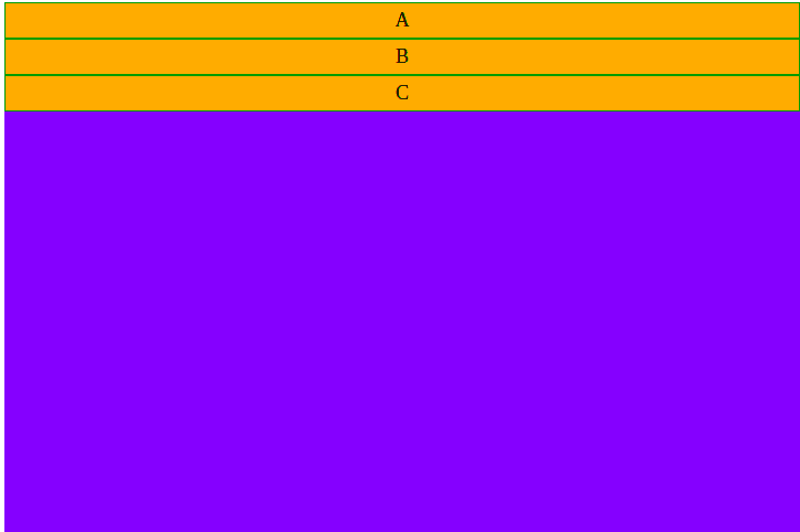
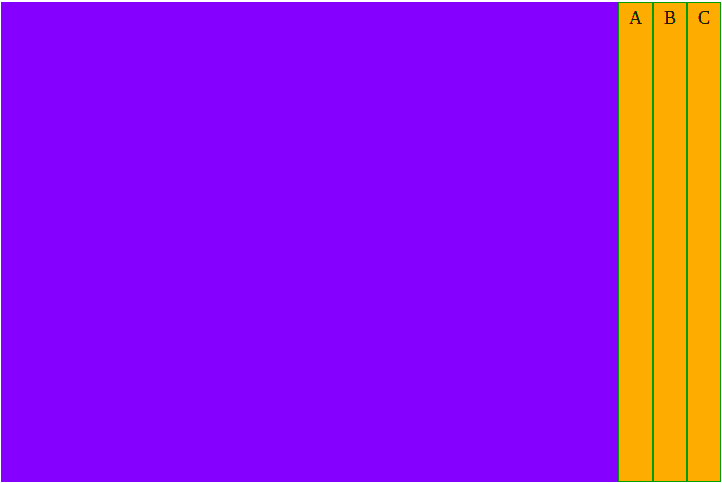
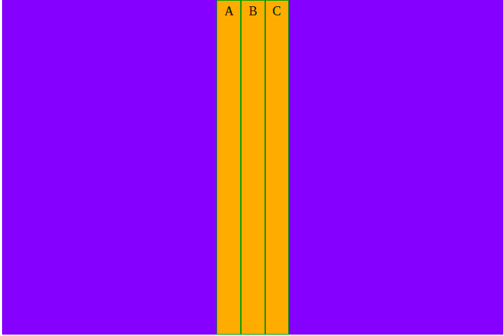
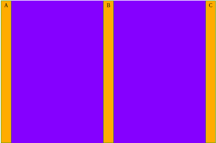
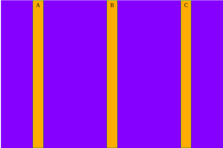
We can place the items at different positions along the container’s main axis by using the ‘justify-content’ property coupled with one of the following values:
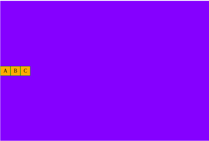
We can place the items at different along the container’s cross axis by using the ‘align-items’ property coupled with one of the following values:
Our Tech works @ Matrix Automata
29


