
29
CSS Flex box : everything you need to know about flex box
Hey, welcome. If you are here, you must have heard about flex box in CSS or you already know what is flex box. But, What exactly Flex box is ?
Flex box layout provide us a more efficient way to manage items of a particular container. Flex box layout align, shrink items or make space among items by occupying the given space, and make the website responsive.
Well to use flex box you just have to set container element's
display property to flex. display: flex; will enable all flex box feature to this container..container{
display: flex;
}i)
Flex-direction : This property is for parent. It allows us to set or change item's direction. Like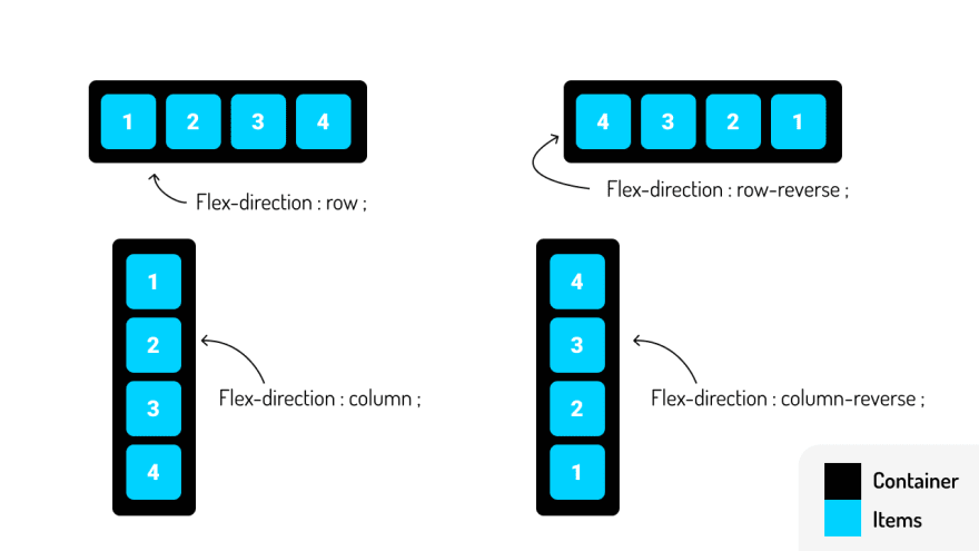
ii)
Flex-wrap : This is also for parent element. It allow you to wrap the items and prevent overflow.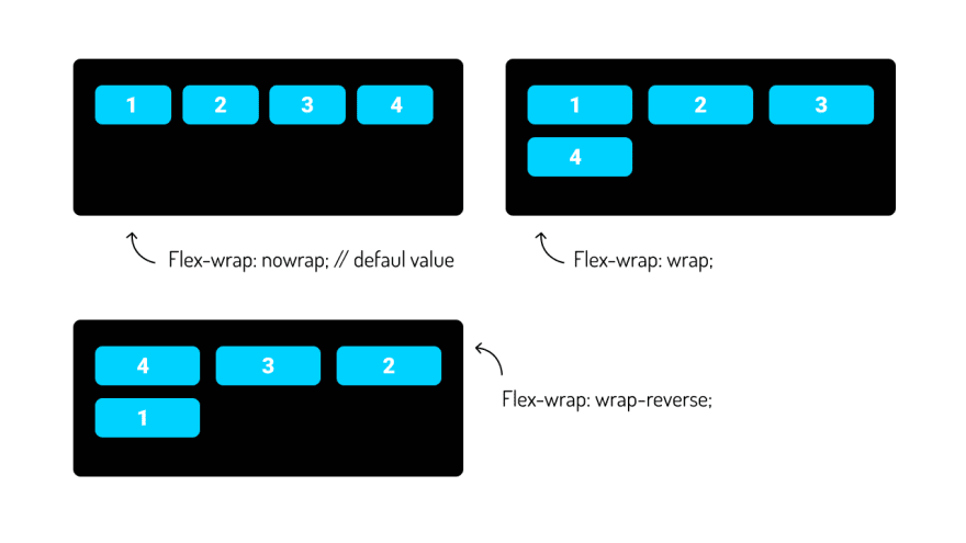
iii)
Flex-flow : This is the shorthand for flex-direction and flex-wrap. The default value is :.container{
flex-flow: row nowrap;
}You can see the first value for this property id flex-direction and second is for flex-wrap.
iv)
justify-content : It is the most common and frequently used property. It is used to align items in the x axis or horizontal axis.
v)
align-items : It is also a common and frequently used property. It is used to align items in Y axis or vertical axis.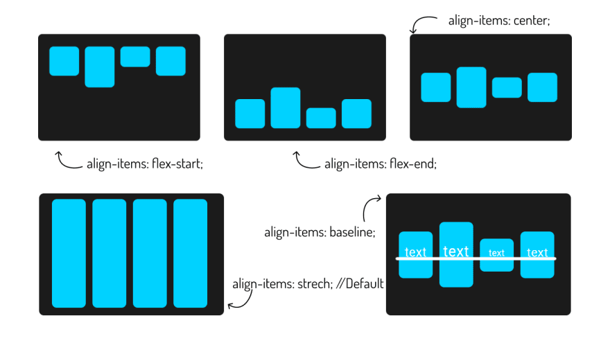
Note : If you have flex-direction: column | column-reverse then justify-content and align-items align items in Y and X axis respectively.
All properties above are for parent element. Now, let's talk about item's property.
vi)
flex-grow : As the name suggests flex-grow is used to increase or grow item's width in proportion to occupy the space.
vii)
flex-shrink : Yes, you guessed right. This property aim is opposite to flex-grow. It shrinks or decrease the width of item in proportions to occupy the space.
viii)
flex-basis : This defines the default size of an element before distributing the space among items. You can give fixed lengths like(100px, 20rem) or you can use auto value. auto means take value from width and height property.
xi)
flex : This is a shorthand for flex grow, flex shrink and flex basis.flex: <flex-grow> <flex-shrink> flex-basis>;x)
align-self : This property allow to align item individually. You can set different align position for each item.
So, that's it about flex box. I hope you understood each and everything. If you have doubt or I missed some point let me know in the comments.
And if you want to improve your webdev skills. You can watch tutorial on Disney+ clone clone by me. If you like, you can subscribe my youtube channel, and follow me on instagram. I create awesome web contents. [Subscribe], [Instagram]
Thanks For reading.
29