
29
23 Responsive And Lightweight CSS Frameworks
Using lightweight CSS frameworks to create responsive websites and web applications can significantly reduce delivery time. CSS frameworks have been around for a long time and are now widely used by front-end developers. These frameworks include code snippets that just need to be incorporated into the source code to create the entire layout. Since we target multiple screen sizes and resolutions, it is critical to perform a responsiveness test of websites and web apps to check how the CSS framework’s implementation performs over different browsers and operating systems.

Keeping these points in mind, below is a list of a few of the responsive and lightweight CSS frameworks which can be used to build top-notch user interfaces and enhance overall user experience.
Let’s begin with the lightweight CSS frameworks!

With the help of Bulma, the implementation and the customization becomes easy. It is created using pure CSS and does not require JavaScript. It has more than 93K users and therefore has a large community.

According to a recent survey, there are 58,326 live and historical websites that are using Bulma. It’s most popularly used in the USA. The websites that are a part of the top 1M websites, out of which 0.17% of them use Bulma.

UIKIT has different pre-installed modules such as Accordion, Iconnav, Animations, etc., showing usage patterns, component options, and methods. UIKIT is a must-try if you need a new, well-maintained CSS framework with a slew of module options. It’s available in Less and Sass and contains a stylesheet to serve right-to-left languages.

Mini.css bridges the gap between fully-featured frameworks and micro-frameworks. Mini.css contains many features in a small package, while it depends solely on CSS, meaning we do not have to worry about any difference from other JavaScript libraries that we might be using.
Mini.css is mobile-friendly and used to solve the problem with responsive grids, cards, and navigation that will entirely change the website’s layout on mobile to create a better content-centered experience. At the same time, the UI doesn’t get in the user’s way.


Skeleton’s successful result lies in taking the attributes from other CSS frameworks and providing a framework that helps make it very simple to use. The browser’s layout stays fluid by using the grid system, and it adjusts automatically to window size.

HiQ is created using PostCSS and comprises all the powerful new CSS features like custom properties. If we use the source version HiQ, we can benefit by using the custom selectors and mixins smooth styling. It allows easy use of themes just by dropping HiQ into our project, adjusting some CSS variables, and we’re good to go. HiQ manages the features like input, primary button, and other parts of HTML styling to focus on essential elements.
The HiQ framework will work across browsers that support custom properties.

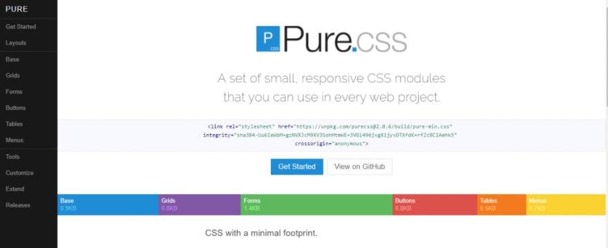
Pure.css is built over Normalize.css, which gives layout and styling for native HTML elements and often uses UI components. It is a responsive grid framework, so elements look perfect on all screen sizes. By keeping minimal styles, Pure.css motivates you to write your own application styles on top of it. It’s crafted such that you can get out of your way and easily override styles.
Companies using Pure.css are Yahoo, LastPass, Flickr, CanYouSeeMe.org, etc.

Unlike other lightweight CSS frameworks, Pure’s design is unopinionated, minimal, and flat. You can add new CSS rules instead of overwriting existing rules. By incorporating a few lines of CSS, you can customize Pure.css to work with your website.

Milligram officially supports the latest versions of Chrome, Firefox, IE, Safari, and Opera.

You can change layouts across devices with ultra-ease using Fictoan. Fictoan runs on SCSS, which means it needs to be transpiled into CSS before the browser can read it.

The major benefits of Spectre.css are basic styling, formatting for typography and elements, flexbox-based responsive layout, and utilities; along with following the best coding practices and maintaining a consistent design language.


Here are the major advantages of Turretcss:
It follows the principle – uses what you need and omits the rest. It has several methods and workflows for optimization. It is even modular, accessible, performant, and reusable.

InvisCSS uses few simple ‘opt-in’ classes, which are at the bottom of the HTML branch. InvisCSS is for real sites. It is built by keeping the Bootstrap audience in mind. Nonetheless, you will love the simplicity.

It’s easy to use because of the intuitive class names and simple to customize with a non-intrusive approach. There are a few exceptions to some basic styling and resets; we only need to add Spark classes to the elements we require for our styling. The framework comes with pre-built different color themes that are interchangeable, consisting of shiny and flat styles. Currently, the primary colors used are silver as the default one, blue, green, purple, lime, and dragonfruit.
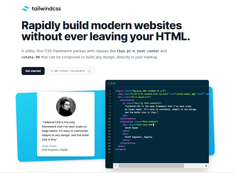
Here are the major advantages of Tailwind CSS:

Built-in 2014 by Google, Materialize CSS is the best lightweight CSS framework to design websites and Android web apps. Several Google products like YouTube, Gmail, Google Drive, and Google Docs are based on this framework.
Materialize comes with plenty of ready-to-use modules and classes, which eases the developer’s work. The framework uses a 12-column grid-based layout developed by Bootstrap, responsive animations and transitions, padding, and depth effects. A website can be created easily using its pre-built starter template.
Major Advantages of Materialize CSS are:


Vital is built-in CSS with zero JavaScript libraries or dependencies. Vital framework is developed with Sass for CSS and Slim for HTML and can be used for development. However, you can export pure CSS directly if you want to utilize Vital for production. You can use a CSS class to recreate any element from the components page. These classes can be partially automated if you use Slim; therefore, Sass/Slim users have a minor advantage.
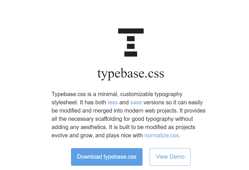
Typebase.css is designed to be easily updated as projects expand and develop, and it works well with Normalize.css. Typebase.css supports a vertical rhythm across many different device screens, ensuring that text across columns and long copy does not become skewed.
Once you have successfully implemented the lightweight CSS framework in your websites, it is important to perform a responsiveness test of the same. You need to ensure that it renders content legibly across all device viewports and resolutions.
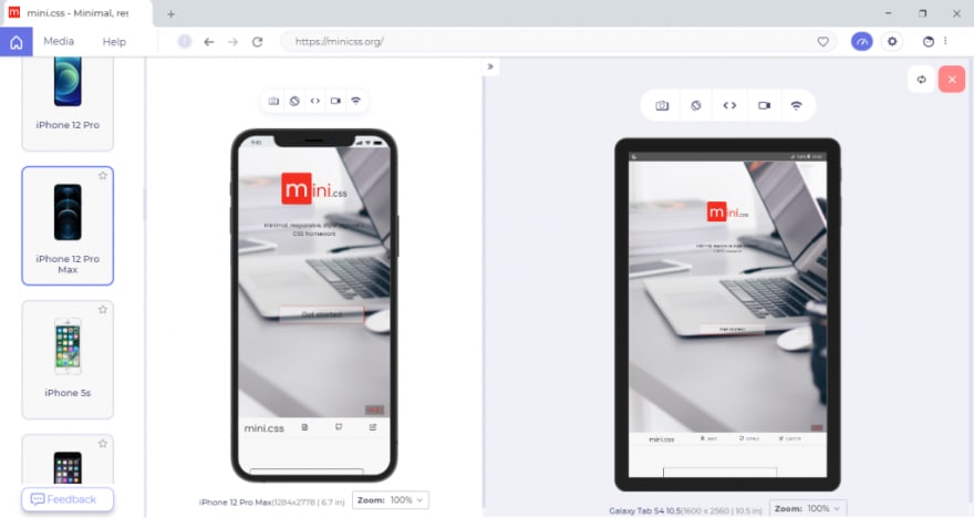
To perform responsive testing across different screen sizes, LT Browser – a developer-oriented tool, can be a go-to option. LT Browser comes with 50+ pre-installed device viewports for mobile, tablets, desktops, and laptops that let you create, analyze, & debug the mobile view of websites. Check the below video in order to get started with LT Browser:
You don’t even need to switch devices; with LT Browser’s smart frame, you can run the mobile web test on two different devices simultaneously.


LT Browser also has some other lucrative features like network throttling, performance reports, device synchronization, and mouse touch mode for experiencing real device touch behavior, etc.
And that’s a wrap for our responsive and lightweight CSS frameworks. Among these 23 frameworks, we can’t say which one is the best lightweight CSS framework. By selecting the right framework, you can handle the tedious and time-consuming styling and create full-fledged responsive websites and web pages. To perform efficient, responsive web design testing, check out our blog on Responsive Web Design Testing Checklist: All You Need to Know.

Got any questions about the lightweight CSS frameworks? Let us know in the comments box below.
Happy Testing!
29