
24
Dynamic image placeholder in Next.js
TLDR
Check the full code here
Being able to see something on the screen immediately makes the app feel faster,
either in a fast connection or a slow connection.
either in a fast connection or a slow connection.
The GIF below shows what a user will see for an image loaded using a slow internet connection.
It gives the impression that something is wrong with our app.
Alternative
We can use the built-in placeholder image in Next.js,
but we might need something that resembles the actual image for some cases, like cover images.
Check this blog for more info
Better but not enough. The placeholder did not load quickly enough to address the first issue.
Also, The sudden change in colors makes it feel unnatural to the eye.
However, we can create a custom placeholder for each image, but do we need to?
However, we can create a custom placeholder for each image, but do we need to?
In this blog post, I will show how to create a dynamic placeholder image in Next.js.
An easy way is to use plaiceholder
import {getPlaiceholder} from 'plaiceholder'

const placeholder = await getPlaiceholder(uri, { size: 64 })

// OR

const placeholder = await getPlaiceholder(uri)

// `size` decides how many blocks there will be
// ranges from 4 to 64
// default is 4
getPlaiceholder returns a promise of object with the following properties:base64blurhashcssimgsvgFor our purposes, we only need the
img and svg property.The way to create the SVG component will depend on the creation of placeholder metadata.
Here's a reference to
Here's a reference to
plaiceholder 's version. To better visualize how to create the SVG component, here is a sample SVG metadata
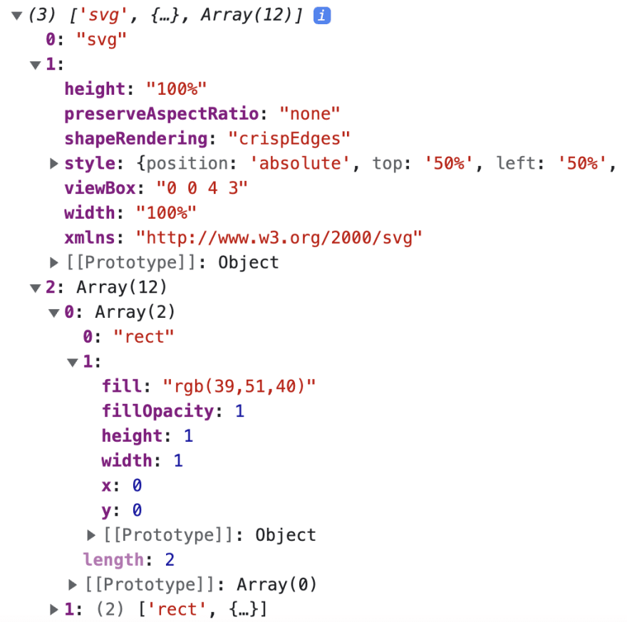
The first element in the SVG metadata is the
The second element in the SVG metadata is the SVG properties.
svg element.The second element in the SVG metadata is the SVG properties.
function BlurringImage({ svg }){
  const Svg = svg[0]
  const svgProps = svg[1]

  return <Svg {...svgProps}>
    {/* TODO */}
  </Svg>
}The third element in the SVG metadata is the list of
rect's, which will render as svg children.function BlurringImage({ svg }){
// ...
const rectangles = svg[2]
return <Svg {...}>
{rectangles.map((rect) => {
const Rect = rect[0]
const rectProps = rect[1]
<Rect {...rectProps} key={`${rectProps.x}${rectProps.y}`} />
)}}
</Svg>
}By doing step

2.a and 2.b, we can create a svg component that looks like this:The SVG can be blurred to remove the pixelated look.
function BlurringImage({ svg }){
  // ...
  const svgProps = svg[1]

  return <Svg
    style={{
      ...svgProps.style,
      filter: `blur(5px)`,
    }}
  >
  {...}
  </Svg>
}
Applying step
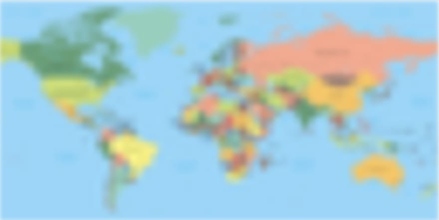
2.c will make the svg looks like this:NOTE: Make sure to apply an appropriate filter value
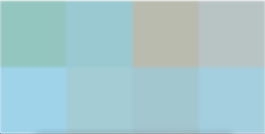
For svg metadata with fewer rects, the result might looks like this:
The
Spread the
svg and Image can be optionally wrapped in a another component(for styling).Spread the
img props in the next Image component.import Image from 'next/image'
function BlurringImage({ img }){
// ...
return <Container>
<Svg {...}>
<Image {...img} />
</Container>
// Create the Container in any way you want
}Since the image is already loaded, the placeholder component can be unmounted.
Unmounting can be achieved using a
Unmounting can be achieved using a
useState and the Image 's' onLoadingComplete callback method.function BlurringImage({...}){
// ...
const [hasPlaceholder, setHasPlaceholder] = useState(true)
return <Container>
{hasPlaceholder && <Svg {...} />}
<Image {...} onLoadingComplete={() => setHasPlaceholder(false)} />
</Container>
}Here's the final Custom Image component with minor refactoring and default prop values:
import React, {useState} from 'react'
import styled from '@emotion/styled'
import Image from 'next/image'

export function BlurringImage({
  svg: [Svg, svgProps, rectangles],
  img,
  alt,
  style,
  blurLevel = 5,
  height = undefined,
  width = undefined,
  ...props
}) {
  const [hasPlaceholder, setHasPlaceholder] = useState(true)

  return (
    <Container style={style}>
      {hasPlaceholder && (
        <Svg
          {...svgProps}
          style={{
            ...svgProps.style,
            filter: `blur(${blurLevel}px)`,
          }}
        >
          {rectangles.map(([Rect, rectProps]) => (
            <Rect {...rectProps} key={`${rectProps.x}${rectProps.y}`} />
          ))}
        </Svg>
      )}

      <Image
        {...img}
        {...props}
        height={height}
        width={width}
        alt={alt}
        onLoadingComplete={() => setHasPlaceholder(false)}
      />
    </Container>
  )
}

const Container = styled.div`
  position: relative;
  overflow: hidden;
  height: 100%;
  width: 100%;
`;Time to integrate our custom component in a NextJs application
import {getPlaiceholder} from 'plaiceholder';
import {BlurringImage} from '../components/BlurringImage';

export default function IndexPage({img, svg}) {
  return (
    {/* <SomeHeaderComponent /> */}
    <BlurringImage
      img={img}
      svg={svg}
      layout="responsive"
      width={1200}
      height={800}
    />
  )
}

// or getServerSideProps depending on your needs
export async function getStaticProps() {
  const uri = 'https://i.imgur.com/gf3TZMr.jpeg';

  const {img, svg} = await getPlaiceholder(uri, {
    size: 64,
  });

  return {
    props: {
      img,
      svg,
    },
  }
}
Here's the final result:

The web page seems to be loading faster even on a slow internet connection, and the transition of the image appears to be more natural.
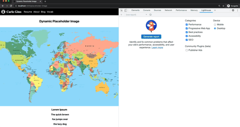
Here's a local lighthouse score:
By adding a dynamic placeholder image, the users' experience will improve due to immediate feedback which gives the impression that the application is working faster. There's no need to stare at an empty screen while waiting for an image to load, especially on a slower network. Also, the transition seems to be more natural as the placeholder image resembles the original image.
24