32
Responsive Skill Icons for your Portfolio Tutorial
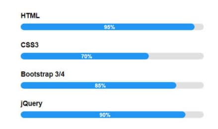
It's important to display your skills on your portfolio website so that potential customers, clients, or employers are able to see what technologies you are familiar with. There are multiple approaches to displaying these skills on your website. Some of which include skill bars, bullet points, ordered lists, tables, and more. I've used almost all of these, but have found them either hard to read, or in the case of skill bars, hard to interpret. I think its more important for your audience to know what software tools you have used, then how knowledgeable you think you are with a tool.
I decided to use this fantastic icons that show a nice pop of color, along with recognizable company logo's for quick representation of skills. I found this amazing resource called Devicon which produces 150+ SVG and Font based icons for all major developer tools, libraries, and frameworks. I chose the SVG version but you can use any version and follow this same guide.
If you want to see a live example of this, check out my portfolio website https://chrisbenjamin.dev
I use react on my website so I created 2 components for my skills section. I have a Skills.js component and a Skill.js component.
Let's make the Skill component which will be our reusable component for all of the skill icons on our site.
// This component will be sent props for the image Source, alt text, and title.
// It will return a HTML image tag (img) with the sourced image, some alt text
// with the name for the technology the image represents, and a title tag which adds
// a hover effect for people to identify the name of the technology by hovering

function Skill({source, alt, title}) {
    return  <img src={source} alt={alt} title={title}/>
}

export default Skill
Perfect, now we need to setup the component that will pass props to the Skill component and return back our image tag.
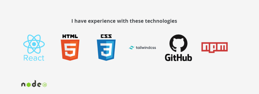
This will create 7 icons to start: React, HTML, CSS, TailwindCSS, GitHub, NPM, and NodeJS. Be sure to update these for your own skill set.
// import the Skill component as Skill for use in this component
import Skill from './Skill'

function Skills() {
    return (
        <div className="skills">
                {* heading for title *}
                <h2>I have experience with these technologies</h2>
                {* Create a div and give it a class of skillsGrid for styling *}
            <div className="skillsGrid">
                {* Let's render multiple copies of the Skill component. Make sure you update *}the source, alt, and title for each icon
                <Skill source="https://cdn.jsdelivr.net/gh/devicons/devicon/icons/react/react-original-wordmark.svg" alt="The logo icon for react" title="React"/>
                <Skill source="https://cdn.jsdelivr.net/gh/devicons/devicon/icons/html5/html5-original-wordmark.svg" alt="The logo icon for HTML 5" title="HTML 5"/>
                <Skill source="https://cdn.jsdelivr.net/gh/devicons/devicon/icons/css3/css3-original-wordmark.svg" alt="The logo icon for CSS3" title="CSS 3"/>
                <Skill source="https://cdn.jsdelivr.net/gh/devicons/devicon/icons/tailwindcss/tailwindcss-original-wordmark.svg" alt="The logo icon for TailwindCSS" title="Twilwind CSS"/>
                <Skill source="https://cdn.jsdelivr.net/gh/devicons/devicon/icons/github/github-original-wordmark.svg" alt="The logo icon for GitHub" title="GitHub"/>
                <Skill source="https://cdn.jsdelivr.net/gh/devicons/devicon/icons/npm/npm-original-wordmark.svg" alt="The logo icon for NPM" title="NPM"/>
                <Skill source="https://cdn.jsdelivr.net/gh/devicons/devicon/icons/nodejs/nodejs-original-wordmark.svg" alt="The logo icon for NodeJS" title="Node JS"/>
            </div>
        </div>
    )
}
export default Skills
You are doing great! You now have 2 components and you are ready to add this to your site. Since my page is a single page site, I'm going to be using the
App.js file and placing my component here. You can choose to import these components anywhere that you see fit.import Skills from "./Components/Skills";
const App = () => {
return (
<div className="App">
// Nav, Header, and other components should be here. I'm only importing my Skills component for styling.
<Skills />
</div>
);
};
export default App;We are going to be using Media Queries with this guide for setting our layouts based on difference screen sizes. For our smaller screens, we only want 3 columns wide. As the screens get larger, we will change the grid columns for better user experiences.
You can use your standard App.css file for these, or create your own CSS file and import it into your App.js file for the skills section. I'm going to put this right in my App.css right now.
This will have 3 columns and the image sizes will be a 75px by 75px square.
We are using Grid for display with 3 equal columns and a gap of 20px between the pictures. We are also center aligning these icons into the middle of the screen.
We are using Grid for display with 3 equal columns and a gap of 20px between the pictures. We are also center aligning these icons into the middle of the screen.
/* Small Screens max width 640px */
@media screen and (max-width: 640px) {
  .skillsGrid{
    display: grid;
    grid-template-columns: repeat(3, 1fr);
    gap: 20px;
    grid-auto-rows: auto;
    height: auto;
  }
.skillsGrid img {
  height: 75px;
  width: 75px;
}
.skills{
  background-color: whitesmoke;
  display: flex;
  flex-direction: column;
  margin-left: auto;
  margin-right: auto;
  text-align: center;
  justify-content: center;
  align-items: center;
}
}
You should have something that looks like this:

Here we are going to step up the columns to 4 columns and increase the size of the pictures and add some extra gap.
/* Medium Screens min width 641px change to 4 columns */
@media screen and (min-width: 641px) {
  .skillsGrid{
    display: grid;
    grid-template-columns: repeat(4, 1fr);
    gap: 30px;
    grid-auto-rows: auto;
    height: auto;
  }
.skillsGrid img {
  height: 100px;
  width: 100px;
}
.skills{
  background-color: whitesmoke;
  display: flex;
  flex-direction: column;
  margin-left: auto;
  margin-right: auto;
  text-align: center;
  justify-content: center;
  align-items: center;
}
}
You should have something that looks like this if you make the screen a bit larger:

Here for large screens and desktop users we are going to increase to 6 rows, increase the gap, and increase the image size again.
@media screen and (min-width: 1080px) {
  .skillsGrid{
    display: grid;
    grid-template-columns: repeat(6, 1fr);
    gap: 50px;
    grid-auto-rows: auto;
    height: auto
  }
.skillsGrid img {
  height: 150px;
  width: 150px;
}
.skills{
  background-color: whitesmoke;
  display: flex;
  flex-direction: column;
  margin-left: auto;
  margin-right: auto;
  text-align: center;
  justify-content: center;
  align-items: center;
  height: 100vh;
}
}
You should have something that looks like this on a large screen at least 1080px wide:

You did awesome! 😎
Congratulations, you now have an amazing looking skills section for your portfolio site. This clearly lets your audience know which tools you work with and have some experience using. Add the tools that you use, or are familiar with and adjust the icons and column sizes to fit your websites flow.
I hope you found this article useful. Please share it on your Twitter if you think other developers could benefit from this.
32

