36
Glass-Buttons my first React component library
I recently created my first React Component Library package and published it on NPM. This library is currently version 1.0 and I plan to add additional features onto it over the coming weeks.
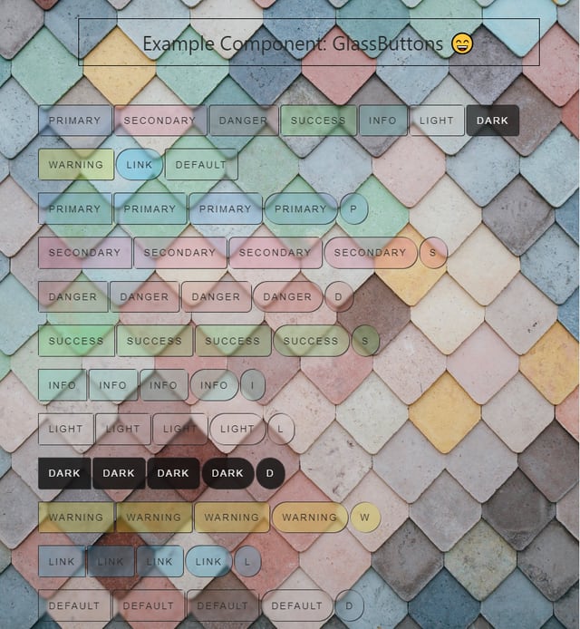
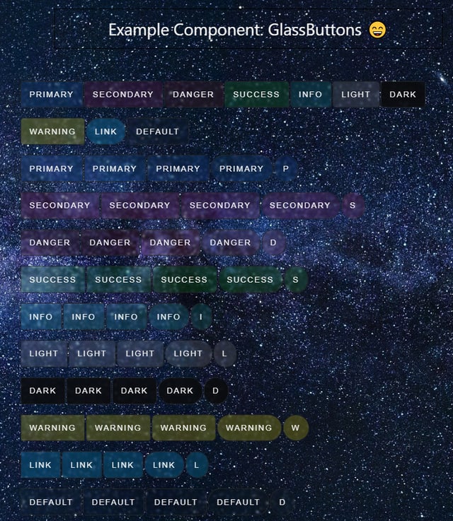
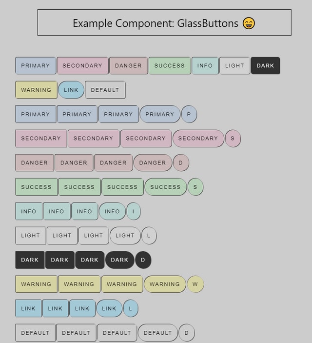
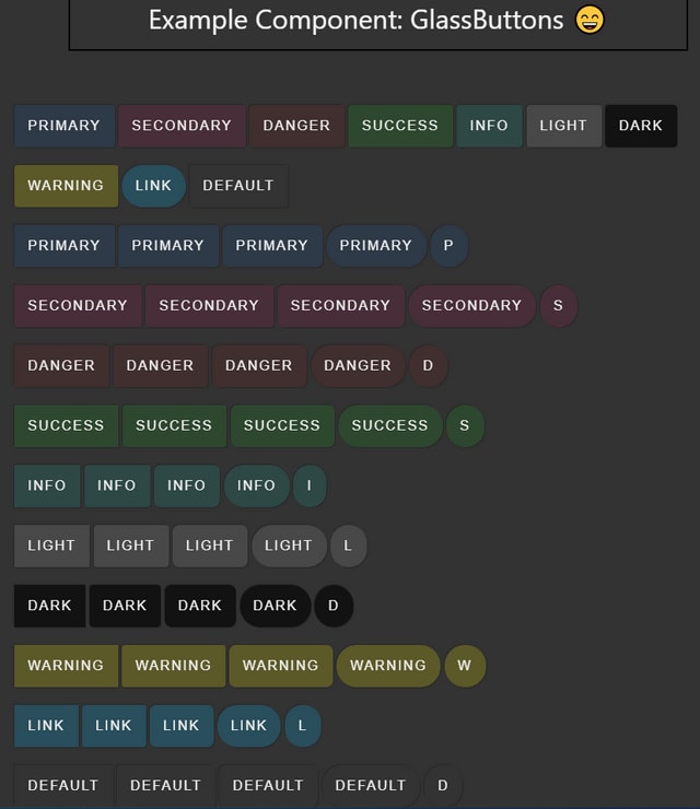
The idea behind this package was to create a react component library of a collection of buttons as a hybrid between Bootstrap and the CSS Glassmorphism effect that is quite popular amongst some developers. This effect allows for a translucent effect with a slight blur so it looks great on any background whether is a solid color or a picture. I'm a big fan of how bootstrap makes buttons a breeze with their naming convention of Primary, Secondary, Info, etc. I also really like the glassmorphism effect of buttons and how they look on a lot of websites. I blended these two together and gave it some CSS style properties for rounding to make changing the look and feel as simple as passing a property to the component.
This consists of 11 different button variations of colors and 5 different rounding options.
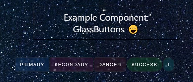
Creating a React component library was a lot more straightforward than I initially thought it would be. You can turn just about any pure functional component into a React component library. I started off with creating a series of just 5 buttons with changeable color styles. I wanted to start off with something small to publish on NPM and learn how packaging and publishing through npm would work. I was pleasantly surprised to find that using webpack and babel made the process simple and easy. Subsequent updates were as simple as running
npm run build followed by npm publish and it was immediately available for download. I went on to add 6 more color variations and some rounding style options. I wanted to ensure this package could be added to any React project and be a simple implementation for the developer. I ensured that all button options had a default condition if one was not set. The color properties were also set to inherit so they will take styling that is already being applied for font colors which will make them blend seamlessly into a project. I also added hover effects which change the opacity.
The package is called glass-buttons. It's a collection of React button components that you can apply one of 5 styles and import a nicely styled button on your React app in a matter of seconds.
These are the default color style names
| Border Style | Property |
|---|---|
| rounded-none | none; |
| rounded-small | 0.25rem; |
| rounded-large | 0.5rem; |
| rounded-xlarge | 1.5rem; |
| rounded-full | 9999px; |
I decided to publish version v1.0.0 on 11/20/2021. This version has 5 styles of buttons and 11 color variations. I plan to expand on the glass buttons to add more customizability. I also intend for this to be open source and will accept contributions from the community.
Support - Your support is 100% optional
You can buy me a Taco to show your support
You can buy me a Taco to show your support
36
