
49
Implementing Light / Dark Mode in Angular
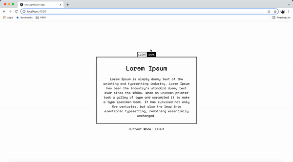
Light / Dark mode toggle is a very common feature in today's web applications. This feature may look very simple to the end users, but it takes some additional effort to correctly implement in a web application.
This post will focus on one of the most straightforward ways of implementing dark mode, using Angular and modern CSS features.
Also as a bonus, I will share a sample Angular project that has some additional features related to this.
Let's get started..!
In high level, A dark mode implementation requires a CSS-in-JS library so that CSS can be manipulated using Javascript. React Js like web libraries provide the flexibility to integrate any CSS-in-JS library that helps developers to implement dark mode easily.
But Angular is different. Being a framework, Most of the features are handled by the framework providing limited ways to change the underlying library. Also adding to that, default view encapsulation in Angular makes it very difficult to change component's styles from outside. (Obviously that is the purpose)
CSS variables play an important role in this. Basically you can assign some CSS variables based on a property in the DOM (commonly a CSS
class in body). Then you can change that property using Javascript, so that CSS variables change accordingly, affecting the child components styles as well. I will explain this using an diagram

First let's define some style variables in global
styles.scss file. (In this example I am using SCSS, but it is completed optional)$bgColor_light: white;
$bgColor_dark: black;
$textColor_light: black;
$textColor_dark: white;
$borderColor_light: black;
$borderColor_dark: white;
// mixin that enables css variables in light mode
@mixin lighten() {
--bgColor: #{$bgColor_light};
--textColor: #{$textColor_light};
--borderColor: #{$borderColor_light};
}
// mixin that enables css variables in dark mode
@mixin darken() {
--bgColor: #{$bgColor_dark};
--textColor: #{$textColor_dark};
--borderColor: #{$borderColor_dark};
}Now we need to call above mixins in a conditional way. We use CSS class name in the body to determine what mixin to call.
body.dark {
  @include darken();
}
body.light {
  @include lighten();
}
Now you can use these CSS variable to style an Angular components.
main {
  display: flex;
  height: 100vh;
  justify-content: center;
  align-items: center;
  flex-direction: column;
  background-color: var(--bgColor);
  color: var(--textColor);
}
Please make sure not to use the SCSS variables directly in your components, since those do not change once defined.
Finally, let's create an Angular component that updates the CSS class in
document.body element programmatically./**
* Function that toggles the current mode
* Exposed publicly
*/
toggleMode() {
this.document.body.classList.toggle(Mode.LIGHT);
this.document.body.classList.toggle(Mode.DARK);
if (this.currentMode === Mode.LIGHT) {
this.updateCurrentMode(Mode.DARK);
} else {
this.updateCurrentMode(Mode.LIGHT);
}
}That's all. Pretty simple and straightforward.
Some devices provide users to set the device theme as part of system settings. So it is important that, our web application should adhere to this device theme, and load the mode appropriately.
You can easily check that using following
@media query@media (prefers-color-scheme: dark) {
...
}But, we will be using it in your Javascript logic
/**
   * Init function that update the application based on the initial mode value
   * Flow as below
   * 1 - If there is a saved mode in the browser - use this as the initial value
   * 2 - If there is no saved mode, Check for the preferred device theme
   * 3 - If device theme is dark, set the init value to `dark`
   * 4 - Else set the default value to `light`
   */
  private init() {
    const deviceMode = window.matchMedia("(prefers-color-scheme: dark)");
    let initMode = this.modeStorage.get();
    if (!initMode) {
      deviceMode.matches ? (initMode = Mode.DARK) : (initMode = Mode.LIGHT);
    }
    this.updateCurrentMode(initMode);
    this.document.body.classList.add(this.currentMode);
}As promised, I will share the sample project that I created to demonstrate above implementation and some additional features such as
You can find all the development information in the
README.md file. That is all for now. Please share you feedbacks. Thank you for reading.
49