
58
Next.js + MUI v5 + Typescript tutorial and starter
If you're just looking for a quick start or in other words for a starter, you can check and download the result of this post on GitHub.
In this article, we're going to start a project with Next.js, MUI v5 (formerly Material-UI), and we're also going to use TypeScript. I don't want to talk about What is Next.js or MUI in this post because you can find a lot to read about them on the web. But, briefly, I will list some of their benefits here.
And lots of other benefits. Check the Next.js site to read more.
Generally, when you use MUI for creating UI there will be a lot of power and freedom in design.
To read and learn more about MUI check it here.
You know that Js doesn't care about typing, for instance you can put a string in a variable which you want as a number, so with Ts:
And a lot more. Check this link.
Alright, it's time to install.
Generally, there are two ways to install Next.js. You can install it manually or via a single command. For this tutorial, I'll use the second approach. In comparison to the first method, the second one is much faster, Also with providing the "--typescript" flag, you'll have typescript and the required configurations in one go.
So, to install Next.js and TypeScript together run:
or if you use yarn:
npx create-next-app@latest --typescript app-nameor if you use yarn:
yarn create next-app --typescript app-nameI use NPM as a package manager and I am also going to name this project "muxt-ts" (combination of MUI + Next and Typescript). So, for me it will be
npx create-next-app@latest --typescript muxt-tsWhen the installation is done, initial files and folders structure should be like this:

And, this is how package.json will look:

Up to this point, you have your Next.js installed. To see if everything works perfectly, run
npm run dev or yarn dev, and open http://localhost:3000 in your browser. You should see a page like this:
as the MUI docs says:
The default style library used for generating CSS styles for MUI components is emotion.
in order to use MUI with Next.js we have to install these packages:
Using server and cache packages in upcoming steps will help us to avoid errors about mismatching of styles files.
So, Run
npm i @emotion/cache @emotion/react @emotion/server @emotion/styled or yarn add @emotion/cache @emotion/react @emotion/server @emotion/styledinstall MUI with this command npm i @mui/material or in case you use yarn run yarn add @mui/material
MUI uses Roboto as the default font so you should install that with this command: npm i @fontsource/roboto or yarn add @fontsource/roboto
(OPTIONAL) If you think you are going to use MUI Icon components you need to install its package as well, otherwise there is no need to install this package. But I'm going to install it in order to have that in my starter. To do that run npm i @mui/icons-material or yarn add @mui/icons-material
Alright, we have installed everything that we need to. Let's take a look at all packages that we installed.

Ok, First of all, I have to say that This step isn't necessary. You can start using MUI in your Next.js app without creating a theme and providing it to your components. But, In my book, it's better to create and provide it right now as you may need it very soon.
To create a theme you need to import "createTheme" function and pass some theme options. Briefly, what I am going to do here is to create a file named "lightThemeOption" and set the light mode for that for now. Later I will use these options to create my light mode theme. Let me explain the reasons that I do things like this:
Always be as clear as possible. Naming this file "lightThemeOptions" tells us that first, this file contains some options for a theme; second, the options are for a light mode theme.
So, first, create a folder with the name of "theme" in the styles folder, with this approach if you decide to add another theme tomorrow you know where to store it; and after that, create a file named "lightThemeOptions.ts" in it.(If you want to start in dark mode you can name it "darkThemeOptions.ts")

We're using TypeScript, and as you know MUI supports it perfectly. So first we import the type for theme options and then create a constant with that type. In the end, we export the created const as the default export. This is the code for "lightThemeOptions.ts":
import { ThemeOptions } from '@mui/material/styles';

const lightThemeOptions: ThemeOptions = {
  palette: {
    mode: 'light',
  },
};

export default lightThemeOptions;
I keep this so simple, you can always come back and add your favorite options to that.
Now it's time to create a utility that creates an emotion cache for us. First, create a top-level directory named "utility" which will contain all of your utilities in the future. Then add a file name "createEmotionCache.ts".
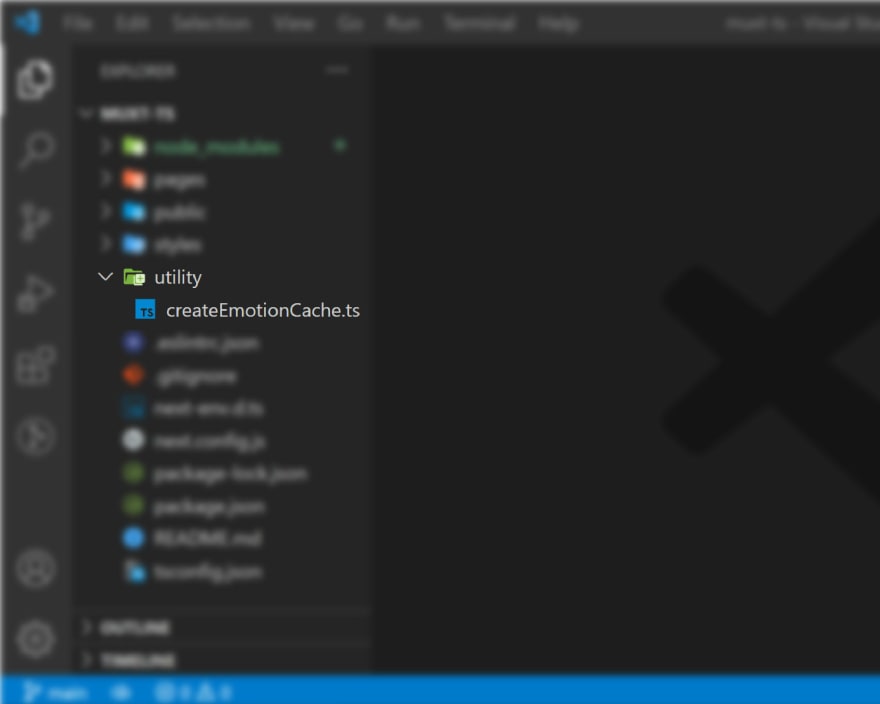
Paste the code below in it.
import createCache from '@emotion/cache';

const createEmotionCache = () => {
  return createCache({ key: 'css' });
};

export default createEmotionCache;
So, this function first will import "createCache " from "@emotion/cache" and then use it to create a cache that has got a key with the value of "css".
In the pages directory add a file named "_document.tsx". This is the way that we can have our own document for a Next.js project. For now just copy the code below and paste it in it.
import * as React from 'react';
import Document, { Html, Head, Main, NextScript } from 'next/document';
import createEmotionServer from '@emotion/server/create-instance';

import createEmotionCache from '../utility/createEmotionCache';

export default class MyDocument extends Document {
  render() {
    return (
      <Html lang="en">
        <Head>
          <link
            rel="stylesheet"
            href="https://fonts.googleapis.com/css?family=Roboto:300,400,500,700&display=swap"
          />
        </Head>
        <body>
          <Main />
          <NextScript />
        </body>
      </Html>
    );
  }
}

// `getInitialProps` belongs to `_document` (instead of `_app`),
// it's compatible with static-site generation (SSG).
MyDocument.getInitialProps = async (ctx) => {
  // Resolution order
  //
  // On the server:
  // 1. app.getInitialProps
  // 2. page.getInitialProps
  // 3. document.getInitialProps
  // 4. app.render
  // 5. page.render
  // 6. document.render
  //
  // On the server with error:
  // 1. document.getInitialProps
  // 2. app.render
  // 3. page.render
  // 4. document.render
  //
  // On the client
  // 1. app.getInitialProps
  // 2. page.getInitialProps
  // 3. app.render
  // 4. page.render

  const originalRenderPage = ctx.renderPage;

  // You can consider sharing the same emotion cache between all the SSR requests to speed up performance.
  // However, be aware that it can have global side effects.
  const cache = createEmotionCache();
  const { extractCriticalToChunks } = createEmotionServer(cache);

  /* eslint-disable */
  ctx.renderPage = () =>
    originalRenderPage({
      enhanceApp: (App: any) => (props) =>
        <App emotionCache={cache} {...props} />,
    });
  /* eslint-enable */

  const initialProps = await Document.getInitialProps(ctx);
  // This is important. It prevents emotion to render invalid HTML.
  // See https://github.com/mui-org/material-ui/issues/26561#issuecomment-855286153
  const emotionStyles = extractCriticalToChunks(initialProps.html);
  const emotionStyleTags = emotionStyles.styles.map((style) => (
    <style
      data-emotion={`${style.key} ${style.ids.join(' ')}`}
      key={style.key}
      // eslint-disable-next-line react/no-danger
      dangerouslySetInnerHTML={{ __html: style.css }}
    />
  ));

  return {
    ...initialProps,
    // Styles fragment is rendered after the app and page rendering finish.
    styles: [
      ...React.Children.toArray(initialProps.styles),
      ...emotionStyleTags,
    ],
  };
};
Ok, time to explain what exactly going to happen.
it means sending the page with the data already populated from the server.
Ok, the last step. In this step, we need to update the code in the "_app.tsx" to provide the theme and the cache for our entire app.
import * as React from 'react';
import type { AppProps } from 'next/app';
import { CacheProvider, EmotionCache } from '@emotion/react';
import { ThemeProvider, CssBaseline, createTheme } from '@mui/material';

import '@fontsource/roboto/300.css';
import '@fontsource/roboto/400.css';
import '@fontsource/roboto/500.css';
import '@fontsource/roboto/700.css';

import createEmotionCache from '../utility/createEmotionCache';
import lightThemeOptions from '../styles/theme/lightThemeOptions';
import '../styles/globals.css';
interface MyAppProps extends AppProps {
  emotionCache?: EmotionCache;
}

const clientSideEmotionCache = createEmotionCache();

const lightTheme = createTheme(lightThemeOptions);

const MyApp: React.FunctionComponent<MyAppProps> = (props) => {
  const { Component, emotionCache = clientSideEmotionCache, pageProps } = props;

  return (
    <CacheProvider value={emotionCache}>
      <ThemeProvider theme={lightTheme}>
        <CssBaseline />
        <Component {...pageProps} />
      </ThemeProvider>
    </CacheProvider>
  );
};

export default MyApp;
Explanation of the code above:
CssBaseline kickstart an elegant, consistent, and simple baseline to build upon.
We're done and the starter is ready.
I've created this repository on GitHub where you can download this starter and use it in case you want to save more time. Download and rename it and done!
58