
73
How to build UI elements using CSS pseudo elements
These days there are a lot of designs that intuitively display information. Instead of plain old one-to-one mapping of fields in a database, we're moving towards a more human-friendly and easy-to-understand UI element. For example, icons, loaders, badges, and progress indicators.
Being front-end developers, it's our responsibility to bring such UI to life using code(or magic 🪄).
An example of such a UI element is a simple status indicator that shows how many steps have been completed in a multi-step process. Because of its visual nature, it conveys this information in an instant look.

The problem arises when we use a bunch of
In this article, we will see how we can build such UI using CSS pseudo-elements and minimising the need for
<div>s and <span>s to build such UI. It gets complicated, unreadable, and hard to maintain very quickly.In this article, we will see how we can build such UI using CSS pseudo-elements and minimising the need for
<div>s (or <span>s).Here is the CodeSandbox link to the final output. Let's get started.
We will build this UI component in a few steps. That way, it is easier to follow and recall a step later. So without further ado, let's go!
import styled from "@emotion/styled";
import checkmarkImage from "path-to-file/file-name.svg";

const Circle = styled.div`
/* We're using CSS variables here. */
  --primaryColor: #00ccb0;
  --secondaryColor: #e1e1e1;
  --scale: 2;
  --size: calc(16px * var(--scale));

  border-radius: 50%;
  position: relative;
  width: var(--size);
  height: var(--size);
  box-sizing: border-box;
  background-color: ${(props) =>
    props.active ? "var(--primaryColor)" : "var(--secondaryColor)"};
  margin-right: var(--size);
`;

export default Circle;styled from the emotion library and an image that we will use in a moment.Circle and add a few CSS rules that make it a nice circle.Let's decode this cryptic looking line:
background-color: ${(props) =>
    props.active ? "var(--primaryColor)" : "var(--secondaryColor)"};
Here we are using template literals syntax to dynamically assign the value of
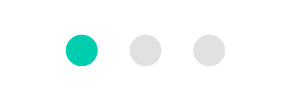
background-color based on the active prop which will be passed by the parent component.At this point, if we wrap a couple of this components in a box, we will have a few nice circles:
(...)
   <Circle active={true} />
   <Circle active={false} />
   <Circle active={false} />
(...)
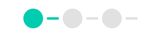
Let's go ahead and connect the dots(pun intended) by creating the link between these circles.
We use the
::after pseudo-element for this as shown below:const Circle = styled.div`
--primaryColor: #00ccb0;
--secondaryColor: #e1e1e1;
--scale: 2;
--size: calc(16px * var(--scale));
--linkWidth: calc(10px * var(--scale));
--linkHeight: calc(2px * var(--scale));
border-radius: 50%;
position: relative;
width: var(--size);
height: var(--size);
box-sizing: border-box;
background-color: ${(props) =>
props.active ? "var(--primaryColor)" : "var(--secondaryColor)"};
margin-right: var(--size);
/* Make a pill shaped element that will act as link between two circles. */
&::after {
content: "";
width: var(--linkWidth);
height: var(--linkHeight);
border-radius: 100px;
position: absolute;
left: calc(var(--size) + ((var(--size) - var(--linkWidth)) / 2));
top: calc((var(--size) - var(--linkHeight)) / 2);
background-color: ${(props) =>
props.active ? "var(--primaryColor)" : "var(--secondaryColor)"};
}
`;Let's understand the code:
First, make a rectangle with rounded borders to give it a pill-like shape using width, height, and border-radius properties.
Then, align it centrally relative to the circle using top and left properties.
Note: We use calc function to figure out values for top and left properties based on the dimension of the Circle and Link so that changing scale won't affect the alignment.
With that change in place our UI look as follow:
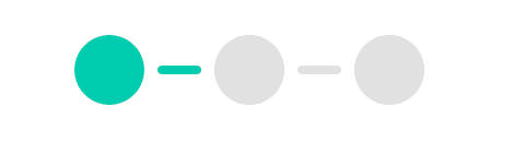
Nice job! But, there is also a line at the end of the last circle that we don't need. So, let's remove it real quick with the following change:
const Circle = styled.div`
  --primaryColor: #00ccb0;
  --secondaryColor: #e1e1e1;
  --scale: 2;
  --size: calc(16px * var(--scale));

  --linkWidth: calc(10px * var(--scale));
  --linkHeight: calc(2px * var(--scale));

  border-radius: 50%;
  position: relative;
  width: var(--size);
  height: var(--size);
  box-sizing: border-box;
  background-color: ${(props) =>
    props.active ? "var(--primaryColor)" : "var(--secondaryColor)"};
  margin-right: var(--size);

  /* Make a pill shaped element that will act as link between two circles. */
  &::after {
    content: "";
    position: absolute;
    width: var(--linkWidth);
    height: var(--linkHeight);
    left: calc(var(--size) + ((var(--size) - var(--linkWidth)) / 2));
    top: calc((var(--size) - var(--linkHeight)) / 2);
    background-color: ${(props) =>
      props.active ? "var(--primaryColor)" : "var(--secondaryColor)"};
    border-radius: 100px;
  }

  /* We don't want to show the link after the last element. */

  &:last-child {
    &::after {
      display: none;
    }
  }
`;
Now, that looks better:
The last missing piece in this UI is the checkmark icon which renders when the step is active.
We use
We use
::before pseudo-element to create it as shown below:const Circle = styled.div`
--primaryColor: #00ccb0;
--secondaryColor: #e1e1e1;
--scale: 2;
--size: calc(16px * var(--scale));
--linkWidth: calc(10px * var(--scale));
--linkHeight: calc(2px * var(--scale));
--checkmarkWidth: calc(9px * var(--scale));
--checkmarkHeight: calc(7px * var(--scale));
border-radius: 50%;
position: relative;
width: var(--size);
height: var(--size);
box-sizing: border-box;
background-color: ${(props) =>
props.active ? "var(--primaryColor)" : "var(--secondaryColor)"};
margin-right: var(--size);
/* Center svg (checkmark in this case). */
&::before {
content: "";
display: ${(props) => (props.active ? "block" : "none")};
position: absolute;
top: calc((var(--size) - var(--checkmarkHeight)) / 2);
left: calc((var(--size) - var(--checkmarkWidth)) / 2);
width: var(--checkmarkWidth);
height: var(--checkmarkHeight);
background-image: url(${checkmarkImage});
}
/* Make a pill shaped element that will act as link between two circles. */
&::after {
content: "";
position: absolute;
width: var(--linkWidth);
height: var(--linkHeight);
left: calc(var(--size) + ((var(--size) - var(--linkWidth)) / 2));
top: calc((var(--size) - var(--linkHeight)) / 2);
background-color: ${(props) =>
props.active ? "var(--primaryColor)" : "var(--secondaryColor)"};
border-radius: 100px;
}
/* We don't want to show the link after the last element. */
&:last-child {
&::after {
display: none;
}
}
`;Voila! Nice and clean:

We can build many UI elements using this approach. And,
that way, we eliminate the need for extra HTML elements such as
that way, we eliminate the need for extra HTML elements such as
<div>.I hope you find this article interesting and had fun reading it because I for sure had fun writing it.
If you find it helpful, please give it a like and share it with someone who might benefit from it.
If you find it helpful, please give it a like and share it with someone who might benefit from it.
73