
26
Building a Line Chart in React with VisX
To build this chart, I will work with IEA data on R&D energy technology spend by country. The data are very comprehensive and go back to 1974. I've preprocessed the data and filtered out those for Denmark for Total and Renewable energy spend to compare both.
This is the resulted data structure:
export const data =
[{"country":"DENMARK","currency":"RDDUSD","type":"RENEWABLE","year":1975,"amount":0.804},
{"country":"DENMARK","currency":"RDDUSD","type":"RENEWABLE","year":1976,"amount":1.350},
{"country":"DENMARK","currency":"RDDUSD","type":"RENEWABLE","year":1977,"amount":7.928},
{"country":"DENMARK","currency":"RDDUSD","type":"RENEWABLE","year":1978,"amount":15.357}]
What we're going to build:
npx create-next-app@latest visx-demo
cd visx-demonpm i @chakra-ui/react @emotion/react@^11 @emotion/styled@^11 framer-motion@^4npm install @visx/axis @visx/event @visx/glyph @visx/gradient @visx/grid @visx/group @visx/responsive @visx/scale @visx/shape @visx/tooltipFor our app to work with Chakra UI, we need to modify
pages/_app.js component, to include chakra styling.import { ChakraProvider, CSSReset } from "@chakra-ui/react";
import Head from "next/head";
const GlobalStyle = ({ children }) => {
return (
<>
<Head>
<meta content="width=device-width, initial-scale=1"
name="viewport" />
</Head>
<CSSReset />
{children}
</>
);
};
function MyApp({ Component, pageProps }) {
return (
<ChakraProvider>
<GlobalStyle />
<Component {...pageProps} />
</ChakraProvider>
)
}
export default MyAppLets build a simple header in
components/Header.js:import { Box, Flex, Heading } from "@chakra-ui/react";
const Header = () => {
return (
<Box
pos="fixed"
as="header"
top="0"
bg='#242730'
left="0"
right="0"
borderBottomWidth="1px"
width="full"
height="4rem"
>
<Box width="full" mx="auto" px={6} pr={[1, 6]} height="100%" >
<Flex size="100%" p={[0, 3]} pl={[0, 4]} align="center" justify="space-between">
<Box as="a" d="block" href="/" aria-label="VisX Area Chart">
<Heading color="gray.100" as="h4" size="md">VizX Area Chart</Heading>
</Box>
</Flex>
</Box>
</Box>
);
}
export default Header;Now we can import header in
pages/index.js file and build simple layout with chakra ui components.import Header from "../components/Header"
import { Container, Heading, Box, Text, Link } from '@chakra-ui/react'
import ParentSize from '@visx/responsive/lib/components/ParentSize';
import LineChart from '../components/LineChart';
import { data } from '../data/stats_for_Denmark'
export default function Home() {
return (
<>
<Header />
<Box height='100vh' bg="#242730">
<Container maxW='4xl' height='85vh' mt="4rem" >
<Heading ml='40px' as='i' size='md' color={'gray.100'}>Denmark R&D Spend on Renewable Energy vs Total</Heading>
// Chart will go here
<Link ml='40px' fontSize='sm' color={'gray.100'} href='https://www.iea.org/data-and-statistics/data-product/energy-technology-rd-and-d-budget-database-2' isExternal>
Data by IEA, 2021
</Link></Container>
</Box>
</>
)
}To make the chart responsive, we need to be aware of width and height of a parent container. VisX library makes it really easy with its
<ParentSize /> component, which could be imported from @visx/responsive/lib/components/ParentSize. We will wrap our chart component in <ParentSize /> and will get width and height as props.<ParentSize>
{({ width, height }) =>
<LineChart data={data} width={width} height={height} />}</ParentSize>Now let's build two svg rectangles to understand
<Group /> and visualise margins. VisX <Group /> components is just a container for all children <g /> elements, it allows to simplify the code and pass the margins. In
components/LineChart.js:import { Group } from "@visx/group";
function LineChart({ data, width, height }) {
// define margins from where to start drawing the chart
const margin = { top: 40, right: 40, bottom: 50, left: 40 };
// defining inner measurements
const innerWidth = width - margin.left - margin.right;
const innerHeight = height - margin.top - margin.bottom;
return (
<svg width={width} height={height} >
<rect x={0} y={0} width={width} height={height} fill={'#718096'} rx={14} />
<Group left={margin.left} top={margin.top}>
<rect x={0} y={0} width={innerWidth} height={innerHeight} fill={'#A0AEC0'} />
</Group>
</svg>
)
}
export default LineChartLayout with and margins:

Browser starts drawing
<svg /> elements in a coordinate system from top left corner (0,0), and the margins are defined clockwise with this initial coordinate, i.e. point of origin. Let's start small and build axes. To build axes, we need to define scales first. Under the hood VisX uses d3, so we it's really useful to review d3 scales documentation. D3 will use math to help translate our numbers to pixel locations inside the container.
To get a range for our scales, I use
d3.extent()function, which returns a min and max values from the array. Ticks on axes can be formatted, using any functions, in this example I transform date label into the string, to remove a comma from the default number formatting.
const formatDate = (year) => year.toString()In
components/Chart.js:// Defining selector functions
const getRD = (d) => d.amount;
const getDate = (d) => d.year;
// Defining scales
// horizontal, x scale
const timeScale = scaleLinear({
range: [0, innerWidth],
domain: extent(data, getDate),
nice: true
})
// vertical, y scale
const rdScale = scaleLinear({
range: [innerHeight, 0],
domain: extent(data, getRD),
nice: true,
});Defining Axes inside the
<svg/> container:<AxisLeft
tickTextFill={'#EDF2F7'}
stroke={'#EDF2F7'}
tickStroke={'#EDF2F7'}
scale={rdScale}
tickLabelProps={() => ({
fill: '#EDF2F7',
fontSize: 11,
textAnchor: 'end',
})}
/>
<text x="-125" y="20" transform="rotate(-90)" fontSize={12} fill='#EDF2F7'>
R&D Spend, RDDUSD
</text>
<AxisBottom
scale={timeScale}
stroke={'#EDF2F7'}
tickFormat={formatDate}
tickStroke={'#EDF2F7'}
tickTextFill={'#EDF2F7'}
top={innerHeight}
tickLabelProps={() => ({
fill: '#EDF2F7',
fontSize: 11,
textAnchor: 'middle',
})}
/>I also want to add
<GridRows /> and GridColumns /> for our chart, they will use the same scales as the axes.<GridRows
scale={rdScale}
width={innerWidth}
height={innerHeight - margin.top}
stroke='#EDF2F7'
strokeOpacity={0.2}
/>
<GridColumns
scale={timeScale}
width={innerWidth}
height={innerHeight}
stroke='#EDF2F7'
strokeOpacity={0.2}
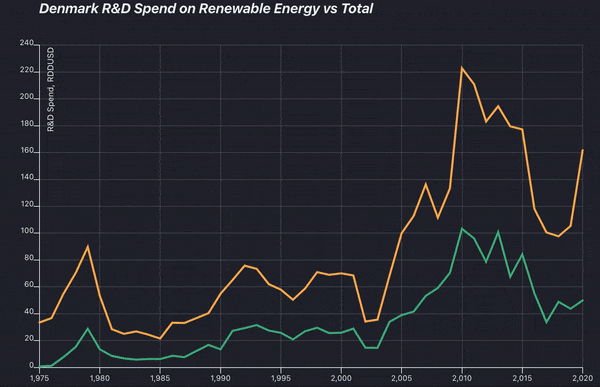
/>This is how the result looks like. I usually remove inner and outer rectangles only in the end, and allow them to guide placing the elements during the work on the chart.

For line charts, we are going to use
<LinePath /> component. I want to build two lines to compare Denmark Total R&D investments versus investment in renewable energy. For that, I will filter the data from the original array and will define a series, which will contain both outputs to build lines. Color scheme for lines I took from this awesome MetBrewer R color palettes package.
//colours for lines
const colors = ['#43b284', '#fab255']

// data for lines
const data1 = data.filter(function (el) {
    return el.type === "RENEWABLE"
});

const data2 = data.filter(function (el) {
    return el.type === "TOTAL"
});

const series = [data1, data2]
Mapping over the data to place
<LinePath /> inside the<svg /> container:{series.map((sData, i) => (
<LinePath
key={i}
stroke={colors[i]}
strokeWidth={3}
data={sData}
x={(d) => timeScale(getDate(d)) ?? 0}
y={(d) => rdScale(getRD(d)) ?? 0}
/>
))}Now we can see lines for each of the data series:

For this chart I wanted to add crosshairs, which are just thin line that centers on a datapoint, and a tooltip with a year and R&D Spend value.
To add a tooltip, a whole component must be wrapped in a
docs
<div position = 'relative'>
/// Your whole component ///
</div>
VisX has a handy hook, which does a tons of work for us.
// tooltip parameters
const {
    tooltipData,
    tooltipLeft = 0,
    tooltipTop = 0,
    showTooltip,
    hideTooltip
} = useTooltip();
However, positioning the tooltip is a but tricky. In a nutshell, we need to get a X and Y coordinates from the mouse hover, and translate them into the data values.
For that, most examples I've seen use d3.bisect() to find the position of the value in the dataset. As I have two lines, for which I need the d values, I've also filtered the array by the date value I got from the bisect function.
// function get data from a year
 const getD = (year) => {
     const output = data.filter(function (el) {
         return el.year === year
     })
     return output
    }
Now, lets define a function, that would handle the tooltip:
const handleTooltip = useCallback((event) => {
const { x } = localPoint(event) || { x: 0 };
const x0 = timeScale.invert(x - margin.left); // get Date from the scale
const index = bisectDate(data, x0, 1); // get index of this date from the array
const d0 = data[index - 1];
const d1 = data[index];
let d = d0;
// is previous data point available?
if (d1 && getDate(d1)) {
d = x0.valueOf() - getDate(d0).valueOf() >
getDate(d1).valueOf() - x0.valueOf() ? d1 : d0;
}
showTooltip({
tooltipData: getD(d.year),
tooltipLeft: x,
tooltipTop: rdScale(getRD(d))
})
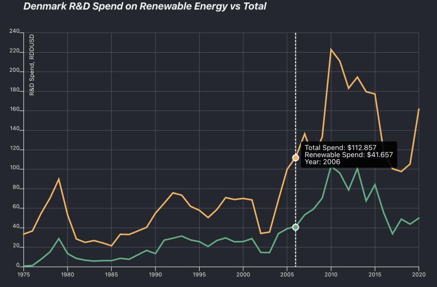
})This is how Tooltip data looks like in my case for two lines:
[
    {
        "country": "DENMARK",
        "currency": "RDDUSD",
        "type": "RENEWABLE",
        "year": 2006,
        "amount": 41.657
    },
    {
        "country": "DENMARK",
        "currency": "RDDUSD",
        "type": "TOTAL",
        "year": 2006,
        "amount": 112.857
    }
]
Now let's define the tooltip, we need to place it outside of the
{/* render a tooltip */}
{tooltipData ? (
     <TooltipWithBounds
         key={Math.random()}
         top={tooltipTop}
         left={tooltipLeft}
         style={tooltipStyles}
      >
      <p>{`Total Spend: $${getRD(tooltipData[1])}`}</p>
      <p>{`Renewable Spend: $${getRD(tooltipData[0])}`}</p>
      <p>{`Year: ${getDate(tooltipData[1])}`}</p>
      </TooltipWithBounds>
      )
: null}
Defining a crosshair, as a simple , all
<g/> elements must go inside the<svg />:{tooltipData && (
<g>
<Line
from={{ x: tooltipLeft - margin.left, y: 0 }}
to={{ x: tooltipLeft - margin.left, y:innerHeight
}}
stroke={'#EDF2F7'}
strokeWidth={2}
pointerEvents="none"
strokeDasharray="4,2"
/>
</g>
)}Defining dots to show on hover using
@visx/glyph:{tooltipData && tooltipData.map((d, i) => (
<g>
<GlyphCircle
left={tooltipLeft - margin.left}
top={rdScale(d.amount) + 2}
size={110}
fill={colors[i]}
stroke={'white'}
strokeWidth={2} />
</g>
))}Now we need to call our handleTooltip function to pass positioning values to the tooltip, crosshair and glyphs.
I wanted to show crosshair if a user will hover at any point inside the chart, for that I changed the fill of the first to transparent and call
handleTooltip on any user interaction:<rect
x={0}
y={0}
width={innerWidth}
height={innerHeight}
fill={'transparent'}
onTouchStart={handleTooltip}
onTouchMove={handleTooltip}
onMouseMove={handleTooltip}
onMouseLeave={() => hideTooltip()}
/>I've also placed this
<rect /> after all my elements, because they are stacked one onto the other, and making this the top element will enable interactivity for all of chart. This how the final result looks like:
To be completely honest, even thought I've worked with d3.js before, building the chart with VisX was a bit tedious and hard at the time. But as I was playing with the code, I've learned to love its concise API and the power and flexibility it gives to the developer.
If you want to try it too, here is a link to GitHub: https://github.com/MariaZentsova/visx-linechart
Examples, I've used for study and inspiration:
How to Make Beautiful Graphs With vx and React-Motion by Dylan Mozlowski
VisX Area Chart
VisX lines with glyphs
VisX Area Difference Chart
How to Make Beautiful Graphs With vx and React-Motion by Dylan Mozlowski
VisX Area Chart
VisX lines with glyphs
VisX Area Difference Chart
26