23
Having Fun with the Lightning Design System for React

I remember the first time I leveraged a component in an application I was building. It was the 1990s and I was creating Windows-based applications for a large insurance company. The experience of working with a customer to provide something of value sparked a thrill inside me that confirmed I had made the right career choice.
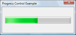
Without much effort, I introduced a progress bar to provide a pleasant user experience while a long-running task processed data. Below, is an example of the progress bar control from that same time period:

While the progress bar may not seem impressive now, this change was a huge improvement compared to the text-based progress approach I had used in an earlier release. I found that simply showing
*** 50% complete *** on the screen wasn’t all that exciting.Despite the fact that a large portion of the application development process has changed since that time, I still find myself leveraging components and frameworks to provide a better user experience in my applications. In fact, starting in 2021, I have been trying to live by the following mission statement:
“Focus your time on delivering features/functionality which extends the value of your intellectual property. Leverage frameworks, products, and services for everything else.”
J. Vester
In this article, I’ll demonstrate how the Lightning Design System (LDS) allows developers to employ a collection of production-ready components that have been provided at no cost by Salesforce Engineering.
From a UI/UX perspective, LDS provides the following features:
By making use of these components, feature teams developing applications in React can stay focused on meeting the business needs requested by their product owners.
The Lightning Design Framework for React (LDS for React) allows developers using the React framework to include into their applications the same components that have been made popular in Salesforce. These components are designed for a quick turnaround time to prototype new ideas. Because they are heavily tested and validated by the Salesforce platform, the components are production-ready.
In fact, LDS for React takes the strengths of LDS (noted above) and wraps everything conveniently into a React layer to provide ready-to-use dynamic components. Salesforce takes the boilerplate code away so that you don't have to implement LDS blueprints manually and takes care of testing for you.
Reading about the Lightning Design Framework excited me, and I wanted to see just how easy it is to use these components outside of Salesforce. Keep in mind, I am primarily a service-layer developer. So, my skills in JavaScript client frameworks are not considered “expert level” by any stretch of the imagination.
Using my MacBook Pro, I started the process of creating a new React application called
having-fun-with-the-lightning-design-system by executing v2 of the Create React App CLI using the following command:npx create-react-app having-fun-with-the-lightning-design-systemThe context of my example is a music service where users can use credits to purchase albums by their favorite artists. I selected a few albums by the Canadian band, Rush, for my sample data.
Next, I navigated to the following URL, which explains how to update the webpack config in order to install the Lightning Design Framework into the application:
These instructions, also included in the README.md of my personal GitLab repository for this article, include the following steps:
react-app-rewired dependency in to the React applicationdesign-system and design-system-react Salesforce dependencies into the React application../public folder of the React application.index.html of the React application to include the salesforce-lightning-design-system.min.css stylesheet file.index.js of the React application to wrap the <App /> element inside an <Icon Settings> element.After completing these steps, I executed the
npm ci command to make sure all the necessary dependencies were installed and ready.With the React core application in place, I wanted to work with the following Lightning Design Framework components:
To keep things simple, I decided to include the data for this application as a static array in JavaScript. I also planned to use a
setTimeout() timer to make the spinner act as if something is being loaded from a remote service. For simplicity, I made all my code changes in the App.js file already created by the Create React App CLI.An alert provides the ability to present information to the end user at the top of the application. I was able to create an alert using the following code in the
render() function:{this.state.showAlert &&
<div>
<AlertContainer>
<Alert
icon={<Icon category="utility" name="user"></Alert>}
labels={{
heading: 'This is an Informational Alert',
headingLink: 'Close this Alert',
}}
onClickHeadingLink={() => this.closeAlert()}
/>
</AlertContainer>
</div>
}
The rendering code relied on the value of the showAlert boolean property, which was initialized to be true when the application started:
state = {
  showAlert: true,
  ...
Clicking the “Close this Alert” link fires the
closeAlert() function in the JavaScript portion of the App.js file to cause the alert to no longer display:closeAlert() {
this.setState({showAlert: false});
}I added a simple boolean called
showSpinner to the App.js file and included the following timer code to simulate waiting for a service request to finish:state = {
...
showSpinner: true,
...
componentDidMount() {
this.timer = setTimeout(
() => {
this.setState({showSpinner: false});
},
3000,
);
}After three seconds, we set the value of the
showSpinner property to false, which causes the spinner to no longer display. Adding the spinner to the application was quite simple:{this.state.showSpinner &&
<div style={{marginTop: 10, position: 'relative', height: '5rem'}}>
<Spinner
size="small"
variant="base"
assistiveText={{label: 'Getting Data, Please Wait ...'}}
></Spinner>
</div>
}
For the remaining components, I employed the rule that they would show only when the
showSpinner boolean was set to false. This would emulate typical functionality where the spinner displays while data is being retrieved. Once retrieved, the spinner disappears and the application content—presented using a badge, data table, and trial bar—becomes available.I added the badge component to provide a summary of the user’s remaining available credits. The few lines of code listed below provide a badge (which includes a money bag icon as well) that communicates to the end user that 2,112.00 credits are available for music purchases:
<div style={{marginTop: 10}}>
  <Badge
    id="badge-base-example-success"
    color="success"
    content="2,112.00 Purchase Credits Available"
    icon={
      <Icon
        category="utility"
        name="moneybag"
        size="xx-small"
        colorVariant="base"
      ></Badge>
    }
   />
</div>
Using a static array of data, I created a nicely-styled data table, which not only displays information about each album, but includes action links to buy, save, and preview a given release by the artist.

The
render() function in the App.js included the data table code shown below:<div style={{marginTop: 25, overflow: 'auto'}}>
<DataTable
items={this.state.items}
id="DataTableExample-music"
striped
>
<DataTableColumn key="album" label="Album Name" property="albumName"></DataTableColumn>
<DataTableColumn key="release-date" label="Release Date" property="releaseDate"></DataTableColumn>
<DataTableColumn key="sales" label="Original Copies Sold" property="sales"></DataTableColumn>
<DataTableColumn key="label" label="Label" property="label"></DataTableColumn>
<DataTableColumn key="credits" label="Credits" property="credits" right="right"></DataTableColumn>
<DataTableRowActions
options={[
{
id: 0,
label: 'Buy this Song',
value: '1',
},
{
id: 1,
label: 'Save for Later',
value: '2',
},
{
id: 2,
label: 'Preview this Song',
value: '3',
}
]}
onAction={this.handleRowAction}
dropdown={<Dropdown length="3"></DataTableRowActions>}
/>
</DataTable>
</div>This code leveraged an items array which followed the design noted below:
[
  {
    id: '0',
    albumName: 'Grace Under Pressure',
    releaseDate: '7/1/1984',
    sales: '1,000,000 (Platinum)',
    label: 'Mercury',
    credits: 13.06
  },
  ...
Upon selecting one of the action items, the current code merely logs the action and item data to the JavaScript console:
handleRowAction = (item, action) => {
  console.log(item, action);
};Finally, I added the trial bar to the
render() function using the following code:<div style={{marginTop: 25}}>
<TrialBar
labels={{timeLeft: '15', timeLeftUnit: 'days'}}
onRenderActions={() => (
<Button variant="success" label="Subscribe Now"></Button>
)}
>
<div style={{marginTop: 15}}>Never miss another deal again, press the <strong>Subscribe Now</strong> button to get started today.
</div>
</TrialBar>
</div>
With the components in place and my IntelliJ IDEA client providing no errors or warnings, I started the React application with the following command:
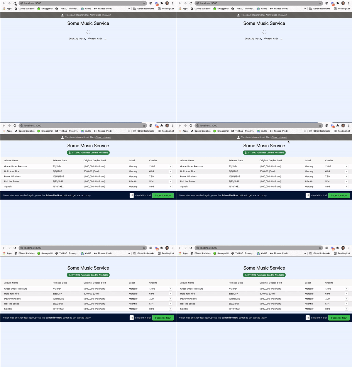
npm startAfter compiling the code, I was able to view the application with my browser pointing to http://localhost:3000. Here’s how it looks:

When the application loads, the alert component displays, along with the spinner. After a few seconds, the spinner is hidden, while the badge, data table, and trial bar components appear.
I was able to dismiss the alert component, which provided a glimpse of the header text for the application. I completed all of this work in less than an hour, which I believe would be much faster for feature developers who are focused on building React applications.
In the introduction to this article, I mentioned the thrill of being able to provide something of value to my customer. Fast forward 30 years, and I still get excited when given the opportunity to use my skills and expertise to help solve business problems. In fact, when I find the opportunity to speak with those who are ready to start (or even change) their career, I always provide instructions which place “finding your passion” at the center of the criteria. If you find passion in what you are doing, the quality of work and financial goals will certainly follow.
In an earlier series, I focused on ways in which the Salesforce platform can be utilized via a Spring Boot service and client applications written in Svelte, Vue.js, React Native, and Angular. Each article in that series offered a different experience to interact with the Salesforce ecosystem.
In this article, I took a different approach to employ the use of rich components provided by Salesforce for use in a React application that might have no connection to the Salesforce service. I was quickly able to include components that provide an amazing user experience. This also helped me remain aligned with my 2021 mission statement to leverage a quality collection of components in order to stay focused on meeting business needs.
My next article will take things a step further and introduce a custom component based upon the Lightning Design Framework for React. Once ready, I will show how easily this component can be added into a React application.
If you are interested in the source code for this article, simply navigate to the following repository on GitLab:
Have a really great day!
23
