
42
Claymorphism on 2022🎁 (CSS only)
Hey There, Hope this new year✨ give you a fabulous moments. There are some trends for every year like Skeuomorphism ➡️ Neumorphism ➡️Glassmorphism ➡️Now, The brand new trend is Claymorphism🎉.
Due to accessibility issues, Some trends can't be hero of the year in real-time😥. Uh, Don't worry guys Claymorphism didn't make any accessibility issues.
Why Claymorphism🤔
Really getting bored with flat designs and world excited for changing UI to 3D. From 2022, we introduce that 3D feel in web world. Sounds amazing right✨ and we can introduce this Claymorphism from pages to atom components. I care to save developer time and let's get this show on the road🎉.
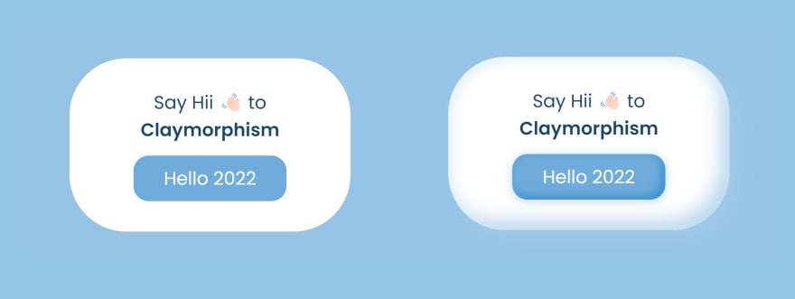
Claymorphism made by 4 styles
In-depth on box-shadow
box-shadow is the main guy for that magical shadow effect. So, we need aware of that.Specify a single
box-shadow using:To specify multiple shadows, provide a comma-separated list of shadows.
inset keyword.Note: Claymorphism is made up of inner shadow and outer shadow
How do we create inner shadows
It’s actually effortless😍. We need to add special value
inset before our shadow. This will inform our browser that this particular shadow is an inner shadow. By default, we create outer shadows. Below code snippet, illustrate the claymorphism made by one outer shadow and at least two inner shadows.box-shadow: 24px 24px 48px rgba(174, 210, 236, 0.4),
inset 12px 12px 24px #e7f2f9, inset -24px -24px 48px #b8d8ee;Now I thought, you are be like😉

Hey still with me. You really curious about trends like trend lovers💖. So, it's my pleasure to give you the live experience and you will playing with that magical shadows🪄.
Hey still with me. You really curious about trends like trend lovers💖. So, it's my pleasure to give you the live experience and you will playing with that magical shadows🪄.
Or you just fork my repository🎁 and practice in your own pace.
If you loved this blog, Then give an endearing heart💝and drop your thought about this blog😍 which really a lot to me. I love the discussion with you, If you feel not comfortable at styling concepts or have any doubts.
Thanks for Reading!!
Preethi
- Make your CSS life easier
Preethi
- Make your CSS life easier
42