65
Data Display with Doughnut and Pie Graph -- React
Today, we will explore displaying data using a doughnut chart and pie chart through the react npm package chartjs-2 which is very easy to use and extremely useful when it comes to the visual representation of your data. Further information about the react-chartjs-2 package can be found here
So, let's begin by creating a new React app using the following command:
npx create-react-app react_charts_appAfter the app is created, we have to install the chartjs dependency by typing in the following command in the terminal of our app:
npm i react-chartjs-2 chart.jsNow, we will create a 'components' folder in the src directory of our app and create two files there:
- Doughnut.js
- PieChart.js
These are the two files where we will write all the code to display the data in the form of graphs.
Let's start with Doughnut.js and create an empty functional component, also don't forget to import the Doughnut component from react-chartjs-2 on the very top of your file:
import {Doughnut} from 'react-chartjs-2';

function DoughnutChart() {
    return (
        <div>
           <h1>Creating a Doughnut Chart</h1>
        </div>
    )
}

export default DoughnutChart
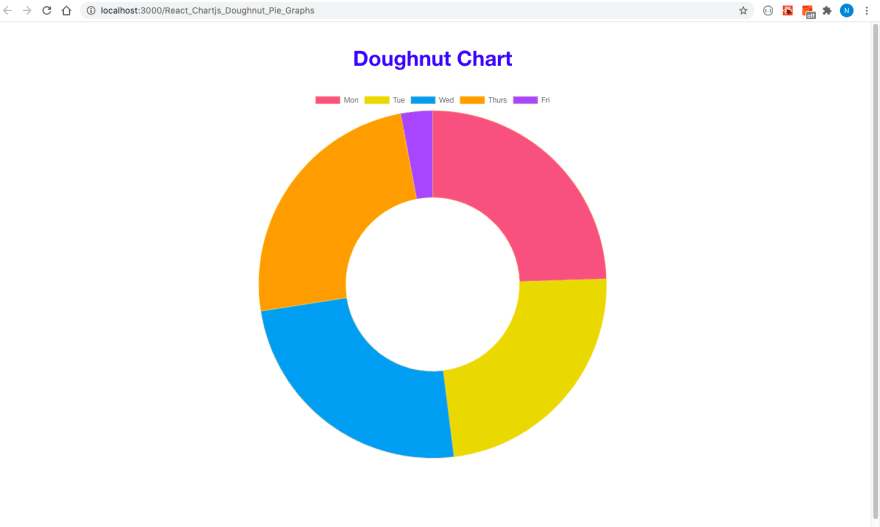
Now, we will add some data to form the doughnut and for this we need to define a data object containing the labels for our graph and also define values, border and background colors to form the slices of the doughnut as follows:
const data = {
    labels: ['Mon','Tue','Wed','Thurs','Fri'],
    datasets: [
        {
            label: 'Attendance for Week 1',
            data: [25,24,25,25,3],
            borderColor: ['rgba(255,206,86,0.2)'],
            backgroundColor: ['rgba(232,99,132,1)',
            'rgba(232,211,6,1)',
            'rgba(54,162,235,1)',
            'rgba(255,159,64,1)',
            'rgba(153,102,255,1)' ],
            pointBackgroundColor: 'rgba(255,206,86,0.2)',
        }

    ]
}
We can add further options to our graph in the following manner:
const options = {
    plugins: {
        title: {
            display: true,
            text: 'Doughnut Chart',
            color:'blue',
            font: {
                size:34
            },
            padding:{
                top:30,
                bottom:30
            },
            responsive:true,
            animation:{
                animateScale: true,
                           }
        }
    }

}
These options are explained below:
- title: corresponds to heading of your graph,
- color: corresponds to the font color of title text,
- font size: corresponds to the size of the title,
- padding on the top/bottom of the title,
- responsive:true which will make our graph appear nice on different devices,
- animateScale:true -- gives a cool animation effect when the graph loads
Now we will call the Doughnut component in the return statement and pass both the data and options props to see the chartjs magic:
return (
      <div>
          <Doughnut data={data} options={options} />
      </div>
    )
Also, we would need to call the Doughnut component in App.js file:
import './App.css';
import DoughnutChart from './components/Doughnut'

function App() {
  return (
    <div className="App">
      <div className="container">
    <DoughnutChart />
      </div>

    </div>
  );
}

export default App;
You can now run the command npm start to see the output of your graph:

Creating a pie chart works similar to the doughnut, only that you will have to replace the Doughnut name with Pie.

Complete code for this app can be found here
That's all for today..
Happy coding
65
