27
Styling Remix using Vanilla CSS
TL;DR: Source and Demo
Link to the source code
Here's a live demo
In my last blog post, I discussed how to perform a CRUD operation in a Remix app.
In this blog post, I will discuss how to style a Remix app using only plain CSS.
According to the official documentation
In general, stylesheets added to the page with
<link>tend to provide the best user experience:
- The URL is cacheable in browsers and CDNs
- The URL can be shared across pages in the app
- The stylesheet can be loaded in parallel with the JavaScript bundles
- Remix can prefetch CSS assets when the user is about to visit a page with
<Link rel="prefetch">.- Changes to components don't break the cache for the styles
- Changes to the styles don't break the cache for the JavaScript
# Remove all files under `app/styles`
rm -r app/styles/*Some CSS defaults I copied from the official documentation with some adjustments.
/* app/styles/global.css */
:root {
  --color-foreground: hsl(0, 0%, 0%);
  --color-background: hsl(0, 0%, 100%);
  --color-primary: hsl(230, 100%, 50%);
  --color-primary-light: hsl(230, 100%, 60%);
  --color-primary-dark: hsl(230, 100%, 40%);
  --color-gray-dark: hsl(0, 0%, 60%);
  --color-gray-light: hsl(0, 0%, 90%);
  --font-body: -apple-system, "Segoe UI", Helvetica Neue, Helvetica, Roboto,
    Arial, sans-serif, system-ui, "Apple Color Emoji", "Segoe UI Emoji";
}

html {
  box-sizing: border-box;
}

*,
*::before,
*::after {
  box-sizing: inherit;
}

html,
body {
  padding: 0;
  margin: 0;
  background-color: var(--color-background);
  color: var(--color-foreground);
}

body {
  font-family: var(--font-body);
  line-height: 1.5;
}

a {
  color: var(--color-primary-light);
  text-decoration: none;
}

a:hover {
  color: var(--color-primary-dark);
  text-decoration: underline;
}
We'll modify app/root.tsx to import the global stylesheet; then, export the style in a links function.
// app/root.tsx
import type { LinksFunction } from "remix";
import styles from "~/styles/global.css";

export const links: LinksFunction = () => {
  return [
    {
      rel: "stylesheet",
      href: styles,
    },
  ];
};

// ...
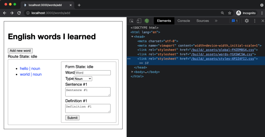
After Adding the links function, nothing changes in the app. If we check the elements inspector, there is no link tag inside the <head> tag.

Since Remix will only do what we tell it to do, we need to inform it to render the links we exported in our pages using the Links compnent.
// app/root.tsx
import {/*other imports*/, Links} from "remix";

// The function containing the HTML declaration
function Document({/*props*/}) {
  return (
    <html lang="en">
      <head>
        {/* This is the magic piece */}
        <Links />
        {/*...*/}
      </head>
      {/*body content*/}
    </html>
  );
}
The changes above will yield to:

TRIVIA: We can technically put
<Links/ >anywhere inside thehtmltag; however, here's a reason why you should not do it.
For now, we're not aiming to get the best design award; we'll just apply some styles for the sake of making it look different.
/* app/styles/words.css */
.words__page {
  margin: 1rem;
  padding: 1rem;
  border: 1px solid black;
}

.words__content {
  padding: 0.5rem;
  border: 1px solid var(--color-gray-dark);
  display: grid;
  grid-template-columns: 1fr 1fr;
  border-radius: 3px;
}// app/routes/words.tsx
// ...
export default function Index() {
// ...
return (
<div className="words__page">
{/*...*/}
<div className="words-content">
{/*...*/}
<Outlet />
</div>
</div>
);
}// app/routes/words.tsx
// ...
import type { LinksFunction } from "remix";
import styles from "~/styles/words.css";
export const links: LinksFunction = () => {
return [
{
rel: "stylesheet",
href: styles,
},
];
};
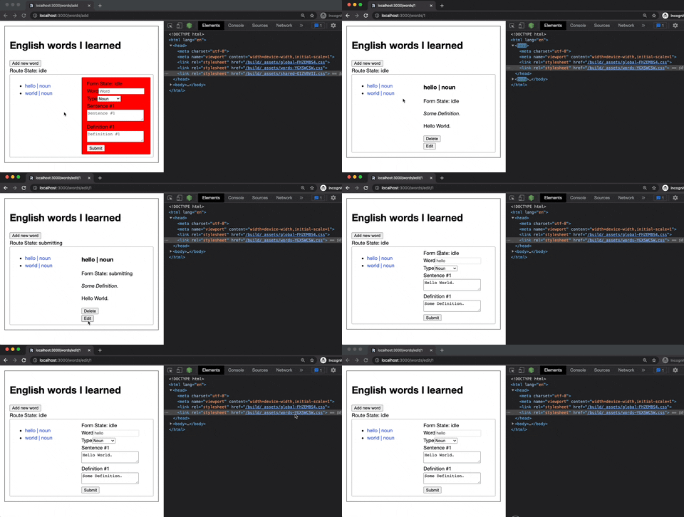
// ...The changes above will yield to:

Apologies if GIFs might not be that clear.
NOTE: every child route of
/wordswill inherit the styles exported inapp/routes/words.tsx
Since both our /add and /edit/$id routes use a form, let's create a shared css file.
I'm too lazy to think of a great design. Let's simply add a border.
// app/styles/words/shared.css
form {
  border: 1px solid var(--color-gray-dark);
  padding: 0.5rem 1rem;
  border-radius: 3px;
}
Now, let's expose the style by exporting it in our links function.
// app/routes/words/add.tsx
// ...
import sharedStyles from "~/styles/words/shared.css";

export const links: LinksFunction = () => [
  {
    rel: "stylesheet",
    href: sharedStyles,
  },
];

// ...After clicking the Add new word button, the word form will be styled as expected.
However, since the Add new word is inside a form as well, that form will also have a border.
A straightforward way to fix this is to improve the specificity of the word form by adding a class name.
/* app/styles/words/shared.css */
form.word-form {
  border: 1px solid var(--color-gray-dark);
  padding: 0.5rem 1rem;
  border-radius: 3px;
}
// fileName=app/components/WordForm.tsx
// ...
export function WordForm({ word }: { word?: Word }) {
// ...
return (
<Form method="post" className="word-form">
{/*...*/}
</Form>
);
}I'm adding a temporary background color to demonstrate how sibling routes styling behave.
/* app/styles/words/shared.css */
form.word-form {
  border: 1px solid var(--color-gray-dark);
  padding: 0.5rem 1rem;
  border-radius: 3px;

  /* Temporary style */
  background-color: red;
}
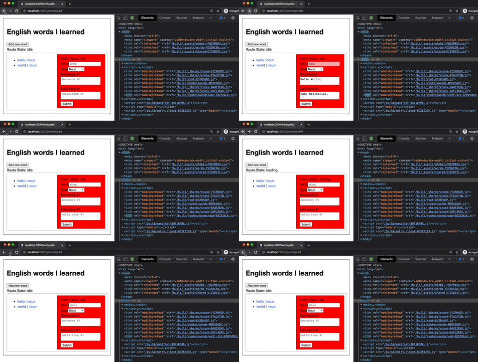
After navigating from /add to /edit/$id, the word form styling is removed in the head; The reason why styles were not applied to the /edit/$id form.
The reason is simple; sibling routes do not share styles with other sibling routes.
To fix the issue, we need to apply similar change to app/routes/words/edit.$id.tsx
/* fileName=app/routes/words/edit.$id */
// ...
import sharedStyles from "~/styles/words/shared.css";

export const links: LinksFunction = () => [
  {
    rel: "stylesheet",
    href: sharedStyles,
  },
];

// ...Revert changes in
app/styles/words/shared.css,app/routes/words/add.tsx, and ,app/routes/words/edit.$id.tsx
We were able to share styles between sibling routes. However, this is not the right approach for this app.
The change we made was specific to a form and not a page, so we'll make the changes in the word form component.
/* app/components/word-form/styles */
.word-form label {
  font-size: 0.8em;
}

.word-form {
  display: flex;
  flex-direction: column;
  gap: 0.5rem;
  padding: 1rem;
  border: 1px solid var(--color-gray-dark);
  border-radius: 0.5rem;
}// app/components/word-form/index.tsx
import type { LinksFunction } from "remix";
import styles from "./styles.css";
export const links: LinksFunction = () => [
{
rel: "stylesheet",
href: styles,
},
];
export function WordForm({ word }: { word?: Word }) {
// ...
return (
<Form method="post" className="word-form">
{/*...*/}
</Form>
);Uh oh! The styles are not applied to the word form component. Now, we only have 2 link tag in the head

It seems the magical behavior of export const links only applied to routes
To fix the issue, we need to propagate the styles to a route
// app/routes/words/add.tsx
import type { LinksFunction } from "remix";
import { WordForm, links as formStyles } from "~/components/word-form";

export const links: LinksFunction = () => [...formStyles()];

// ...
Apply the same thing in
app/routes/words/edit.$id.tsx
The changes above will yield to:

Q: So how do we style a custom basic HTML element using CSS?
A: The same as for
word form. Although, we need to propagate more until the reference reaches aroute.
// app/components/basic/button/index.tsx
import React from "react";
import styles from "./styles.css";
import type { LinksFunction } from "remix";

export const links: LinksFunction = () => [
  {
    rel: "stylesheet",
    href: styles,
  },
];

type CustomButtonProps = {
  color?: "primary" | "success" | "danger" | "warning" | "info";
};

export const Button = React.forwardRef<
  HTMLButtonElement,
  JSX.IntrinsicElements["button"] & CustomButtonProps
>(({ color, ...props }, ref) => (
  <button {...props} ref={ref} custom-button={color ? color : ""} />
));
/* app/components/basic/button/styles.css */
button[custom-button] {
display: block;
height: 2rem;
color: #000000;
}
button[custom-button="primary"] {
background-color: var(--color-primary);
color: #ffffff;
}There is nothing fancy for other elements, so you can view the sources here for input, select, and textarea.
// app/components/word-form/index.tsx
// ...
import { Input, links as inputLinks } from "../basic/input/Input";
import { Select, links as selectLinks } from "../basic/select/Select";
import { TextArea, links as textAreaLinks } from "../basic/textarea/Textarea";
import { Button, links as buttonLinks } from "../basic/button/Button";
import styles from "./styles.css";

export const links: LinksFunction = () => [
  ...inputLinks(),
  ...selectLinks(),
  ...textAreaLinks(),
  ...buttonLinks(),
  {
    rel: "stylesheet",
    href: styles,
  },
];

// ...After replacing the default html elements with our custom ones, our word form will look like this:
// app/components/word-form/index.tsx
import type { LinksFunction } from "remix";
import { useTransition, Form } from "remix";
import { Word, WordType } from "~/models/word";
import { Input, links as inputLinks } from "../basic/input/Input";
import { Select, links as selectLinks } from "../basic/select/Select";
import { TextArea, links as textAreaLinks } from "../basic/textarea/Textarea";
import { Button, links as buttonLinks } from "../basic/button/Button";
import styles from "./styles.css";

export const links: LinksFunction = () => [
  ...inputLinks(),
  ...selectLinks(),
  ...textAreaLinks(),
  ...buttonLinks(),
  {
    rel: "stylesheet",
    href: styles,
  },
];

export function WordForm({ word }: { word?: Word }) {
  let transition = useTransition();

  return (
    <Form method="post" className="word-form">
      <div>Form State: {transition.state}</div>
      <div>
        <label htmlFor="name">Word</label>
        <Input
          id="name"
          name="name"
          type="text"
          placeholder="Word"
          required
          defaultValue={word?.name ?? ""}
          disabled={Boolean(word?.name)}
        />
      </div>
      <div>
        <label htmlFor="type">Type</label>
        <Select
          id="type"
          name="type"
          defaultValue={word?.type ?? WordType.NOUN}
        >
          <option value={WordType.NOUN}>Noun</option>
          <option value={WordType.VERB}>Verb</option>
          <option value={WordType.ADJECTIVE}>Adjective</option>
        </Select>
      </div>
      <div>
        {word?.sentences.map((sentence, i) => (
          <SentenceField index={i + 1} sentence={sentence} key={i} />
        )) ?? <SentenceField index={1} sentence={""} />}
      </div>
      <div>
        {word?.definitions.map((definition, i) => (
          <DefinitionField index={i + 1} definition={definition} key={i} />
        )) ?? <DefinitionField index={1} definition={""} />}
      </div>
      <Button type="submit" color="primary">
        Submit
      </Button>
    </Form>
  );
}

const SentenceField = ({ index, sentence }: any) => (
  <div>
    <label htmlFor={`sentence.${index}`}>Sentence #{index}</label>
    <TextArea
      id={`sentence.${index}`}
      name="sentence"
      defaultValue={sentence}
      placeholder={`Sentence #${index}`}
      minLength={10}
    />
  </div>
);

const DefinitionField = ({ index, definition }: any) => (
  <div>
    <label htmlFor={`definition.${index}`}>Definition #{index}</label>
    <TextArea
      id={`definition.${index}`}
      name="definition"
      defaultValue={definition}
      placeholder={`Definition #${index}`}
      minLength={10}
    />
  </div>
);
The changes above will yield to:

There are many ways to implement dark mode.
This example will use prefers-color-scheme to update the CSS variables when a media query is satisfied.
/* app/styles/dark */
:root {
  --color-foreground: hsl(0, 0%, 100%);
  --color-background: hsl(0, 0%, 7%);
  --color-primary-dark: hsl(230, 100%, 65%);
  --color-primary-light: hsl(230, 100%, 80%);
}// app/root.tsx
// ...
import styles from "~/styles/global.css";
import darkStyles from "~/styles/dark.css";
export const links: LinksFunction = () => {
return [
{
rel: "stylesheet",
href: styles,
},
{
rel: "stylesheet",
href: darkStyles,
media: "(prefers-color-scheme: dark)",
},
];
};The changes above will yield to:

We'll use the same approach in the dark mode example to change the layout depending on the result of a media query.
/* app/styles/words-sm */
.words__content {
  grid-template-columns: 1fr;
  border: none;
}

.words__content form {
  margin-top: 1rem;
}// app/routes/words.tsx
import type { LinksFunction } from "remix";
import styles from "~/styles/words.css";
import smStyles from "~/styles/words-sm.css";
export const links: LinksFunction = () => [
{
rel: "stylesheet",
href: styles,
},
{
rel: "stylesheet",
href: smStyles,
media: "(max-width: 600px)",
},
];
// ...The changes above will yield to:

Styling Remix using Vanilla CSS is a fun exercise for me.
I was able to review concepts that I almost forgot due to the convenience of using third-party libraries.
I have fine-grain control over the styling of my routes and components, and I know that I only ship styles that will be used.
Less code to transmit to the Network means faster load times.
However, I'm not a fan of working in vanilla CSS, which is why in this project's next iteration, I will be integrating either Tailwind or Emotion.
- Styling using
TailwindorEmotion - Error handling
- Authentication
- Pagination
- Deeply nested routes
- SEO
27


