37
Creating a dashboard for Postgres db with React and Recharts
Dashboards offer us visibility into the data and provides us with a holistic view of everything that's happening with that product or field of interest.
In this tutorial, we'll build a dashboard on top of postgresSQL database. This is a simple dashboard showing a view of projects and users stored in the database. We'll use
React for frontend, semantic-ui for UI library, Canonic for creating APIs, and to add some graphics we'll use recharts library.We're looking to create something like this:
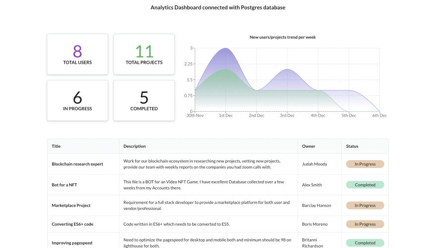
Since this is a guide on building dashboard on postgres database, make sure you have one ready.
Step 1: Kicking things off with CRA
We start by creating a new project with
create-react-appnpx create-react-app postgres-dashboardThis will create a basic react project for us. Let's also install
semantic-ui-react for our styling and basic UI components.yarn add semantic-ui-react semantic-ui-cssStep 2: Creating our Dashboard Components
We'll divide our dashboard into two parts:
DashboardGrid
DashboardTable
Create both the components inside a
components folder in src directory. In each folder, we'll create three files - one for the react code, one for the css, and one for exporting the component.Let's start by creating
DashboardGrid component. Dashboard Grid
We create 4 boxes and add styles - and dummy data for now.
src/components/DashboardGrid/DashboardGrid.jsimport React from "react";
import { Card, Statistic } from "semantic-ui-react";
import "./DashboardGrid.css";
const DASHBOARD_BOXES = [
{
title: "Total Users",
className: "purple",
},
{
title: "Total Projects",
className: "green",
},
{
title: "Projects Created",
},
{
title: "Projects Completed",
},
];
function DashboardGrid() {
return (
<div className="dashboardGrid">
<div className="dashboardGrid-boxes">
{DASHBOARD_BOXES.map((box, i) => (
<Card className="dashboardGrid-boxes-item" centered raised>
<Statistic
className={box.className ? box.className : ""}
as="h4"
label={box.title}
value="89"
/>
</Card>
))}
</div>
<div>
{/** We'll add the chat here later */}
</div>
</div>
);
}
export default DashboardGrid;src/components/DashboardGrid/DashboardGrid.css.dashboardGrid {
display: flex;
justify-content: space-between;
}
.dashboardGrid-boxes {
display: grid;
grid-template-rows: 1fr 1fr;
grid-template-columns: 1fr 1fr;
gap: 20px;
}
.dashboardGrid-boxes-item {
text-align: center;
border: 2px solid #9e9e9e;
border-radius: 4px;
padding: 0 30px;
}
.dashboardGrid-boxes-item .value {
font-size: 32px;
}
.dashboardGrid-boxes-item .label {
margin-top: 6px;
font-weight: 400;
}
.dashboardGrid-boxes-item .purple .value {
color: #8f8cda;
}
.dashboardGrid-boxes-item .green .value {
color: #8fcfa7;
}src/components/DashboardGrid/index.jsexport { default } from "./DashboardGrid";Dashboard Table
Similar to
DashboardGrid component, we create basic table structure and respective styling - DashboardTable.src/components/DashboardTable/DashboardTable.jsimport React from "react";
import { Table } from "semantic-ui-react";
import "./DashboardTable.css";
const TABLE_DATA = [
{
name: "Lorem Ipsum",
description: "Lorem ipsum dolor sit amet, consectetur adipiscing elit, sed do eiusmod tempor incididunt ut labore et dolore magna aliqua.",
owner: "John Doe",
status: "in progress",
},
];
function DashboardTable() {
return (
<div className="dashboardTable">
<Table celled padded>
<Table.Header>
<Table.Row>
<Table.HeaderCell>Name</Table.HeaderCell>
<Table.HeaderCell>Description</Table.HeaderCell>
<Table.HeaderCell>Owner</Table.HeaderCell>
<Table.HeaderCell>Status</Table.HeaderCell>
</Table.Row>
</Table.Header>
<Table.Body>
{TABLE_DATA.map((item, i) => (
<Table.Row>
<Table.Cell>
<div>{item.name}</div>
</Table.Cell>
<Table.Cell>
<div>{item.description}</div>
</Table.Cell>
<Table.Cell>
<div>{item.owner}</div>
</Table.Cell>
<Table.Cell>
<div>{item.status}</div>
</Table.Cell>
</Table.Row>
))}
</Table.Body>
</Table>
</div>
);
}
export default DashboardTable;src/components/DashboardTable/DashboardTable.css.dashboardTable {
margin-top: 60px;
}src/components/DashboardTable/index.jsexport { default } from "./DashboardTable";Step 3: Hooking them up to App.js
Let's add both of our components to
App.js and see how our design looks.src/App.jsimport React from "react";
import { Header } from "semantic-ui-react";
import DashboardGrid from "./components/DashboardGrid";
import DashboardTable from "./components/DashboardTable";
import "./App.css";
function App() {
return (
<div className="App">
<header className="App-header">
<Header as="h3">Analytics Dashboard connected with Postgres</Header>
</header>
<div className="App-main">
<DashboardGrid />
<DashboardTable />
</div>
</div>
);
}
export default App;src/App.css.App-header {
padding: 0 16px;
text-align: center;
}
.App-main {
padding: 0 16px;
max-width: 1160px;
margin: 60px auto 0;
}Let's head to the terminal, and run
yarn start to check how our dashboard looks so far. It should look something like this 👇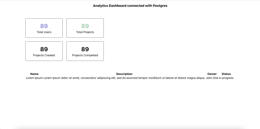
Step 4: Building APIs on top of PostgresSQL
Now that we're done with the basic skeleton of our dashboard, let's move on to building APIs on top of postgresSQL database. Generally, there's two route we can go for this -
Keeping this guide short, let's move ahead with the second option. We head to Canonic to create a new project for our backend.
Create new project → Select "link" → Select Postgres and add Postgres Url - looking something like -
postgres://...... For this guide purposes, you can directly clone this project and get started - if you choose this route — skip the rest of this step and skip Step 6.
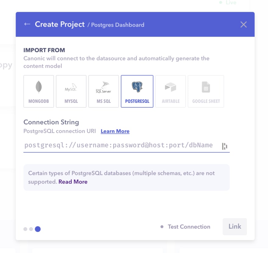
It'll end up creating APIs linked to our database and deploy those APIs on a URL for us. You can also see the structure of our tables in the postgres database.
In our current setup, we have two table -
projects and users. We get CRUD APIs for both the tables. Docs tab should have the documentation.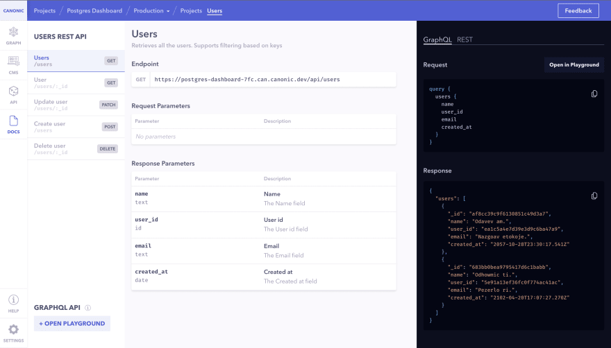
Step 5: Integrating DashboardTable API
Now that we have our APIs, let's integrate it in
DashboardTable component. We're using axios library that you can install by yarn add axios.We modify the
DashboardTable.js file to call our API and get the data....
import axios from "axios";
import { Table, Loader, Dimmer } from "semantic-ui-react";
import "./DashboardTable.css";
// get this URL from your project on Canonic
const GET_PROJECTS_URL =
"https://postgres-dashboard-7fc.can.canonic.dev/api/projects";
function DashboardTable() {
const [loading, setLoading] = React.useState(false);
const [projects, setProjects] = React.useState([]);
React.useEffect(() => {
setLoading(true);
axios(GET_PROJECTS_URL).then(({ data }) => {
setProjects(data.data || []);
setLoading(false);
});
}, []);
return (
<div className="dashboardTable-wrapper">
...
<Table.Body>
{projects.map((item, i) => (
<Table.Row>
...
// change item.owner to below
<Table.Cell width={1}>
<div>{item.users.name}</div>
</Table.Cell>
...
</Table.Row>
))}
</Table.Body>
</Table>
</div>
);
}
export default DashboardTable;Step 6: Creating custom APIs for dashboard stats
Now, as we just have our basic CRUD APIs for now, we'll have to create custom GET API for the metric to get displayed in our boxes and for the graph.
The metrics required are - total users, total projects, number of projects in progress, number of projects completed, and a distribution of new users/projects per day.
Let's head back to our project on Canonic. Go to the API tab, and create a new API in projects table to get all these metrics. Fill in the top level details - title, path.
Then add in the following in the
outputs section.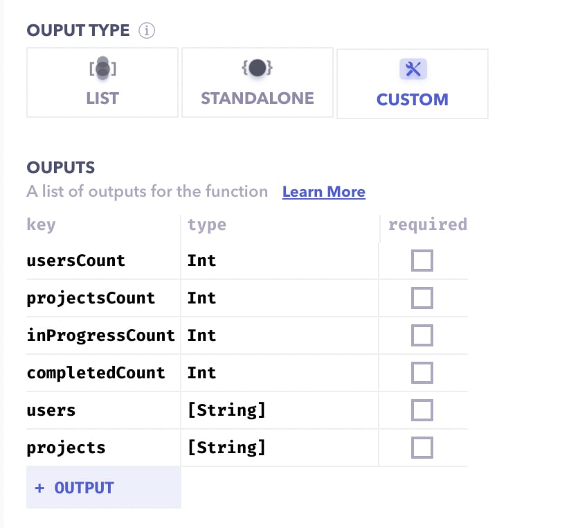
Move to the code section from the top of the properties panel, and add the following code.
module.exports = async function endpoint(params, ctx) {
  const [users, projects] = await Promise.all([User.find({}),Project.find({})]);
  return {
    users: users.map((user) => user.created_at),
    projects: projects.map((project) => project.created_at),
    usersCount: users.length,
    projectsCount: projects.length,
    inProgressCount: projects.filter(project => project.status === 'in progress').length,
    completedCount: projects.filter(project => project.status === 'completed').length
  }
}
Deploy the project again, and our API should be ready to consume. Find the link and request parameters in the docs tab.
Step 7: Integrating DashboardGrid API
We integrate our newly built API in the DashboardGrid component.
...
import axios from "axios";
import { Card, Statistic } from "semantic-ui-react";

import "./DashboardGrid.css";

const DASHBOARD_API_URL =
  "https://postgres-dashboard-7fc.can.canonic.dev/api/projects/dashboard";

function DashboardGrid() {
  const [dashboardCount, setDashboardCount] = React.useState({});

  React.useEffect(() => {
    axios(DASHBOARD_API_URL).then(({ data }) => setDashboardCount(data.data));
  }, []);

  const DASHBOARD_BOXES = [
    {
      title: "Total Users",
      className: "purple",
      value: dashboardCount?.usersCount,
    },
    {
      title: "Total Projects",
      className: "green",
      value: dashboardCount?.projectsCount,
    },
    {
      title: "In Progress",
      value: dashboardCount?.inProgressCount,
    },
    {
      title: "Completed",
      value: dashboardCount?.completedCount,
    },
  ];

  return (
    <div className="dashboardGrid">
      ...
            <Statistic
              ...
              value={box.value ? box.value : "-"}
            />
          </Card>
        ))}
      ...
    </div>
  );
}

export default DashboardGrid;
BONUS: Adding Recharts for the graph!
Step 8: Install Recharts
Adding
recharts like other packages is easy with yarn.yarn add rechartsStep 9: Modify DashboardGrid to add graph
Let's modify the code of
DashboardGrid and add in our graph. We'll use AreaChart for our purposes....
import {
AreaChart,
CartesianGrid,
XAxis,
YAxis,
Tooltip,
Area,
} from "recharts";
...
function DashboardGrid() {
...
const { projects = [], users = [] } = dashboardCount || {};
// We're manually making displaying the trend for this week.
// You can always make it dynamic by using Date.now().
// Let me know in the comments if you want me to cover this part.
const PREVIOUS_WEEK_DATA = [
{
name: "30th Nov",
projects: projects.filter(
(created_at) =>
// for now, we're using timestammps of the day to compare which
// data point lies on which day
created_at >= 1638230400000 && created_at < 1638316799000
).length,
users: users.filter(
(created_at) =>
created_at >= 1638230400000 && created_at < 1638316799000
).length,
},
{
name: "1st Dec",
projects: projects.filter(
(created_at) =>
created_at >= 1638316800000 && created_at < 1638403199000
).length,
users: users.filter(
(created_at) =>
created_at >= 1638316800000 && created_at < 1638403199000
).length,
},
{
name: "2nd Dec",
projects: projects.filter(
(created_at) =>
created_at >= 1638403200000 && created_at < 1638489599000
).length,
users: users.filter(
(created_at) =>
created_at >= 1638403200000 && created_at < 1638489599000
).length,
},
{
name: "3rd Dec",
projects: projects.filter(
(created_at) =>
created_at >= 1638489600000 && created_at < 1638575999000
).length,
users: users.filter(
(created_at) =>
created_at >= 1638489600000 && created_at < 1638575999000
).length,
},
{
name: "4th Dec",
projects: projects.filter(
(created_at) =>
created_at >= 1638576000000 && created_at < 1638662399000
).length,
users: users.filter(
(created_at) =>
created_at >= 1638576000000 && created_at < 1638662399000
).length,
},
{
name: "5th Dec",
projects: projects.filter(
(created_at) =>
created_at >= 1638662400000 && created_at < 1638748799000
).length,
users: users.filter(
(created_at) =>
created_at >= 1638662400000 && created_at < 1638748799000
).length,
},
];
return (
<div className="dashboardGrid">
<div className="dashboardGrid-boxes">
...
</div>
<div>
<div className="dashboardGrid-chart">
New users/projects trend per day
</div>
<AreaChart
width={700}
height={250}
data={PREVIOUS_WEEK_DATA}
margin={{ top: 10, right: 30, left: 0, bottom: 0 }}
>
<defs>
<linearGradient id="colorUv" x1="0" y1="0" x2="0" y2="1">
<stop offset="5%" stopColor="#8884d8" stopOpacity={0.8} />
<stop offset="95%" stopColor="#8884d8" stopOpacity={0} />
</linearGradient>
<linearGradient id="colorPv" x1="0" y1="0" x2="0" y2="1">
<stop offset="5%" stopColor="#82ca9d" stopOpacity={0.8} />
<stop offset="95%" stopColor="#82ca9d" stopOpacity={0} />
</linearGradient>
</defs>
<XAxis dataKey="name" />
<YAxis />
<CartesianGrid strokeDasharray="3 3" />
<Tooltip />
<Area
name="Projects"
type="monotone"
dataKey="projects"
stroke="#8884d8"
fillOpacity={1}
fill="url(#colorUv)"
/>
<Area
name="Users"
type="monotone"
dataKey="users"
stroke="#82ca9d"
fillOpacity={1}
fill="url(#colorPv)"
/>
</AreaChart>
</div>
</div>
);
}
export default DashboardGrid;And finally! After all the back and forth, let's run the app and see what it looks like! It should match the screenshot at the begning.
Congratulations! You've successfuly built a dashboard! 🎉
Hope this guide helped you gain better insight about creating a dashboard in react, how you can structure it, and how to quickly get a basic dashboard up and running. You can also check out our other guides here.
Join us on discord to discuss or share with our community. Write to us for any support requests at support@canonic.dev. Check out our website to know more about Canonic.
37
