44
Vue JS 3 Composition API → Registration Form Validation [2021]
Want to learn how to implement client-side form validation functionality in Vue js 3 Composition API for the sign-up and login pages?
Then, you’ve come to the right place!
Before going any further, let’s take a look at what you’re going to learn in this Vue JS 3 Composition API tutorial.
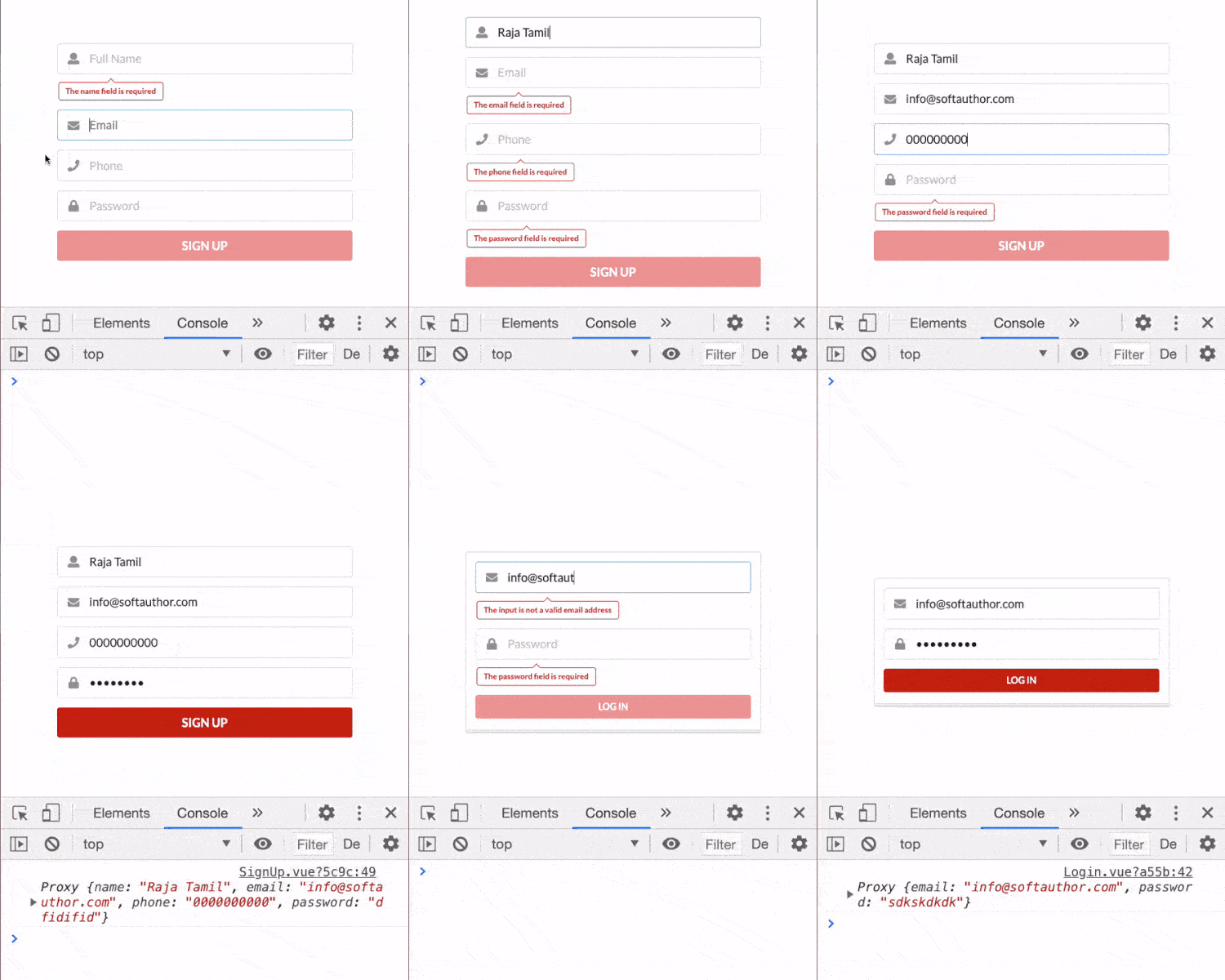
As you can see from the final output below, all of the input fields in the sign-up form have empty check validation as well as additional validation such as email, min length etc on keyup and blur events.
When all the input fields are filled with no errors, the submit button is enabled, otherwise it is disabled.

Along the way, you’re going to learn how to create reusable and scalable code for form validation that you can use throughout your web app.
Sound interesting? Let’s get started!
I assume you already know how to get Up and Running With Vue JS 3 Project Using Vue CLI.
If you’re using Options API instead of Composition API, check out the link below:
Vue JS 2 Form Validation Using Options API
I have a simple SignUp.vue component inside the src/views folder and it has a basic skeleton of a Composition API vue component.
Some CSS style at the bottom makes the form center to the viewport horizontally and vertically.
Signup.vue
<template>
  <section class="signup-view">
    <form class="ui form">
    </form>
  </section>
</template>
<script>
export default {
  setup() {},
};
</script>
<style scoped>
.signup-view {
  display: flex;
  justify-content: center;
  align-items: center;
  height: 100vh;
}
.form {
  width: 450px;
}
</style>Rather than creating template code for the name input field in the SignUp.vue file, create a new child component called NameField.vue inside the src/components folder.
NameField.vue
<template>
  <div class="field">
    <div class="ui left icon input big">
      <i class="user icon"></i>
      <input type="text" placeholder="Full Name" autocomplete="off" />
    </div>
  </div>
</template>
 <script>
export default {
  setup() {},
};
</script>
As you can see, I’ve used some additional CSS classes that are coming from Semantic UI. You do not need to know this in order to follow along with the rest of this guide.
Feel free to use your favourite CSS framework.
Let’s import the NameField.vue child component to the Signup.vue with three simple steps.
Signup.vue
import NameField from "@/components/NameField";export default {
components: {
NameField,
},
...
}<NameField />And the output will look like this:

Pretty straight forward!
Now, we’re ready to do the validation for the Name Input Field.
First, I’m going to check if the input field is empty or not using computed property inside the NameField.vue component.
Declare a variable called input initialized with an empty string using ref() object inside the setup() function.
Bind it to the name input field at the top in the vue template.
Now, define a computed property called error which will return an error message if the value of the input field is empty, otherwise return an empty string.
NameField.vue
<template>
  ...
  <input
    type="text"
    placeholder="Full Name"
    autocomplete="off"
    v-model="input"
  />
  ...
</template>
<script>
import { ref, computed } from "vue";
export default {
  setup() {
    let input = ref("");
    const error = computed(() => {
      return input.value === "" ? "The Input field is required" : “”;
    });
    return { input, error };
  },
};
</script>
Finally, add the error variable to the returned object to show the error message on the view.
Now, let add some markup to show the error message.
As I mentioned earlier, the additional CSS classes in the markup come from the Semantic UI CSS Framework.
Also check to make sure to only show the error message if the error variable is not empty using the v-if directive.
NameField.vue
<template>
  <div class="field">
    <div class="ui left icon input big">
      <i class="user icon"></i>
      <input type="text" placeholder="Full Name" autocomplete="off" />
    </div>
    <div class="ui basic label pointing red" v-if="error">
     {{ error }}
    </div>
  </div>
</template>
This works fine…

But the error message is visible by default…
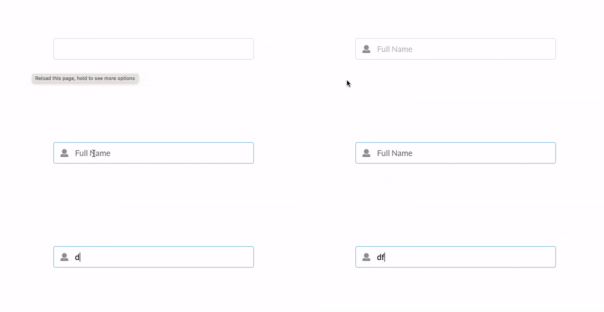
What we want is to not show any error until the user starts interacting with the input field.
To fix it, set the default value of the input variable to null instead of “”.
NameField.vue
let input = ref(null);That’s works great!

So what’s happening…? 🤷♀️
When the component loads, the value of the input is set to null so the input.value === “” inside the error computed property is false which hides the error message by default.
When a user starts typing and clearing all of the characters, the error computed property returns the error message which then will be visible to a user.
Here is another problem…🛑
What if a user clicks the input field and clicks somewhere aka blur?
Well…
We need to show the error in that scenario as well for a better user experience.
Basically, we want to show the error message when a user starts typing and clears all the characters out or clicks it and clicks somewhere else.
In other words, we want to show the error message when the input field is empty on keyup and blur events.
Let’s see how to do that next.
44
