
28
Cards that flip!
Hi all! This blog is me sharing how I applied CSS to make the cards flip on my memory game web-app called Flip!
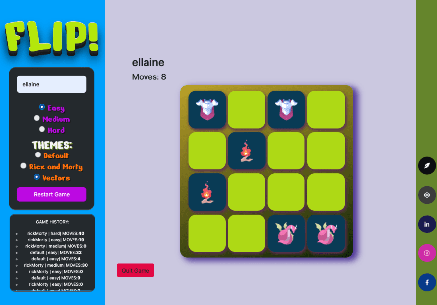
Browser view
Mobile view

The game was built for a project submission while I was in the bootcamp. Main requirement is to utilize vanilla JavaScript.
Besides the themes and APIs I’ve used, I am pretty proud that I was able to pull through the card flip effect using CSS!
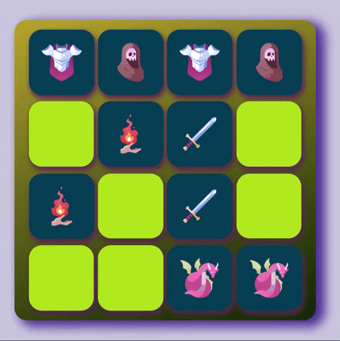
The animation we’re trying to breakdown looks like this:
I'm just going to breakdown how I did it with vanilla JavaScript. (You may definitely apply the similar principles with a library like React!)
So where do we begin?
- Here, we add the
eventListenerfor a click, and use a built-in function called toggle to switch the class.

- Don't forget to append it to the body! (Ex.
body.appendChild(container))
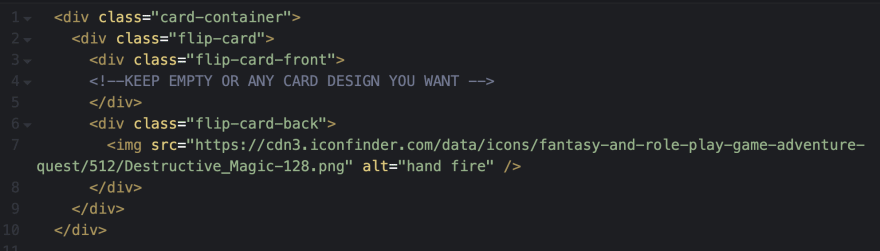
- The card container - I utilized this for size, shape and positioning of the 'cards' in the deck and also where we toggle class every click.
- Flip-card - A div that contains our Front and Back divs and will have the animation
- Front - A div that will remain empty as if the card is facing down
-
Back - A div where the icon or image will be in.
- Don't forget to append them and nest them correctly! It will look like this;
Okay now we have our cards set and our class toggle is in code, let's work our CSS.
.card-container {
  width: 180px;
  height: 200px;
  perspective: 1000px;
  border-radius: 20px;
}
Something new here is the perspective attribute. The higher the pixel, the tighter the turn as our card flips. Setting it lower will make it look like a big door swing.(Try to set it at 200px and you'll see what I mean.)
.flip-card {
  position: relative;
  width: 100%;
  height: 100%;
  transition: transform 1s;
  transform-style: preserve-3d;
}
2 important things here, the transition and transform-style. For transition, there can be 4 attributes values you can declare. CSS tricks explains it in detail. But all we need is the transition-property of transform with a duration of 1s or 1 second. Definitely can adjust slower or faster based on your preference. While for transform-style, we need it in preserve-3d value to have our elements stack up together in 3d dimension. Codrops explains other subcategories of transform-style.
.card-container.flip .flip-card {
  transform: rotateY(180deg);
}
In here, we're setting our flip-card div to transform rotate in Y-axis at 180 degrees. In line with transform-style, CSS-tricks also explained how perspective transform works and has examples here.
.flip-card-front, .flip-card-back {
  padding: 30px;
  width: 100%;
  height: 100%;
  position: absolute;
  backface-visibility: hidden;
  border-radius: 20px
}
So here we set the size for both front and back divs. You probably notice the backface-visibility set as hidden. It's literally doing what it says. Hiding the backface of the element since we have them set in 3d dimension. Here's a link for a better breakdown of what it does.
.flip-card-front {
  background-color: #333;
  color: #fff;
}

.flip-card-back {
  background-color: #05486b;
  color: #fff;
  transform: rotateY(180deg);
}
Of course! Colors! Just to differentiate the front and back, and see it flip better, I set it into 2 different background colors. But one div has also a transform rotate. We want the empty side to show first.
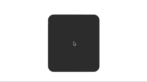
Now you should have something like this!!
I hope this is helpful for anyone wanting to build an app with this effect! Until the next!
References:
My CodePen: Card flip
CSS tricks: link
RickMorty API: Characters
Flip! memory game: App