15
How to clip elements in CSS using clip-path
I've never really learned the clip-path concept, and this article is a change in that habit.
I'll go through the learning process of the CSS clip-path property to make some fantastic shapes with CSS.
To give you some more background: back in my day, when we worked on CSS, a lot of the shaping was done by overlaying elements and hiding them among other shapes above it.
The clip-path property existed but didn't have massive support back then.
That is, of course, changed, but my habits did not change, so let's refresh my brain 🧠 by exploring the CSS clip-path property.
Let's first look at the central concept of clipping.
We'll start off by defining a sample box that is 200 by 200 pixels and has a background:

Nothing crazy yet, but let's see what happens when we add clip-path in the mix.
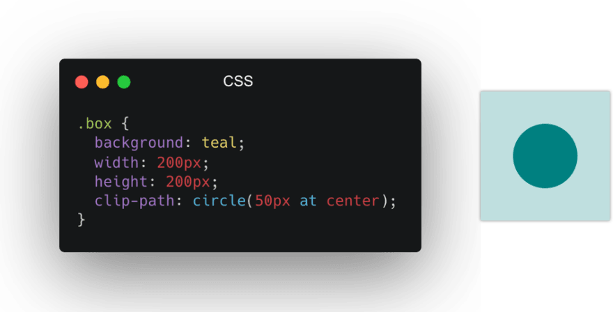
We'll put the clip-path on the box class, and we'll start by clipping a circle in the middle of our box.

I've made the clipped piece less transparent for you to see, the actual clip-path only shows the circle bit, but this should give you an idea of what the clipping does.
It masks on top of an existing item.
There are a couple of shapes we can use as clip-paths. Let's have a look at those and how they work.
The circle we have already seen in the basic example comes with the following syntax:
circle(radius at posX posY)The default position will be center, so we can also use a circle like this:
clip-path: circle(50%);This will make a circle that fills the whole box since the circle is half of the box.
And place it in the center by default.
However, we can offset the circle like this:
clip-path: circle(50% at 70% 20%);Which in turn, results in this:

I've added the box as a transparent element so you can see what part is being clipped by our circle.
A shape that works similarly is the ellipse, which has two values for the radius.
ellipse(radiusX radiusY at posX posY)To use it to clip our box:
clip-path: ellipse(50% 25% at 50% 50%);Resulting in a shape like such:

Another great option is the inset value. This can be used to inset from the box bounding.
In basic it works like this:
inset(top right bottom left round roundX roundY)Let's try out a quite extreme issue to showcase what happens:
clip-path: inset(10px 20px 30px 40px round 15px 50px);Resulting in a shape like this:

The last one is super versatile. It's called the polygon and accepts pairs of x/y coordinates.
Making it possible to create impressive shapes with this.
The basic properties work like this:
polygon(x1 y1, x2 y2, etc)Let's make a star shape and see how that works:
clip-path: polygon(
  50% 0%,
  61% 35%,
  98% 35%,
  68% 57%,
  79% 91%,
  50% 70%,
  21% 91%,
  32% 57%,
  2% 35%,
  39% 35%
);
Resulting in a star shape like this:

The last resource we can use is an SVG path. Yes, you heard that right.
Let's see how that works.
First, we'll need a HTML resource that has a SVG clip path definition:
<svg class="svg">
  <clipPath id="triangle" clipPathUnits="objectBoundingBox">
    <path d="M0.05,0.05 h1 v1"></path>
  </clipPath>
</svg>clip-path: url(#triangle);Resulting in a shape like this:

Another really cool thing we can do is animate the clip-paths.
We can use these to animate our clip-paths, however, make sure they are compatible shapes.
Meaning when using a polygon, for instance, keep the same amount of points to animate with.
@keyframes move {
  0% {
    clip-path: polygon(0 0, 50% 0, 100% 0, 100% 50%, 100% 100%, 50% 100%, 0 100%, 0 50%);
  }
  50% {
    clip-path: polygon(
      50% 50%,
      50% 25%,
      50% 50%,
      75% 50%,
      50% 50%,
      50% 75%,
      50% 50%,
      25% 50%
    );
  }
  100% {
    clip-path: polygon(0 0, 50% 0, 100% 0, 100% 50%, 100% 100%, 50% 100%, 0 100%, 0 50%);
  }
}
You can try this animate and all the other described properties on this Codepen.
Thank you for reading this article. I do hope you learned something new about clip-paths in CSS.
If you are eager to read some more about this, check out these fantastic resources.
15
