24
8 New Features of Amplify Studio
This post was written with @theswaminator
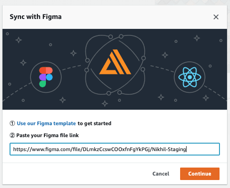
Last Thursday at re:Invent, AWS Amplify, the team I work on, launched Amplify Studio which brings developers new capabilities to help accelerate UI development. Amplify Studio automatically translates designs made in Figma to human-readable React UI component code. You can also connect a cloud backend to your UI components — Studio integrates with existing Amplify data modeling.
Here are 8 exciting new features available in the brand new Amplify Studio!
The biggest new feature is the ability to go from designs made in Figma to developer-friendly React code. Amplify Studio uses Figma capabilities such as components and auto-layout to generate React code that can be used directly in your own code. This workflow empowers UI/UX designers to control every styling decision of components – box shadows, border radii, paddings, margins, and colors that us devs always end up messing up 🙈.
Studio allows developers to focus on the core business logic that makes their app different rather than spending tons of time going back-and-forth on UI styling.
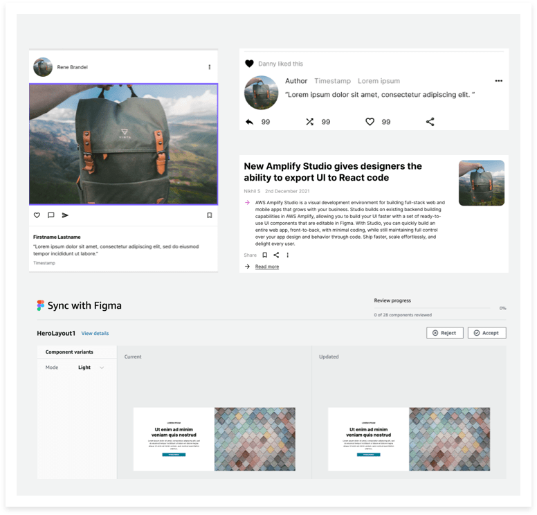
To accelerate UI development, Amplify Studio uses the gorgeous, brand new Amplify UI library. It offers dozens of components such as newsfeeds, contact forms, e-commerce cards, and primitives such as Buttons, TextFields, and Alerts. All of these components are also available in the Amplify Studio Figma community file. You can mix and match Figma generated UI components with Amplify UI components to build complete apps in very little time.
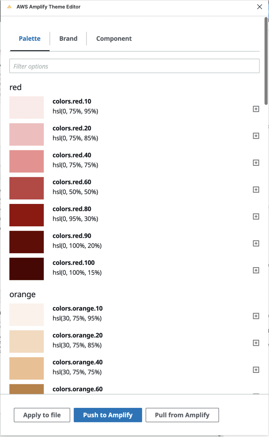
The Amplify UI library ships with theming capabilities, allowing you to define design tokens that apply globally across your app. The theming plugin for Figma allows you to update the Amplify Figma file to match your brand styles!
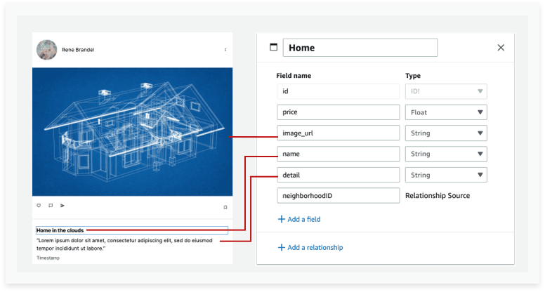
You can use Amplify’s point and click interface to visually bind UI components imported into Studio to items in your backend data model. Studio automatically generates all the ‘glue’ code required to power the UI with real data.
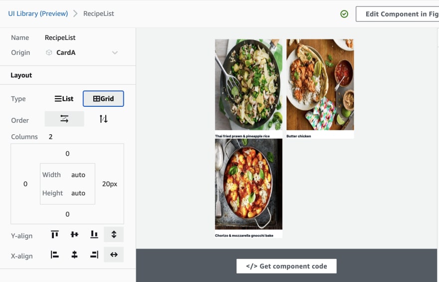
Almost all apps we build render collections (or a repeating list of items). You can create collections in Studio that display multiple instances of your data. Connect to the data in your data manager, dynamically query data with filtering and sorting , bind your collection to specific records, and define your collection layout styling (e.g. grid vs list, padding, direction).
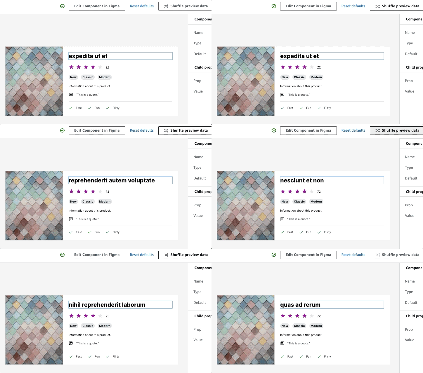
Shuffle preview gives you the ability to test how your UI component renders with different types of data from your data model. You can make sure that your UI will still look good with a very short title and a very long one, for example!
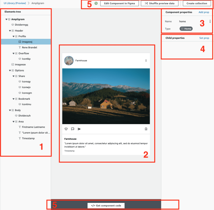
Amplify Studio renders a live preview of your UI component, with the ability to edit properties ranging from styles such as color, font weight and data. All property changes made in the editor are reflected in real-time in the live preview.
My favorite part of Studio is that we focus first and foremost on a developer audience. We have a visual way to make components, but then they can be generated using normal React code. All generated code can be extended by either modifying the component props or by overriding the generated code.

Amplify Studio is live right now! I’d love to hear your feedback as you build with it!
24
