30
Creating A Reusable Speedometer Component.
Working on a project recently, I noticed that a speedometer is one of the functional components that are rare to find outside and a lot of developers are finding it so hard to come up with.
Speedometers can be used as a chart to display constantly updating data, to showcase real-time changes in something, and it gives the user a more friendly appeal they can relate to.
In this article, we will be creating a speedometer component, making it reusable and also looking into how to get data dynamically to work with.
Outline
- Understanding components structure.
- Understanding trigonometry and how to apply it to UI design.
- Creating project structure.
- Updating data dynamically.
- Conclusion
Prerequisites
To understand this tutorial, you will need to have:
- Basic Understanding of react JS
- Node JS installed on your PC
- A Text Editor (Preferably VS Code)
- Terminal (CMD or any other terminals)

The speedometer part is divided into 3 parts which are the display, the speed loader and the indicator bar, The display serves as the main screen where info (numbers) is shown to the users, The Speed Loader serves as a moving progress bar to show the user the level they are and last, the indicator bar is the pinpoint that rotates around the speedometer as the data changes.
Understanding Trigonometry
Trigonometry is one of the basic mathematics topics introduced in school, though they don’t mention the use case or how it can be applied, it is one of the mathematical solutions that is been applied when it comes to solving motion problems. We will be able to work with degrees and see how we can go around a circle.

From the Project structure, we can carve it into a semi-circle which is divided into two parts that help to get the centre of the action, which is where the circles revolve around. This means that all the rotations we will be doing will revolve around the centre of the action.
Without much talk, let’s set up the project structure and move into coding the components themselves.
Project setup
Since we will be using react for the project, we need to first create a blank react project. Then we will install the necessary packages, firstly open your terminal and enter this command.
npx create-react-app SpeedometerOnce you have successfully created the project, you should see something like this:
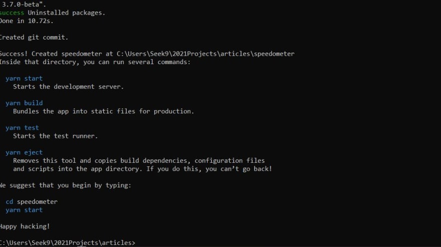
Once you have successfully created the project, you should see something like this:
Then open the code in a text editor and, let’s clean up the file structure by removing what we will not need there. Go to the src folder and delete logo.svg, reportWebVitals.js, setupTests.js, App.test.js and App.css.
Open index.js and replace the code inside with this:
import React from 'react';
import ReactDOM from 'react-dom';
import './index.css';
import App from './App';
ReactDOM.render(
  <React.StrictMode>
    <App />
  </React.StrictMode>,
  document.getElementById('root')
);
Open app.js and replace the code inside with this also;
function App() {
  return (
    <div>
     Hello World
    </div>
  );
}
export default App;
Create two folders with the name: components and styles and open the components folder and create a file with the name speedometer.js inside, then open the styles folder and create a file with the name SpeedometerStyle.style.js and also a file name Wrapper.style.js.
We will be using styled-components for the styling, so we have to install styled-components to the project, go back to your terminal and install the package using this command.
yarn add styled-componentsNow open the Wrapper.style.js file and add the following code inside:
import styled from 'styled-components';
export const Wrapper = styled.div`
    width: 100%;
    max-width: 100vw;
    height: 100vh;
    display: flex;
    justify-content: center;
    align-items: center;
    background: #fff;
`
Looking at the code above, we are importing the styled-components package we installed then we are using it to create a style we can be used everywhere on the project as a reusable component, the style set the width and height to 100vw and 100vh respectively, just for it to fill the user's screen and then centralize using flex.
Just to set up the style for the Speedometer itself, open the SpeedometerStyle.style.js file and add this code.
import styled from 'styled-components';

export const StyledSpeedometer = styled.div`
    width: 100%;
    max-width: 450px;
    margin-top: 3rem;
    .guage_body {
        width: 100%;
        height: 0;
        padding-bottom: 50%;
        background: #000;
        border-top-left-radius: 100% 200%;
        border-top-right-radius: 100% 200%;
        position: relative;
        overflow: hidden;
    }
`
Looking at the style above, we are creating a rectangle with a width of 450px to get a semi-circle, making the guage_body width 100% and a 50% padding to the bottom, which will give us access to just 50% of the space we have. Then we use a border radius to the top left and top right of the rectangle, in other to perfectly curve it.
Lastly, we make the position relative so that the 'body' children position can be set independently without issues and overflow as hidden in the other to hide anything going out of the guage_body.
Go to Speedometer.js and add the following code:
import React from 'react'
import { StyledSpeedometer } from '../styles/SpeedometerStyle.style'
import { Wrapper } from '../styles/Wrapper.style'
const Speedometer = () => {
    return (
        <Wrapper>
            <StyledSpeedometer>
                <div className="guage_body"></div>
            </StyledSpeedometer>
        </Wrapper>
    )
}
export default Speedometer
Looking at the code above, we imported the styled-component we created for Wrapper and StyledSpeedometer, which is what we are using to construct the layout.
After the setup, let’s go to the App.js file and replace the code with this.
import Speedometer from "./components/Speedometer";
function App() {
  return (
    <Speedometer />
  );
}
export default App;
This is just using the speedometer component we have created to display the content, If it is successfully implemented, we should have something like this when we run the code with "yarn start" from the terminal.
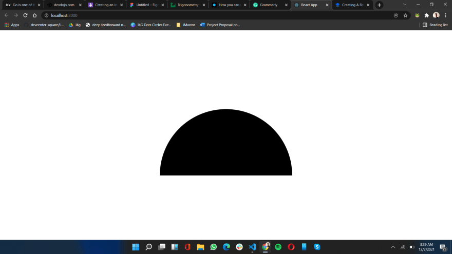
Now let’s continue, add the following line of code inside your Speedometer.js file inside the guage_body div tag
<div className="guage_body_cover">
  <div className="guage_indicator_slider" />
</div>
<div className="guage_indicator" />
And open the SpeedometerStyle.style.js and update the style by adding this style inside the .guage_body section.
.guage_body_fill {
    position: absolute;
    top: 100%;
    left: 0;
    width: inherit;
    height: 100%;
    background: #000;
    transform-origin: center top;
    transform: rotate(0turn);
    transition: transform 0.2s ease-in-out;
}

.guage_indicator {
    position: absolute;
    width: 225px;
    height: 225px;
    top: 125%;
    left: 50%;
    transform: translate(-50%, -50%);
    transform-origin: center top;
    transform: rotate(0.3turn);
    border-radius: 50%;
    background: #000;
    z-index: 7;
    &::before {
    }
}

.guage_indicator_slider {
    width: 4px;
    height: 22rem;
    background-color: #000;
    transform-origin: center;
    transform: rotate(0.3turn);
    margin-bottom: 1rem;
}

.guage_body_cover {
    width: 97%;
    height: 200%;
    border-radius: 50%;
    background: #fff;
    position: absolute;
    top: 3%;
    left: 50%;
    transform: translateX(-50%);
    display: flex;
    justify-content: center;
    align-items: center;
}
The output should be something like this:
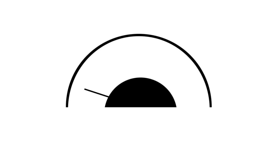
Let’s move forward by adding the text board to the speedometer to get the numbers as it's changing, open your Speedometer.js file and update by adding this code to the below guage_indicator div.
<div className="text_content">
    <h3>100</h3>
    <p>Mbps</p>
</div>
And open the SpeedometerStyle.style.js and update the style by adding this style immediately after the guage_body class.
.text_content {
    position: absolute;
    top: 0;
    background-color: #000;
    top: 80%;
    left: 50%;
    transform: translate(-50%, -50%);
    z-index: 55;

    h3 {
        font-size: 2.25rem;
        font-weight: 400;
        color: #fff;
        margin: 0;
        padding: 0;
        text-align: center;
    }

    p {
        font-size: 1rem;
        font-weight: 300;
        color: #fff;
        text-align: center;
        padding: 0;
        margin: 0;
    }
}
This style is to add style to the h1 tag and the paragraph tag, then position the text_content class to fit where we want it to be. We should have something like this once we are done

Our UI is ready. The next thing is to make it dynamic so that we can get data from external sources or backend and make it work perfectly without issue.
Updating Data Dynamically.
Just to get dummy data to use, we will be using random data with the JavaScript Math API, so let’s create a snippet that generates a number in every second so still inside the Speedometer.js file, update it by adding a useEffect and add this code inside, it should look like this:
// create a state to store the speed
const [speed, setSpeed] = useState(0)

// generates a random number between 0 and 35 every second
useEffect(() => {
    setInterval(function(){
      setSpeed(Math.floor((Math.random()*35)+1));
    }, 1000);
}, [])
Looking at the code above, a speed state to store the speed, then a "useEffect" is used to run the interval immediately once the page loads, which updates every 1 second and using the Math.random function we create a random number from 0 to 35 and store it on the speed state.
We need to update the speedometer so that we can update it once the speed state change, To achieve this, we need to create a ref for some of our div tags and also use another useEffect to update it.
Firstly, let’s create our ref by creating a ref which will be hooked with some div tags, updating the code with
const turnRef = React.useRef(null)
const sliderRef = React.useRef(null)
Then update the div tags with this to link the div with the ref
<div className="guage_body_fill" ref={turnRef} />
<div className="guage_body_cover">
    <div className="guage_indicator_slider" ref={sliderRef} />
</div>
Lastly, let’s create another useEffect and add this code inside
useEffect(() => {
    const turn = speed >= 37.5 ? ((12.5 + 37.5) / 100) : ((12.5 + speed) / 100)
    turnRef.current.style.transform = `rotate(${turn}turn)`
    sliderRef.current.style.transform = `rotate(${turn + 0.25}turn)`
}, [speed])
Looking at the code above, we are using a useEffect that uses the speed as a dependency so that it will update once the speed value changes. Then we set a turn value which checks if the speed is greater and equal to 37.5. If yes, then it uses a fixed value which is (12.5 / 37.5) / 100. If no, then we will use (12.5 + speed) / 100.
The reason why we are using 12.5 is that the circle is not complete and to start from the circle cutout we are adding the value to the speed value. Once the speed is more than 37.5 we stop it from going through the cut-out by restricting it with a fixed value.
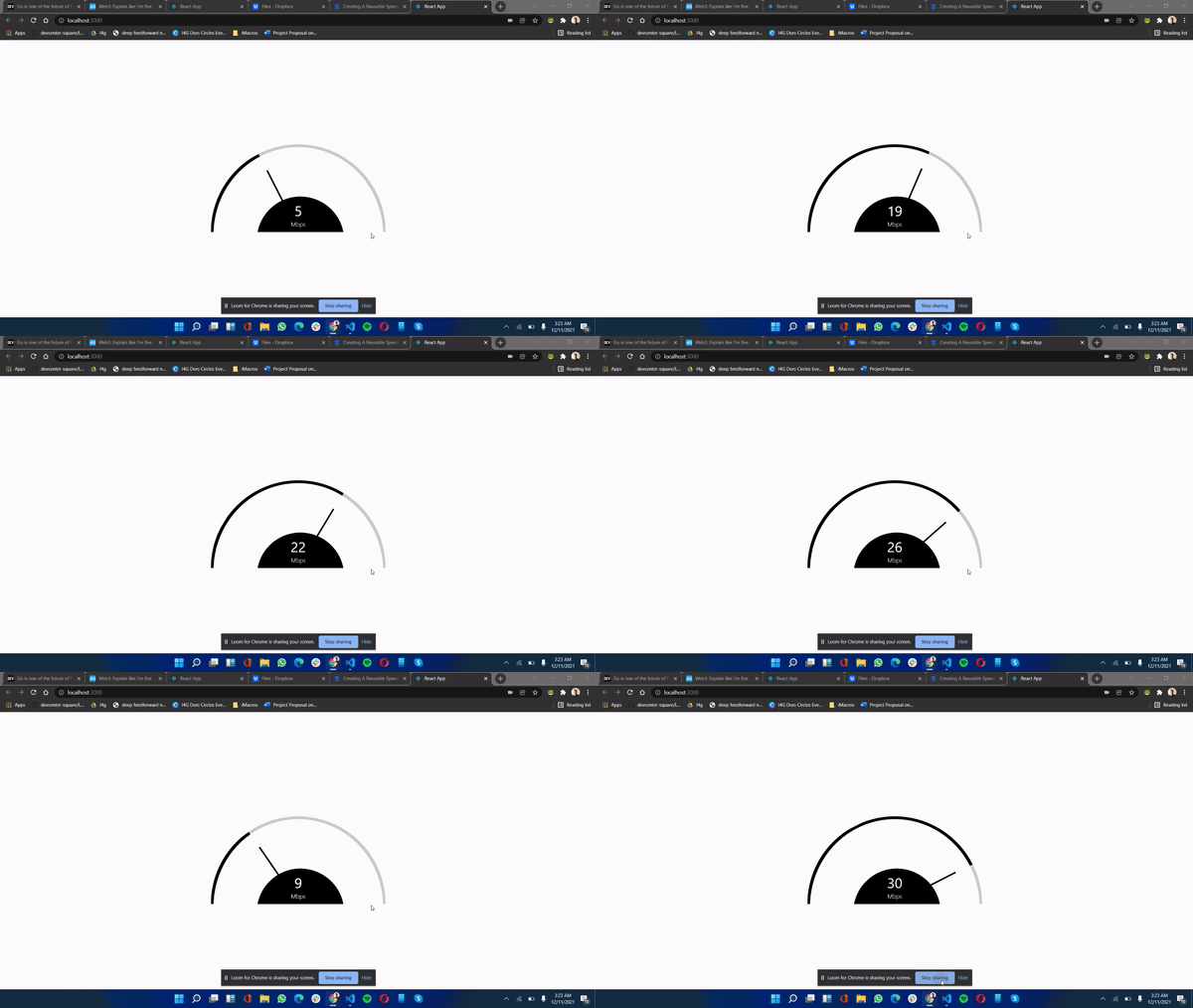
So it should look like this after the update.
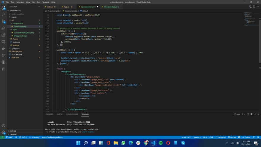
If everything is done correctly as it is in this tutorial, you should get something like this once you run the server again.
Conclusion
Creating this speedometer component actually helps in learning some aspects in react which include a look into trigonometry, updating CSS values and dynamically passing data to update CSS value, This component can be used in many use cases to suit different purposes, including getting the data from a backend and updating the style to suit your need.
To get this code, check it up on GitHub, by using this link
This is the live link: https://speedometer-smoky.vercel.app/
30
