33
How To Create A Custom Edit Form In DevExtreme Datagrid Using Semantic UI React.
Have you ever tried to change the edit/add form of your DevExtreme grid when creating a CRUD operation and found out you couldn’t do it? In this article, you will learn how to create a custom edit/add form. Before we start the project, let us get to know about Semantic UI and DevExtreme DataGrid.
Semantic UI is a front-end development framework similar to bootstrap. It is designed for theming. It contains prebuilt semantic components that help create beautiful and responsive layouts using friendly HTML syntax. It integrates React, Angular Ember, etc. It uses gulp build tools to help your project preserve its theme changes. Gulp is a javascript tool that allows you to automate tasks like builds, minification, compilation, etc.
You can read more about it here: https://react.semantic-ui.com/.
You can read more about it here: https://react.semantic-ui.com/.
DevExtreme Datagrid helps us in creating large datasets with integrated server-side support that helps with data sorting, record grouping, filtering, and paging.
To start the project, create a react app called devgrid.
$ npx create-react-app devgridAfter creating the app in react, cd into the folder and install Semantic UI react, there are two ways you can install it. You can either use npm or yarn.
npm:
$ npm install semantic-ui-react semantic-ui-css
yarn:
$ yarn add semantic-ui-react semantic-ui-css
Import the Semantic minified CSS file into the index.js component, this provides a light weight css version of Semantic UI. It is important you import it so you can see every change you make.
// index.js
import React from "react";
import "semantic-ui-css/semantic.min.css";Next you will install the DevExtreme dependencies, create a components folder inside the src folder, then create a component file called DevGrid within the components folder. Import react and DevExtreme UI into the DevGrid components.
npx -p devextreme-cli devextreme add devextreme-react
//DevGrid.js
import React from "react";
import "devextreme/dist/css/dx.common.css";
import "devextreme/dist/css/dx.light.css";
Import the datagrid from DevExtreme.
import DataGrid, {
  FilterPanel,
  FilterRow,
  SearchPanel,
  Paging,
  Editing,
  Export,
  Pager,
  Grouping,
  GroupPanel,
  RowDragging,
  Column,
  RequiredRule,
} from "devextreme-react/data-grid";
Also import the popup from DevExtreme.
import { Popup } from "devextreme-react/popup";Import the Form, Segment, and Button from Semantic UI.
import { Segment, Button, Form } from "semantic-ui-react";To create your custom edit form that will override that of DevExtreme Datagrid, you will structure your codebase in the format below, using the segment element from Semantic UI to wrap every other element.
const DevGrid = () => {
  return (
    <Segment>
      <h1>Welcome To Devgrid</h1>
      <div className="ui info message">
        <div className="header">We Love To Learn.</div>
      </div>

      <div>
        <DataGrid
          id="devgrid"
          className="dx-datagrid dx-row-alt"
          hoverStateEnabled={true}
          columnAutoWidth={true}
          dataSource={DataSource}
          activeStateEnabled={true}
          columnResizingMode="widget"
          allowColumnResizing={true}
          columnHidingEnabled={true}>
          <RowDragging allowReordering={true} />
          <FilterPanel visible={true} />
          <SearchPanel visible={true} />
          <FilterRow visible={true} />
          <Paging defaultPageSize={10} />
          <Pager
            showPageSizeSelector={true}
            allowedPageSizes={[10, 20, 50, 100]}
            showInfo={true}
          />
          <Grouping contextMenuEnabled={true} />
          <GroupPanel visible={true} />
          <Editing
            mode="popup"
            useIcons={true}
            allowUpdating={true}
            allowDeleting={true}
            allowAdding={true}>
            {" "}
          </Editing>

          <Export
            enabled={true}
            fileName="Devgrid"
            allowExportSelectedData={true}
          />

          <Column dataField="ID" visible={false}></Column>
          <Column dataField="Prefix">
            <RequiredRule />
          </Column>
          <Column dataField=" FirstName">
            <RequiredRule />
          </Column>
          <Column dataField="LastName">
            <RequiredRule />
          </Column>
        </DataGrid>

      </div>
    </Segment>
  );
};
export default DevGrid;
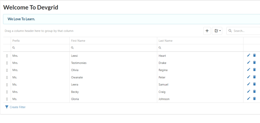
Run your project using yarn start/ npm start in your terminal to see how it looks like in your browser.
This is how your grid and edit form will look like.

const myData = [
    {
      ID: 1,
      FirstName: "Leesi",
      LastName: "Heart",
      Prefix: "Mrs.",
    },
    {
      ID: 2,
      FirstName: "Testimonies",
      LastName: "Drake",
      Prefix: "Mrs.",
    },
    {
      ID: 3,
      FirstName: "Olivia",
      LastName: "Regina",
      Prefix: "Mrs.",
    },
    {
      ID: 4,
      FirstName: "Owanate",
      LastName: "Peter",
      Prefix: "Ms.",
    },
    {
      ID: 5,
      FirstName: "Leera",
      LastName: "Samuel",
      Prefix: "Ms.",
    },
    {
      ID: 6,
      FirstName: "Becky",
      LastName: "Craig",
      Prefix: "Mrs.",
    },
    {
      ID: 7,
      FirstName: "Gloria",
      LastName: "Johnson",
      Prefix: "Ms.",
    },
];<DataGrid
...
dataSource={myData}
>
...
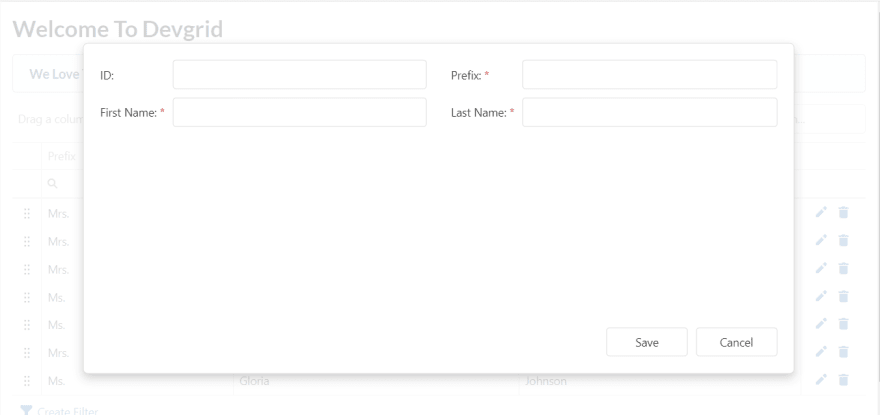
</DataGrid>Your DevExtreme edit/add form looks like this before customizing it.

To modify the form, add the Semantic UI form element. Add the form element as a child of the popup element from DevExtreme. Add another elememt called ‘Form. Field’ inside the form as shown below. In Semantic UI, ‘.field’ is added to forms that contain the label and input element .The popup should be outside the DataGrid.
<Popup
          title="Create"

          showCloseButton={false}
          width={700}
          minHeight={"auto"}
          height={600}>
            <Form size="large" >
              <Form.Field>
                <label>ID</label>
                <input placeholder="ID" />
              </Form.Field>
              <Form.Field>
                <label>Prefix</label>
                <input placeholder="Prefix" />
              </Form.Field>
              <Form.Field>
                <label>First Name</label>
                <input placeholder="First Name" />
              </Form.Field>
              <Form.Field>
                <label>Last Name</label>
                <input placeholder="Last Name" />
              </Form.Field>
              <Form.Field></Form.Field>

            <Button.Group>
              <Button positive>Save</Button>
              <Button.Or />
              <Button>Cancel</Button>
            </Button.Group>
          </Form>
        </Popup>
Next create a state that will manage your popup and form component. Set its initial value to false.Create a function to handle your state and set it to true. Call it in your popup and form as shown below.
const [onVisible, setOnVisible] = React.useState(false);const handleAddNew = () => {
setOnVisible(true);
};<Popup
visible={onVisible}
>
<Form size="large" setOnVisible={() => setOnVisible(false)}>This doesn't make a change on the form, you can still see the DevExtreme form. To make your custom form visible,you need to create a function that you will call in your Datagrid in the DevGrid component. To do this, create a function called onToolbarPreparing. In it create a variable called “tools items”, assign the “tool bar option" to it. Do a for loop that increases the length of the “tools items”. Create a variable called item and assign the tools item to it create an if statement in the for loop that checks if “item.name “ is equal to “addRowButton” when clicked. If equal, it adds up a new form using the "handleAddNew” function.
function onToolbarPreparing(e) {
let toolsItems = e.toolbarOptions.items;
for (let i = 0; i < toolsItems.length; i++) {
let item = toolsItems[i];
if (item.name === "addRowButton") {
item.options.onClick = handleAddNew;
break;
}
}
}Pass function onToolbarPreparing as a prop to your Datagrid this way
<DataGrid
id="devgrid"
className="dx-datagrid dx-row-alt"
hoverStateEnabled={true}
columnAutoWidth={true}
dataSource={myData}
activeStateEnabled={true}
columnResizingMode="widget"
allowColumnResizing={true}
onToolbarPreparing={onToolbarPreparing}
columnHidingEnabled={true}>Now click on your add button and you will be able to see your custom form.

import React, { useState, useEffect } from "react";
import "devextreme/dist/css/dx.common.css";
import "devextreme/dist/css/dx.light.css";
import DataGrid, {
FilterPanel,
FilterRow,
SearchPanel,
Paging,
Lookup,
Position,
Editing,
Export,
Pager,
Grouping,
GroupPanel,
RowDragging,
Column,
RequiredRule,
} from "devextreme-react/data-grid";
import { Popup } from "devextreme-react/popup";
import { Segment, Button, Form } from "semantic-ui-react";
import axios from "axios";
const DevGrid = () => {
const [onVisible, setOnVisible] = React.useState(false);
const myData = [
{
ID: 1,
FirstName: "Leesi",
LastName: "Heart",
Prefix: "Mrs.",
},
{
ID: 2,
FirstName: "Testimonies",
LastName: "Drake",
Prefix: "Mrs.",
},
{
ID: 3,
FirstName: "Olivia",
LastName: "Regina",
Prefix: "Mrs.",
},
{
ID: 4,
FirstName: "Owanate",
LastName: "Peter",
Prefix: "Ms.",
},
{
ID: 5,
FirstName: "Leera",
LastName: "Samuel",
Prefix: "Ms.",
},
{
ID: 6,
FirstName: "Becky",
LastName: "Craig",
Prefix: "Mrs.",
},
{
ID: 7,
FirstName: "Gloria",
LastName: "Johnson",
Prefix: "Ms.",
},
];
const handleAddNew = () => {
    setOnVisible(true);
  };
function onToolbarPreparing(e) {
    let toolsItems = e.toolbarOptions.items;

    for (let i = 0; i < toolsItems.length; i++) {
      let item = toolsItems[i];
      if (item.name === "addRowButton") {
        item.options.onClick = handleAddNew;
        break;
      }
    }
  }
return (
<Segment>
<h1>Welcome To Devgrid</h1>
<div className="ui info message">
<div className="header">We Love To Learn.</div>
</div>
<div>
<DataGrid
          id="devgrid"
          className="dx-datagrid dx-row-alt"
          hoverStateEnabled={true}
          columnAutoWidth={true}
          dataSource={myData}
          activeStateEnabled={true}
          columnResizingMode="widget"
          allowColumnResizing={true}
          onToolbarPreparing={onToolbarPreparing}
          columnHidingEnabled={true}>
<RowDragging allowReordering={true} />
<FilterPanel visible={true} />
<SearchPanel visible={true} />
<FilterRow visible={true} />
<Paging defaultPageSize={10} />
<Pager
showPageSizeSelector={true}
allowedPageSizes={[10, 20, 50, 100]}
showInfo={true}
/>
<Grouping contextMenuEnabled={true} />
<GroupPanel visible={true} />
<Editing
mode="popup"
useIcons={true}
allowUpdating={true}
allowDeleting={true}
allowAdding={true}>
{" "}
</Editing>
<Export
enabled={true}
fileName="Devgrid"
allowExportSelectedData={true}
/>
<Column dataField="ID" visible={false}></Column>
<Column dataField="Prefix">
<RequiredRule />
</Column>
<Column dataField="FirstName">
<RequiredRule />
</Column>
<Column dataField="LastName">
<RequiredRule />
</Column>
</DataGrid>
<Popup
title="Create"
// showTitle={true}
visible={onVisible}
showCloseButton={false}
width={700}
minHeight={"auto"}
height={600}>
<Form size="large" setOnVisible={() =>
setOnVisible(false)}>
<Form.Field>
<label>ID</label>
<input placeholder="ID" />
</Form.Field>
<Form.Field>
<label>Prefix</label>
<input placeholder="Prefix" />
</Form.Field>
<Form.Field>
<label>First Name</label>
<input placeholder="First Name" />
</Form.Field>
<Form.Field>
<label>Last Name</label>
<input placeholder="Last Name" />
</Form.Field>
<Form.Field></Form.Field>
<Button.Group>
<Button positive>Save</Button>
<Button.Or />
<Button>Cancel</Button>
</Button.Group>
</Form>
</Popup>
</div>
</Segment>
);
};
export default DevGrid;With this customization, your form will be having a different look and feel, you could also create multiple forms using different form styles in DevExtreme Datagrid using this method. I choose Semantic UI for the customization because it's a natural language, you can easily make your form responsive, the sleek feel you get when looking at the UI and lastly it is lightweight.
33
