44
Develop & test React components in isolation
Writing front-end code is easy. But writing reliable front-end code? That's tough.
Modern UIs are more complicated than ever. It is critical that you have confidence in your code. Developing and testing your UI components in isolation allows you to accomplish that.
In this article, we will go through the process of crafting an isolated, independent & reliable Image component for React. We will be leveraging tools like Storybook, Testing Library and Jest. ✨
To follow along, use this repo as boilerplate.
After installing the dependenices, run
yarn storybook to start the Storybook and run yarn test --watch to start the test-runner.Let's start with tests.
Writing tests before you start developing your component is important. We want our component to fulfill our test cases. Not the other way round. Tests give you constant feedback during development. Once you pass all the tests, you can be assured that your code will work as intended.
There is one thing that you have to keep in mind, though. Since your code's quality is being verified by the tests you write, it is critical that you write good tests. A good unit test should be readable, fast, reliable and should cover all the different use cases of your component.
Let's write the test cases now.
// src/components/Image/Image.test.tsx
import * as React from 'react';
import { fireEvent, render } from '@testing-library/react';

import { Image } from './';
import { photoSrc } from '../../constants';

const altText = 'abcd';

describe('Image', () => {
  it('should render the image properly', async () => {
    // render the Image component
    const { getByAltText } = render(<Image src={photoSrc} alt={altText} />);

    // retrieve a reference to the image
    const image = getByAltText(altText) as HTMLImageElement;

    // load the image
    fireEvent.load(image);

    // verify that the image exists on the DOM
    expect(image).toBeTruthy();

    // verify the src of the image
    expect(image.src).toEqual(photoSrc);
  });
});
The test will, of course, not pass. We still haven't written the mark-up for our component. Let's do that now.
// src/components/Image/index.tsx
import React from 'react';
// import { fallbackSrc, loadingSrc } from '../../constants';

export interface ImageProps {
  src: string;
  alt: string;
  height?: string | number;
}

export const Image: React.FC<ImageProps> = ({ src, alt, height = '400px' }) => {
  return (
    <>
      <img
        src={src}
        alt={alt}
        style={{ height, width: 'auto', borderRadius: '10px' }}
      />
    </>
  );
};
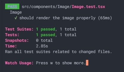
You will notice that the test now passes. ✔️ Awesome! (If you get an error, restart the test runner.)

Wait...but what does our component look like? Should we render it on the home route of our React app? 🤔
No. We will leverage Storybook for this.
Let's write the Story for our component.
A story captures the rendered state of a component. We write multiple stories per component that describe different states a component can support. Stories allow us to develop React components in isolation. If you are not familiar with Storybook, I highly recommend that you go through this page.
// src/components/Image.stories.tsx
import React from 'react';
import { Story, Meta } from '@storybook/react';

import { Image, ImageProps } from './';
import { photoSrc } from '../../constants';

export default {
  title: 'Example/Image',
  component: Image,
  argTypes: {
    src: { control: 'text' },
    alt: { control: 'text' }
  }
} as Meta;

const Template: Story<ImageProps> = args => <Image {...args} />;

export const Primary = Template.bind({});
Primary.args = {
  src: photoSrc,
  alt: 'Sample alt text'
};
There it is! Our Image component is looking clean. But right now, it does not handle the loading state and errors properly. Let's write tests for these two cases. Replace your test file code with the following:
// src/Image/Image.test.tsx
import * as React from 'react';
import { fireEvent, render } from '@testing-library/react';

import { Image } from './';
import { fallbackSrc, loadingSrc, photoSrc } from '../../constants';

const altText = 'abcd';

describe('Image', () => {
  it('should render the image properly', async () => {
    // render the Image component
    const { getByAltText } = render(<Image src={photoSrc} alt={altText} />);

    // retrieve a reference to the image
    const image = getByAltText(altText) as HTMLImageElement;

    // load the image
    fireEvent.load(image);

    // verify that the image exists on the DOM
    expect(image).toBeTruthy();

    // verify the src of the image
    expect(image.src).toEqual(photoSrc);
  });

  it('should display the loader until the image loads', async () => {
    const { getByAltText } = render(<Image src={photoSrc} alt={altText} />);

    const image = getByAltText(altText) as HTMLImageElement;

    // verify that the src of the image matches the loader. note that the image has not been loaded yet.
    expect(image.src).toEqual(loadingSrc);
  });

  it('should handle errors and render the fallback', async () => {
    const { getByAltText } = render(<Image src="#" alt={altText} />);

    const image = getByAltText(altText) as HTMLImageElement;

    // fire the error event for the image
    fireEvent.error(image);

    // verify that the src of the image matches our fallback
    expect(image.src).toEqual(fallbackSrc);
  });

  // an extra test case that verifies that our height prop behaves as expected
  it('should apply the provided height', async () => {
    const height = '200px';
    const { getByAltText } = render(
      <Image src={photoSrc} alt={altText} height={height} />
    );

    const image = getByAltText(altText) as HTMLImageElement;

    fireEvent.load(image);

    expect(image.style.height).toEqual(height);
  });
});
We also added an extra test case for the
height prop. More (good 😉) test cases never hurt!Two out of the three newly added tests will indeed fail. Let's re-visit the code for our component and change it so that our tests pass. Modify your component's source code to match the following:
// src/components/Image/index.tsx
import React from 'react';
import { fallbackSrc, loadingSrc } from '../../constants';

export interface ImageProps {
  src: string;
  alt: string;
  height?: string | number;
}

export const Image: React.FC<ImageProps> = ({ src, alt, height = '400px' }) => {
  // whether an error has occured or not
  const [err, setErr] = React.useState(false);

  // whether the image is loading or not
  const [loading, setLoading] = React.useState(true);

  return (
    <>
      <img
        // use the fallback image as src if an error has occured
        // use the loader image as src if the image is still loading
        src={!err ? (loading ? loadingSrc : src) : fallbackSrc}
        alt={alt}
        style={{ height, width: 'auto', borderRadius: '10px' }}
        // set loading to false once the image has finished loading
        onLoad={() => setLoading(false)}
        // set err to true if an error occurs
        onError={() => setErr(true)}
      />
    </>
  );
};
The code may seem daunting at first, but it isn't complicated. We are using state to keep track of two things - whether the image is still loading, and whether an error has occured. Then, we leverage these state variables to conditionally render the image with the appropriate src. It's that simple!
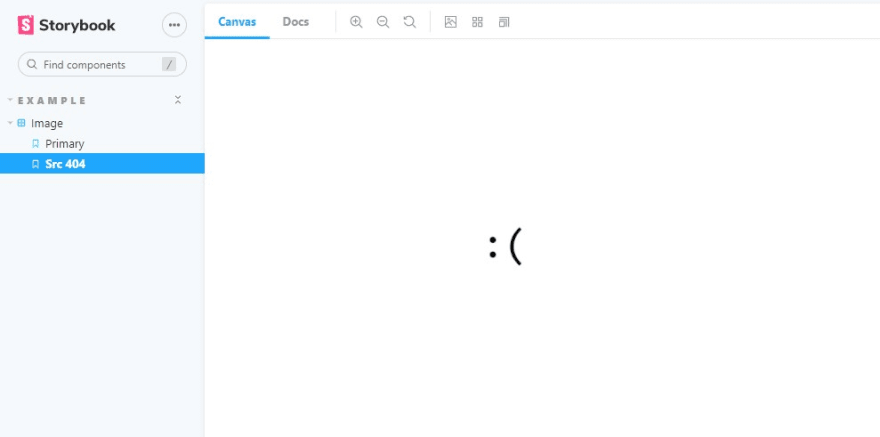
Let's now write a Story to see our fallback image in action. Add the following code to the bottom of your component's .stories file.
export const Src404 = Template.bind({});
Src404.args = {
  src: '#',
  alt: 'something broke'
};
And just like that, we added a new Story (a rather sad one) for our component. You can easily switch between your component's states to see how your component behaves. This is the power of Storybook!

You will also notice that all the test cases now pass! 🥳 Aren't those green ticks just lovely?
That's it. We have now successfully developed a reliable React component in isolation.
You must be feeling confident about the code that you just wrote. Doesn't that feel great? 🤩
😇 If this article helped you, follow me on Twitter. I won't disappoint you. I promise.
💡 If you're feeling curious, go visit componentdriven.org to learn more about the Component-Driven Development process.
44
