
40
Visualizing Sales Data with Arctype Dashboards
Arctype dashboards allow you to generate charts and tables to examine your data. You can also use them to create tools that modify and visualize data from your database and automate technical and tedious activities.
To follow and fully understand this tutorial, you need to have the following:
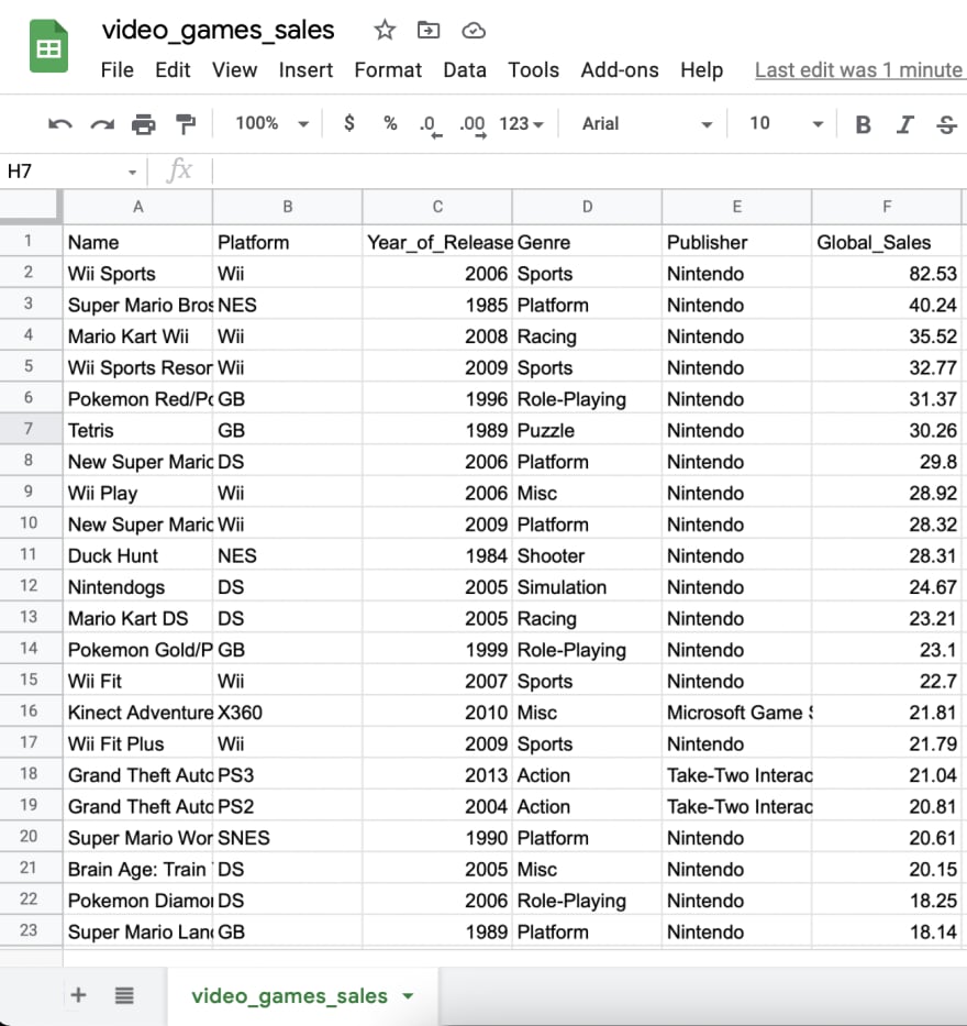
We will need to get sales data to visualize. In this tutorial, we will use publicly available data, which you can download here.
The dataset is only 1MB and includes the name, platform, year of release, genre, publisher, and global sales of about 16,000 video games from Metacritic.
The dataset is only 1MB and includes the name, platform, year of release, genre, publisher, and global sales of about 16,000 video games from Metacritic.
Next, we need to create a table in Arctype and import the dataset. To do this, use the
Import Table button from the Arctype client.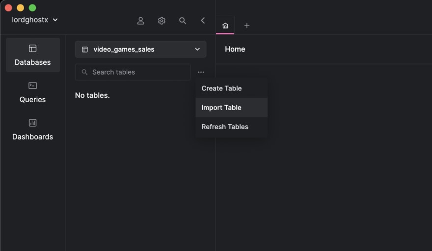
After doing that, select the CSV file to import. Arctype will show you a preview of the data you are about to import. If it is correct, press the
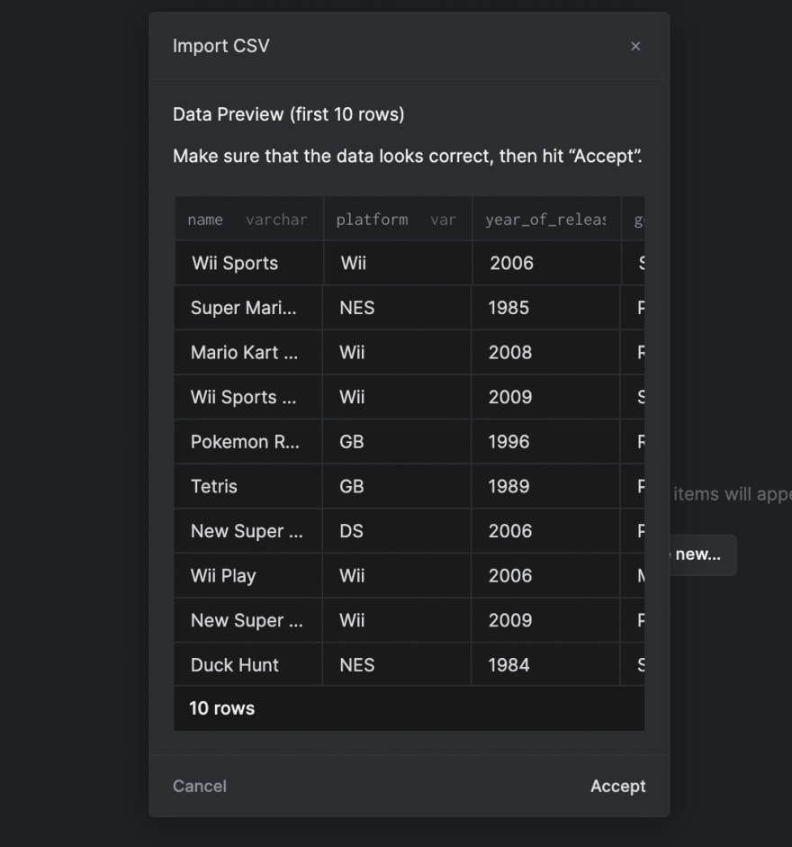
Accept button located at the bottom right of the pop-up.Then, we need to confirm the automatically generated schema of our table from the imported CSV:
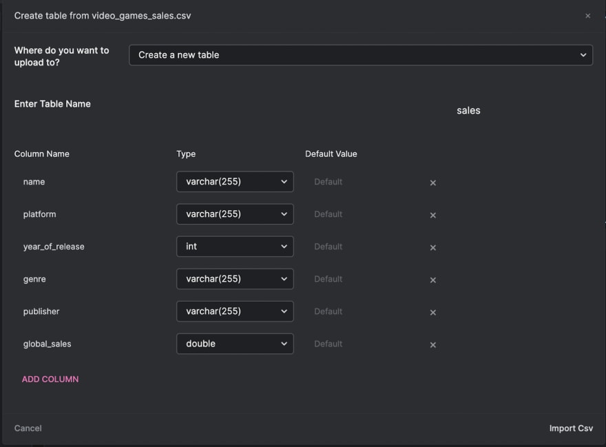
We will be renaming the new table to
sales. We also need to change the datatype of the year_of_release column to int and the global_sales column to double.After doing that, press the
Import CSV button located at the bottom right of the pop-up.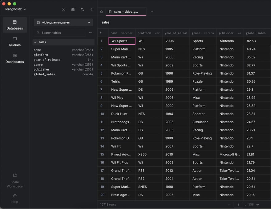
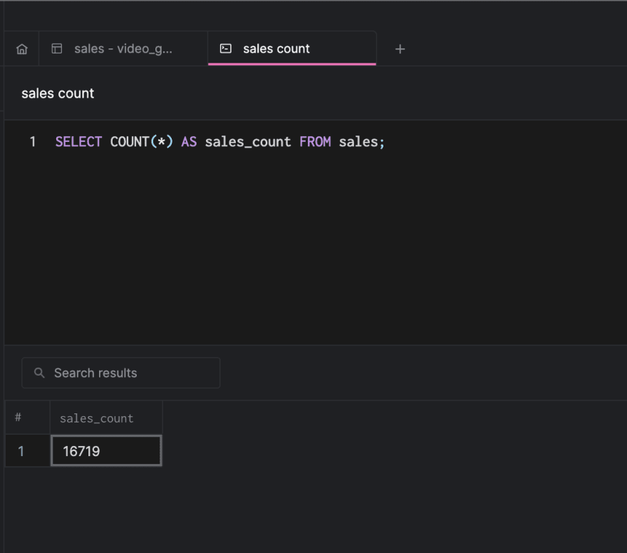
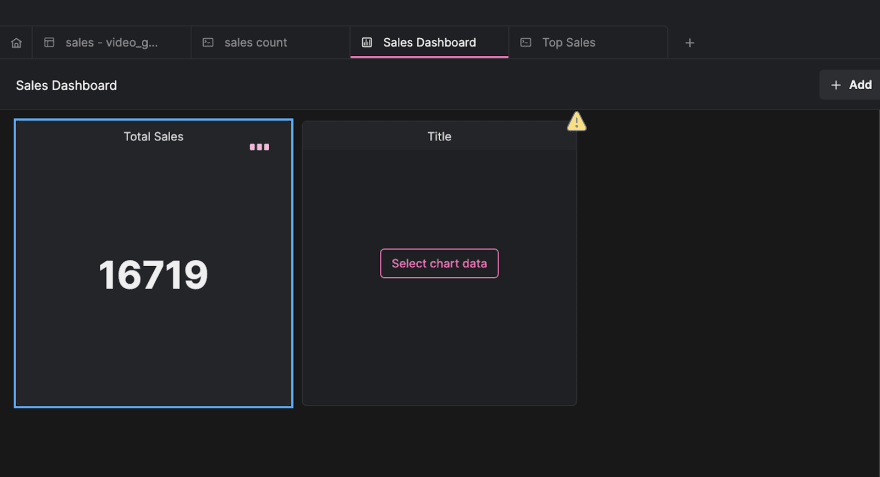
Now, let’s begin visualizing our database using Arctype. We will start by displaying a count of all sales made. Arctype dashboards provide a handy component called
scorecard Which shows a value on a card.To do this, we need to write an SQL query that will fetch the count of the records. Click on the
Queries tab by the Arctype sidebar (left side of the screen), then click on the Create Query button.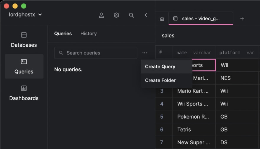
Paste and save the following query in the editor that comes up:
SELECT
    COUNT(*) AS sales_count
FROM
    sales;
You should get a result that looks like the screenshot below when you run the query in Arctype:
Next, click on the
Dashboards tab by the Arctype sidebar (left side of the screen), then click on the Create Dashboard button.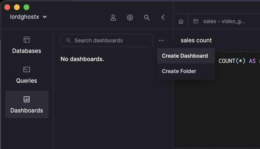
Then, click the
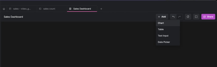
Add button at the header of the Dashboards section and select Chart.Now, click on the
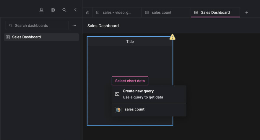
Select chart data button and select the sales count query we created earlier.Navigate to the right sidebar. Change the title of the dashboard component, select
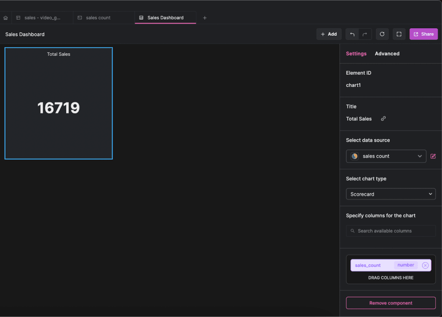
Scorecard as the chart type and drag the sales_count column to be displayed.Let’s create a table component with Arctype to display the names of the games with the most sales.
Create a new query called
top sales and save the following code in it:SELECT
name,
global_sales AS sales
FROM
sales
ORDER BY
global_sales DESC
LIMIT 10;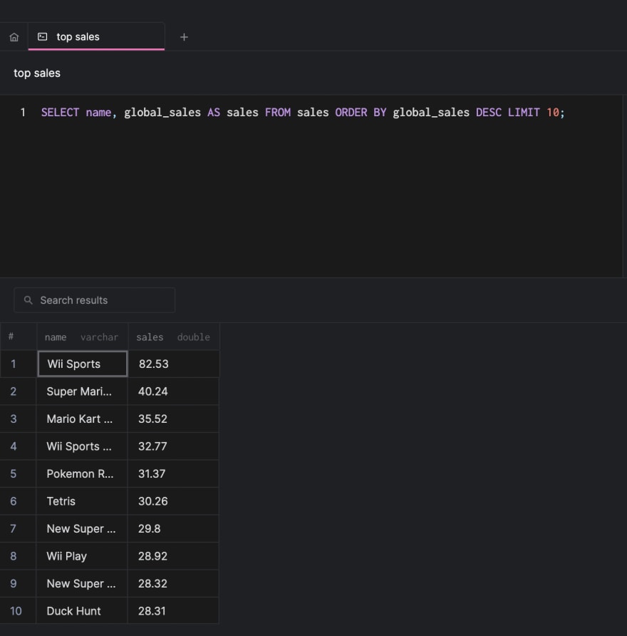
Then, click the
Add button at the header of the Dashboards section and select Table.Once you have done that, click on the
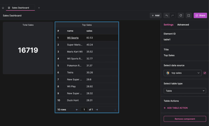
Select chart data button and select the top sales query we created earlier.Let’s create chart components with Arctype to display the game platforms and genre grouped into pie charts.
Create a new query called
platforms and save the following code in it:SELECT
platform,
COUNT(*) AS platform_count
FROM
sales
GROUP BY
platform;Next, create another new query called
genres and save the following code in it:SELECT
genre,
COUNT(*) AS genre_count
FROM
sales
WHERE
genre IS NOT NULL
GROUP BY
genre;Then, click the
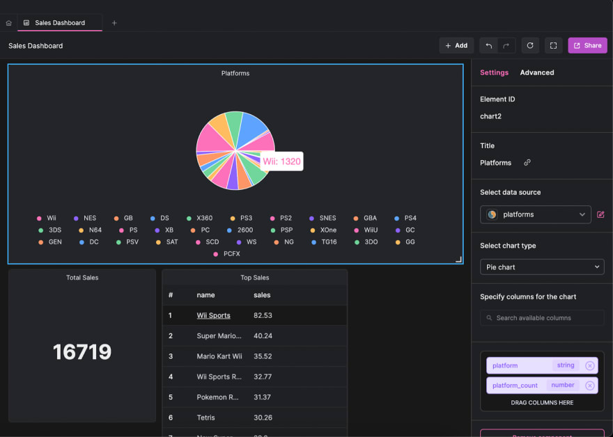
Add button at the header of the Dashboards section and select Chart. Select Pie chart as the chart type, and drag the platform column to the category box and the platform_count column to the values box.Repeat the process to generate a pie chart for the

genres query:Let’s create chart components with Arctype to display the number of games released each year and game publishers on a bar chart.
Create a new query called
year_of_release and save the following code in it:SELECT
year_of_release,
COUNT(*) as release_count
FROM
sales
WHERE
year_of_release IS NOT NULL
GROUP BY
year_of_release
ORDER BY
year_of_release;Next, create another new query called
publisher and save the following code in it:SELECT
publisher,
COUNT(*) AS publisher_count
FROM
sales
GROUP BY
publisher
LIMIT 15;Then, click the
Add button at the header of the Dashboards section and select Chart.After doing that, click on the
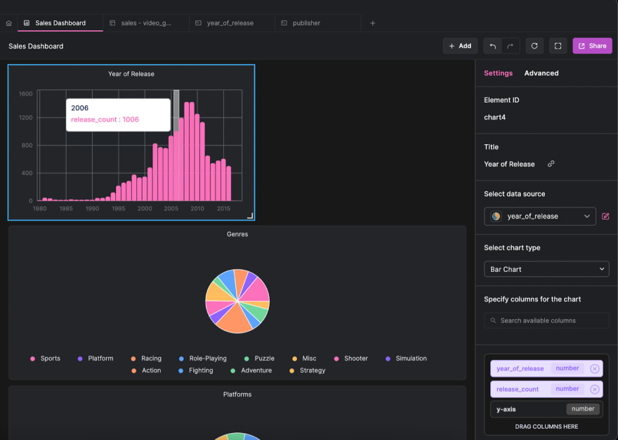
Select chart data button and select the year_of_release query we created earlier. Also, change the title of the dashboard component, select Bar Chart as the chart type, and drag the year_of_release column to the x-axis box and the release_count column to the y-axis box.Repeat the process to generate a horizontal bar chart for the
publisher query: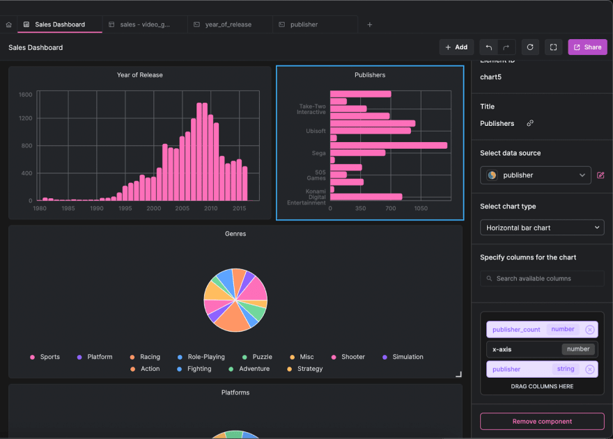
Let’s create a doughnut chart with Arctype for our publisher query. Click the
Add button at the header of the Dashboards section and select Chart.Change the title of the dashboard component, select
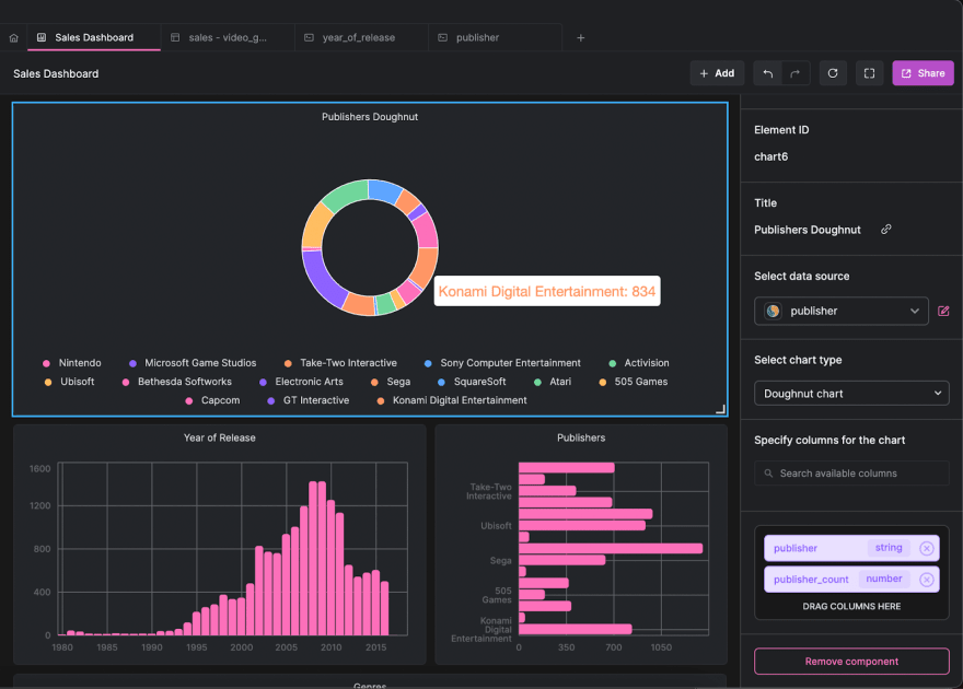
Doughnut Chart as the chart type, and drag the publisher column to the category box and the publisher_count column to the values box.Let’s create a chart component with Arctype to display the annual number of game sales on a line chart.
Create a new query called
annual_game_sales and save the following code in it:SELECT
year_of_release,
SUM(global_sales) AS sales
FROM
sales
WHERE
year_of_release IS NOT NULL
GROUP BY
year_of_release
ORDER BY
year_of_release;Just like all other chart types, select
Line Chart as the chart type, and drag the year_of_release column to the x-axis box and the sales column to the y-axis box.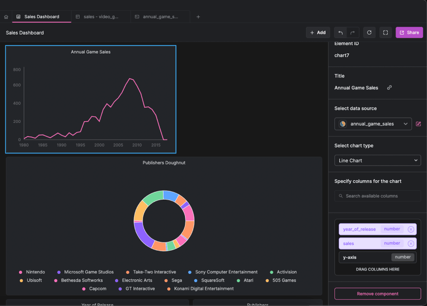
Let’s create an area chart with Arctype for our
annual_game_sales query. Click the Add button at the header of the Dashboards section and select Chart.Select
Area Chart as the chart type, and drag the year_of_release column to the x-axis box and the sales column to the y-axis box.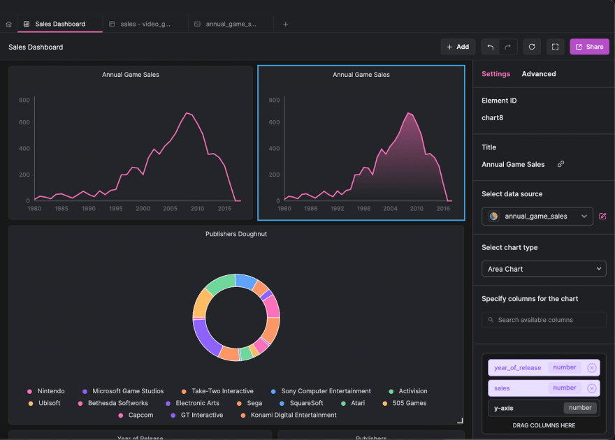
We have been creating visualizations based on specific queries with set parameters. What if we wanted to give Arctype input and have it create visualizations based on our information? We can use query variables to assist us in addressing this problem.
We will create a query to return the number of game sales in a year using query variables. Create a new SQL query named
yearly_sales and save the following code in it:SELECT
SUM(global_sales) AS year_sales
FROM
sales
WHERE
year_of_release = {{year}};When this query executes in Arctype, you will notice that it lets you provide value for the
year variable. This is because query variables prepare a query structure, then provide the functionality to pass different values to the variables to get desired results.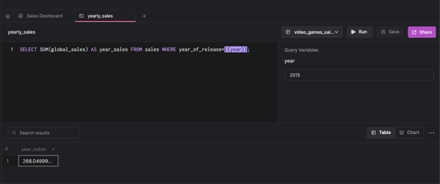
We will create a scorecard to display the result of the
yearly_sales query with a query variable. To do this:yearly_sales query as the data source,year_sales column to the display text box.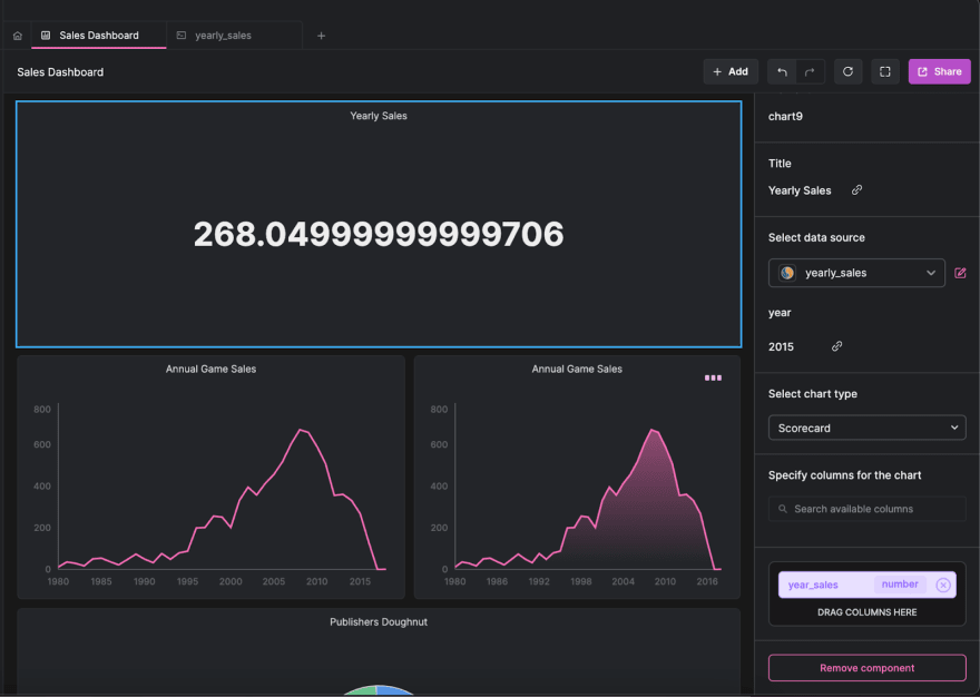
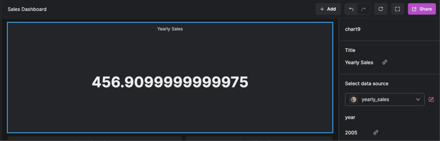
You will notice that the
year variable also appears by the right sidebar. Changing this value will instantaneously update the result of the scorecard.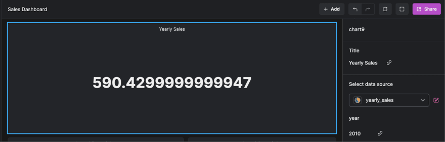
In this article, we learned about Arctype and saw how to visualize sales data using its built-in dashboards. We also explored query variables and used them to generate dynamic visualization results.
You can learn more about Arctype from the official documentation. If you have any questions, don't hesitate to contact me on Twitter: @LordGhostX.