37
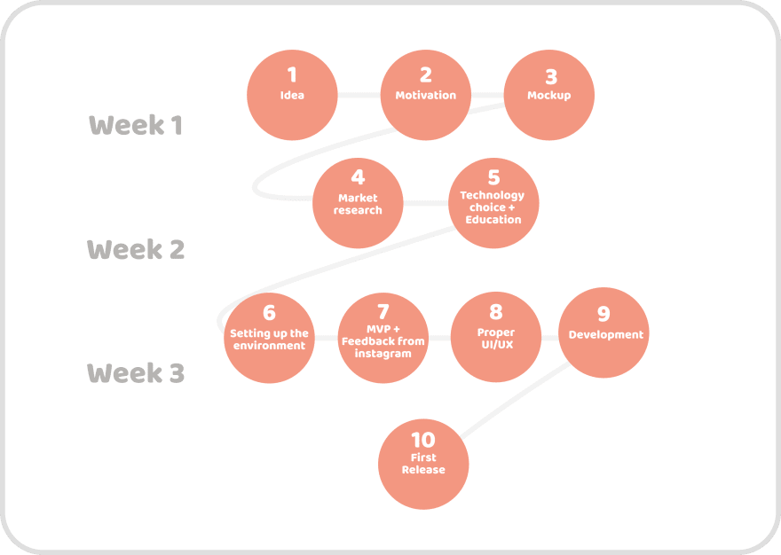
10 Steps that will help you turn your idea into a product. Part 1
Hi Devs!
Do you remember how you got the 💎idea and want to make it but don't know how to approach it?
Let's start with Part 1, what we have for today:

Each step has a 🎯 end goal so it's easy to be laser-focused
🎯End goal: Clear vision
My idea is simple: Habit-tracking app.
After my one-year experiment I decided to create an app that will help me stick with good habits.
🎯End goal: Motivational boost
At the start, the motivation level is super high, but based on my experience product development will take time.
So I decided to write down things that will help me stay motivated for a longer time:
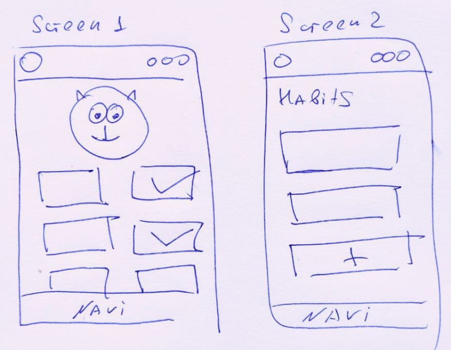
🎯End goal: general visuals to understand the architecture

Here I decided to not go into details, only features that help make the job done: Create a habit and mark it as done.
🎯End goal: Update my knowledge in a field
So, I bounced about the idea with my friends first, to listen to what they think. A friend of mine already researched the topic so he gave me pretty good sources to scrutinize.
I have looked at 22 apps that exist in Apple/Play stores, noted the pros and cons of each to better understand the landscape.
And created the notion page with:
🎯End goal: Define a tech stack
I set two main criteria in order to simplify choice:
And what we have had on a table:
Let's look a bit in detail at how the decision here has been made.
PWA - Seems good, but after read this research
I decided to not go this way. The onboarding process for IOS users seems pretty horrible from a UX point of view, at least for now.
I decided to not go this way. The onboarding process for IOS users seems pretty horrible from a UX point of view, at least for now.
Phone Gap/Cordova - Same as start something new with PHP now. It works, but you know what I mean😁.
Native apps - Two code bases will be expensive to develop and maintain. And the benefits of the native approach are just overkilling for a simple app like mine.
React Native/Flutter - Both actually perfectly fit the task. After a quick look at the documentation, checked the GitHub trends, and available tooling I decided to go with Flutter.
Here is how made that decision:
And I spent 1 day watching flutter crash-course, reading documentation, learning about Firebase basics.
🎯End goal: speed up the development
I wanted something that is already working, so I looked at the boilerplates, starters to bring myself as close to the working app as possible.
I found one, and in a few minutes, the simple app with authentication had already been on my phone. Cool, isn't it?
With a starter code, I am helped myself a lot since I am new at flutter:
I learned from other developers how to structure the code in a right way
I decreased the development time quite a lot
🎯End goal: feedback and extra motivation boost
Cool, after few days of modification starter I had a working app:

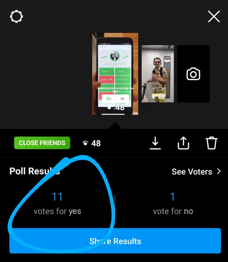
I uploaded a video of the app to Instagram with a simple question: Would you like to use such an app?:

The result was good, even though I knew I have to be careful with this data because of Ugly Baby Syndrome.
Anyway, it was good for the motivation, the public announcement created positive pressure on me and I had first feedback.
🎯End goal: UI layout
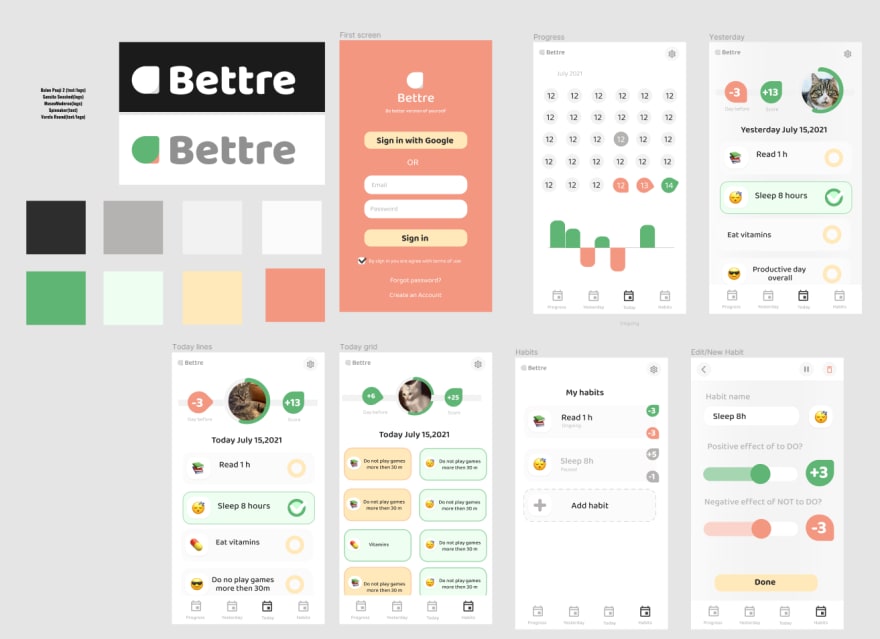
I went to a dribble for the inspiration. Looked at how the designers show certain things in an app like mine, what color scheme is usually used.
I did run the second survey on Instagram that showed that most people prefer grid view instead of the list. So I picked that one for the first version
🎯End goal: Working App with new UI/UX
It took me 2 extra days to make it real. Some UI things have been removed to speed up the process.
Few key points here:
🎯End goal: Google Play link to share
So here I chose the same approach as described above: Theory + Practice in 20/80 proportion.
I looked at how other app developers present their products in stores
Read the articles about how to make a better visuals, SEO and higher acquisitions rate
Made visuals in Figma and Photoshop
Wrote SEO description with wording from Market Research
Built a simple website to basically place terms of use and privacy policy which is required by App Store and Google Play
And after a 3 days (Google reviewed took exactly that time) I am finally got a approved app here: Google Play 🎉🎉🎉
Cool, I hope it was a fun read for you! Now the plan is to gain a small user base to test in a real environment, so you are very welcome to join here
After the testing process will be done, I will make a release for IOS so I could start more aggressive distribution such as Product Hunt, Google/Facebook Ads, and so on. About this, you can read in Part 2, which will be published after the work is done!
Subscribe to stay tuned!
And I really appreciate your negative or positive feedback in the comment section below!
37

