40
Android Basics: UI Layouts
The entire content is inspired by ,
Google's udacity course Android Basics: User Interface. Its first part of the five parts Android Basics Nanodegree Program series , This course is for basics of Android and Java programming as , and take the first step on your journey to becoming an Android developer, you can learn more about this here.
So I would be writing a Blog series where I will cover everything that I have learned ,and explain it in easy way.
If you are thinking of starting an Android Development you can check this blog,
We cover about the basic knowledge of how to place the layouts on the page to create
image, text , button on the phone screen.res/ directory of the project.Every individual view make up what we call layout of the app of what the user sees on the screen.
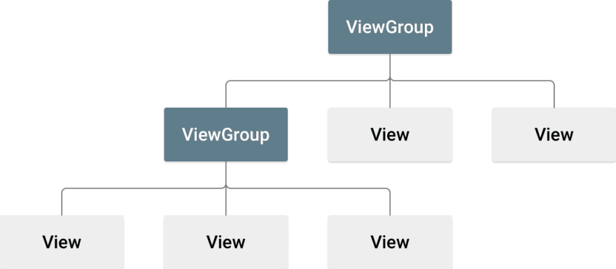
The basic building block for user interface is a View object which is created from the View class and occupies a rectangular area on the screen and is responsible for drawing and event handling. View is the base class for widgets, which are used to create interactive UI components.
The ViewGroup is a subclass of View and provides invisible container that hold other Views or other ViewGroups and define their layout properties.

A rectangle on the screen that shows up in a piece of information or some content
It can be
It can be
image text buttonor anything a app can displayandroid:idView object may have a unique ID assigned to it which will identify the View uniquely. The syntax for an ID, inside an XML tag is
For assigning the View ID name
For assigning the View ID name
android:id="@+id/text_id"For using its id name to as a reference
android:id="@id/text_id"layout_width & layout_heightThese are ViewGroup Layout Params
Its specifies the basic width & height of the view respectively.This is a required attribute for any view inside of a containing layout manager.
Its specifies the basic width & height of the view respectively.This is a required attribute for any view inside of a containing layout manager.
This is actually an attributes of ViewGroup and used by the view to tell there parent view how they want to be set
The attributes value may be a dimension (such as "12dp") which is hardcoded value or one of the special constants..
| Attributes Value | Description |
|---|---|
| Hardcoded values |
px (pixels), dp (density-independent pixels), sp(scaled pixels based on preferred font size), in (inches), and mm (millimeters) |
| MATCH_PARENT | which means the view wants to be as big as its parent (minus padding) |
| WRAP_CONTENT | which means that the view wants to be just big enough to enclose its content (plus padding) |
android:layout_width="match_parent"
android:layout_height="wrap_content"The one small dot or illuminated area on screen is called 1 pixel
Screens are made up of rows and columns of 1000' of these pixel.
Now,
Device can range in
If we use
Screens are made up of rows and columns of 1000' of these pixel.
Now,
Device can range in
screen density which is numbers of pixel per inch are on the screen , Hences devices with are varies in low,medium, high and extra high resolution.If we use
pixel(px) as a unit it would appear very smaller on high resolution device as there screen density is more View attributes.match_parent wrap_content which is flexible and set accordingly .There are number of UI controls provided by Android that allow you to build the graphical user interface for your app.
| Sr.No. | UI Control | Description |
|---|---|---|
| 1 | TextView | This control is used to display text to the user |
| 2 | EditText | Its includes rich editing capabilities |
| 3 | AutoCompleteTextView | Its similar to EditText and shows a suggestions while the user is typing. |
| 4 | ImageView | To display image inside the view |
| 5 | Button | It clicked by the user to perform an action . |
| 6 | ImageButton | This shows a button with an image (instead of text) that can be pressed or clicked by the user. |
| 7 | CheckBox | An on/off switch that can be toggled by the user |
| 8 | ToggleButton | An on/off button with a light indicator. |
| 9 | RadioButton | The RadioButton has two states: either checked or unchecked. |
| 10 | RadioGroup | A Radiogroup is used to group together one or more RadioButtons. |
| 11 | TimePicker | Its enables users to select a time of the day, in either 24-hour mode or AM/PM mode. |
| 12 | DatePicker | Its enables users to select a date of the day |
| And many more.... |
android:text
Text to display.
android:textAllCaps
Present the text in ALL CAPS. Possible value either "true" or "false".
android:textSize
Size of the text. Recommended dimension type for text is "sp" for scaled-pixels (example: 15sp).
We use attributes values unit as sp here because its changes to with the preference of user for the font size, which is setting app of the Android devices
android:textStyle Style (bold, italic, bolditalic) for the text. You can use or more of the following values separated by '|'.
normal - 0
bold - 1
italic - 2
bold - 1
italic - 2
Android has set of color defined byt not all ,hence from material design we can use color code called hex color code is given a specific hexadecimal digits start with "#" sign.
Eg:- #FF0000-> Red
#000000-> Black
#FFFFFF-> White ,etc
Eg:- #FF0000-> Red
#000000-> Black
#FFFFFF-> White ,etc
<TextView
      android:id="@+id/text_id"
      android:layout_width="300dp"
      android:layout_height="wrap_content"
      android:text="Hello_world"
      android:textAllCaps="true"
      android:textColor="@android:color/holo_blue_dark
android:textSize="50sp"/>android:src
Sets a drawable as the content of this ImageView.
How to insert and image file ❓
- First of all download an image , save it somewhere in local
- Now, in the directories app/res/drawable ,we put here every images used in the app
- For placing here we have to right click on drawable folder, click on reveal in explorer
- Now, just drag and drop the image file here in the drawable folder
- Inside the ImageView use this attributes
android:srcto refer our image in the drawable folder -
@is used for the referencing a resource in an android app, heredrawableis the resource type, and then we write the filename of the specific image
android:src="@ drawable/image_nameThere are many various other resources like static content that your code uses, such as bitmaps, colors, layout definitions, user interface strings, animation instructions, and more. These resources are always maintained separately in various sub-directories under res/ directory of the project.
MyProject/
   app/
      manifest/
         AndroidManifest.xml
   java/
      MyActivity.java
      res/
         drawable/
            image_name.png
         layout/
            activity_main.xml
            info.xml
         values/
            strings.xml
android:scaleType
Controls how the image should be resized or moved to match the size of this ImageView.
It has some constant attributes values Lets check some of its ,
-
centerCenter the image in the view, but perform no scaling. -
centerCropIts scales the image to fit, the bounds of the view And it also maintain the aspect ratio of the image so that it didn't get distorted and then it crop of the edges and centres the image .
<ImageView
         android:layout_width="wrap_content"
         android:layout_height="wrap_content"
         android:scaleType="centerCrop"
android:src="@drawable/image_name />Below there is XML, how to define a button view in your android application:
<Button
    android:id="@+id/button_id"
    android:layout_width="match_parent"
    android:layout_height="wrap_content"
    android:text="Click me"
    android:textColor="@android:color/holo_blue_dark" />
public class MyActivity extends Activity {
protected void onCreate(Bundle savedInstanceState) {
super.onCreate(savedInstanceState);
setContentView(R.layout.content_layout_id);
final Button button = findViewById(R.id.button_id);
button.setOnClickListener(new View.OnClickListener() {
public void onClick(View v) {
// Code Perform action on click
}
});
}
}The above code is in
activity class its creates an instance of View.OnClickListener and wires the listener to the button using setOnClickListener .Therefore, whenever we press the button with id
button_id, the above method is called which executes the code written in onClick(View) methodandroid:onClick attributesWe can also assign a method directly in the layout XML while defining the button using, android:onClick attribute
<Button
    android:id="@+id/button_id"
    android:layout_width="match_parent"
    android:layout_height="wrap_content"
    android:text="Click Me"
    android:textColor="@android:color/holo_blue_dark"
    android:onClick="study" />
When user will click on the Button defined in the above layout xml file, then Android system will call
study(View) method, defined in MainActivity.java file. In order for this to work, the method must be public and accept a View type as its only parameter.public void study(View view) {
//Perform action on click
}TextView , Button , ImageView,etc.There are number of Layouts provided by Android which you will use in almost all the Android applications to provide different view, look and feel.
Some of them are ,
Some of them are ,
Linear Layout
LinearLayout is a view group that aligns all children in a single direction, vertically or horizontally.
Relative Layout
RelativeLayout is a view group that displays child views in relative to the parent or the other child view.
Table Layout
TableLayout is a view that groups views into rows and columns.
Frame Layout
The FrameLayout is a placeholder on screen that you can use to display a single view.
Constraint Layout
Constraint Layout allows us to create large and complex layouts with a flat view hierarchy, and also allows you to position and size widgets in a very flexible way.
If you liked my content, plz do share
Also if you got any questions feel free to comment below .
Also if you got any questions feel free to comment below .
40

