

20
Understanding Logistic Regression — Binary Classification
Why do we need logistic regression rather than linear regression? Actually, we can use linear regression for those regression problems but let's talk about why we need this. I recommended reading my previous article about Linear Regression. In this article, we'll talk about logistic regression and train a simple logistic regression model using Scikit Learn.
Typically, Logistic Regression use for classification problems. It has two categories,
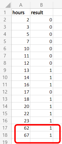
Logistic Regression is usually used for binary classification. Let's get a simple example for binary classification. We have some data set students who are whether pass or fail the exam with weekly study hours. Also, We can represent pass as 1 and fail as 0.
| Study Hours | Result |
|---|---|
| 2 | Fail |
| 3 | Fail |
| 5 | Fail |
| 7 | Fail |
| 10 | Fail |
| 11 | Fail |
| 12 | Fail |
| 13 | Pass |
| 14 | Pass |
| 16 | Pass |
| 17 | Fail |
| 18 | Pass |
| 20 | Pass |
| 22 | Pass |
| 23 | Pass |
Let's see what happens when we plot these data and get the best fit line using linear regression. First, you have to save this data into a
.csv file like this. In my case, book.csv is the file name.
Open jupyter notebook and start with installing some libraries that we need to perform this task.
!pip install numpy
!pip install pandas
!pip install matplotlib
Import those libraries
import numpy as np
import pandas as pd
import matplotlib.pyplot as plt
Read
book.csv filedata = pd.read_csv("book.csv")Assign hours and results values as numpy array
hours = np.array(data['hours'].values)
results = np.array(data['result'].values)
Plot data using matplotlib library.
plt.scatter(hours, results, color='green')
plt.xlabel("Hours")
plt.show()
You can see the graph like this.

Draw best fit line
# m - slope
# b - intercept
m,b = np.polyfit(hours,results,1)
plt.xlabel("Hours")
plt.plot(hours, results, 'o', color='green')
plt.plot(hours,m*hours+b)
So, if we draw a line
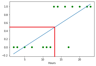
y=0.5, We can see mostly 13 or less than study hours students are failed, and others are passed the exam because the y value is 0.5 or higher.Typically, We can conclude that the linear regression is correct for this. But what happen if I add some higher values to that data set?
The graph and best fit line will change like this

So now, If divide from
y=0.5, we can see something wrong in the linear regression. It's not a fair line as the previous one.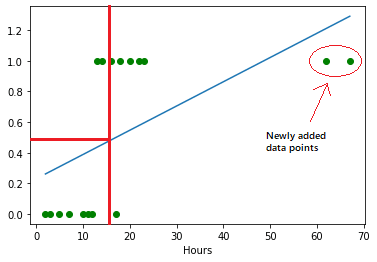
Come back to the main topic, "Why Logistic Regression?". Now you understand that there is a issue with the linear regression for classification problems. If we add more higher data records, it will never get a fair line, therefore, we cannot satisfy with the output. That's why we use logistic regression for classification problems like this.
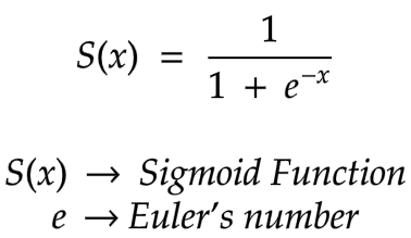
In a nutshell, when we come to a classification problem, we have to use a sigmoid function instead of a straight line. It looks like an S shape graph. Not a straight line. The formula of the sigmoid function is,
Therefore, When we get the previous original data set (without newly added two data points), we had 15 data records. So now, the graph will look like this using the sigmoid function.

If we divide from
y=0.5, more than 0.5 (y>0.5) are passed students, and lower than 0.5 (y<0.5) are failed students. Also, we can dismiss some data points that I marked in the graph below because those will occur rarely.
Using the Python Scikit Learn library, We can implement and train a logistic regression model. In this case, We use 15 records data set (without newly added two data records) and implement binary classification.
Install Scikit Learn library
!pip install scikit-learnImport necessary libraries
import numpy as np
import pandas as pd
import matplotlib.pyplot as plt
# for divide data set to train data and test data
from sklearn.model_selection import train_test_split
# logistic regression model
from sklearn.linear_model import LogisticRegression
Read
book.csv file using pandasdata = pd.read_csv("book.csv")Take hours as x values and results as y values
# x_data as 2d array
x_data = data[['hours']]
y_data = data['result']
Then, divide the data set into train and test sections using the train_test_split method. In my case added the
random_state=2 parameter to prevent the data changes by random. In your case, you can use any number or dismiss it. Also, you can add the test_size parameter to change the percentage of the test data set if you want. (default - 0.25)x_train, x_test, y_train, y_test = train_test_split(x_data, y_data, random_state=2)If you execute
len(x_train) and len(x_test), you can see the length of those data sets. in my case, x_train length is 11, x_test length is 4.Create a logistic regression model object and train the model.
model = LogisticRegression()
model.fit(x_train, y_train)
Alright, now we can predict the result using the model. To do that, we can use x_test data.
model.predict(x_test)
# predicted result - array([1, 0, 0, 0], dtype=int64)
Then we have to know whether it is correct or not. We can manually check by executing
y_test. For me, the result is,11 1
4 0
5 0
0 0
Name: result, dtype: int64That is exactly the same as the predicted result👏. Also, you can test with your own data using the model.
Using four study hours values,
model.predict([[6], [15], [19], [25]])
# predicted result - array([0, 1, 1, 1], dtype=int64)| Study Hours | Result |
|---|---|
| 6 | Fail |
| 15 | Pass |
| 19 | Pass |
| 25 | Pass |
Get the score of prediction accuracy,
model.score(x_test, y_test)
# 1.0
For me, It's 1.0. That means 100% accuracy. But in your case, It may vary depending on the length of the data set and the trained data set.
If you want to see the sigmoid curve according to the data set, you need to install another library to make it easier.
!pip install seabornImport and
regplot it with book.csv data.import seaborn as sns
sns.regplot(x='hours', y='result', data=data, logistic=True)
20