26
Consistency vs flexibility when building components
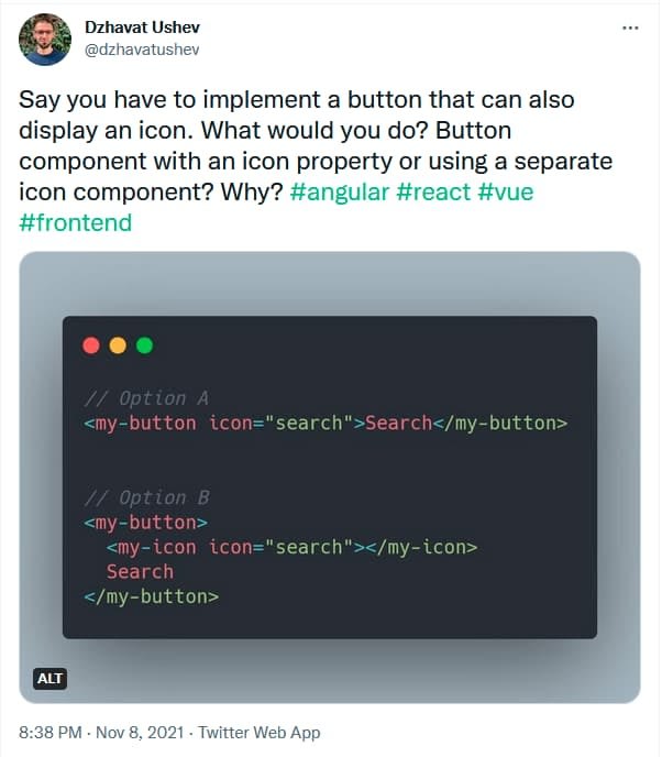
A few days ago I asked Twitter how would one solve the task of implementing a button component that can also display an icon. Is it by adding an icon property to the button component or by having a separate icon component nested inside the button? I also asked why would one choose one approach over the other.

Quite a few people replied with their pros and cons for both options. In this post I’m going to try and summarize the points mentioned there. I think that’s quite valuable to have as a reference in the future.
- Convention - only one way to display an icon
- Consistency - all buttons with an icon will look the same across the app/product
- Simpler syntax to remember
- Simple at first but might become complex later on when more requirements like position, size, color, etc. are added. Requires expanding the button component to support more properties
- Less control over the icon
- Harder to tweak accessibility extras on a case by case basis
- Flexibility - things like margin, position, size, color, etc. are easier to tweak
- Composition - building a complex UI element by combining two simpler components
- Icon can be loaded differently (e.g. icon component, raw SVG element, etc.)
- Easier to add accessibility extras to the icon on a case by case basis
- Easier to test the button component because it doesn’t depend on the icon
- Separation of concerns
- People might end up creating their own styles by changing padding, margin, size, etc.
- Good documentation is necessary in order to keep the style consistent across the app/product
As you can see, there are pros and cons with both solutions. Which one to choose will depend on factors like requirements, app size, team size, etc. Nevertheless, there are some signs that can point you in a specific direction.
- Who are your users? Do you create components for other developers who don’t necessarily care as much about front-end development as you? They just want to solve their task and move on. Favoring consistency and convention can be a good choice thus Option A might be preferable.
- Do you know from the beginning that you’re going to have many buttons with an icon in them? Option A can be a good choice.
- Do you value flexibility and having more control over the components? Are other developers going to use those components to build UI as well? Write documentation with examples so they have a good starting point. Option B might be preferable in this case.
As a side note, I’m not saying that it’s impossible to keep the style consistent with Option B. But it’s harder when all the possibilities are available. Counter that with documentation, good examples, PR reviews and guidance.
Do you have other points that are not mentioned above? Share them on the Twitter thread.
Thanks to everyone who responded to my question and inspired this post ♥
26
