16
Designing fast sign in forms— diving into the data
The modern web is obsessed with speed. Just this week, Vercel launched Next.js 11 with a special focus on Core Web Vitals, a new set Google metrics that are measured in tens of milliseconds to determine page speed. Google has noticed that faster websites mean better user experiences, and has incorporated these metrics into their search ranking algorithms.
At Clerk, we're focused on a speed challenge that's equally important but often neglected: how quickly can users sign in?
In working to optimize our prebuilt Sign In UI, we've learned a few surprising lessons we thought are worth sharing.
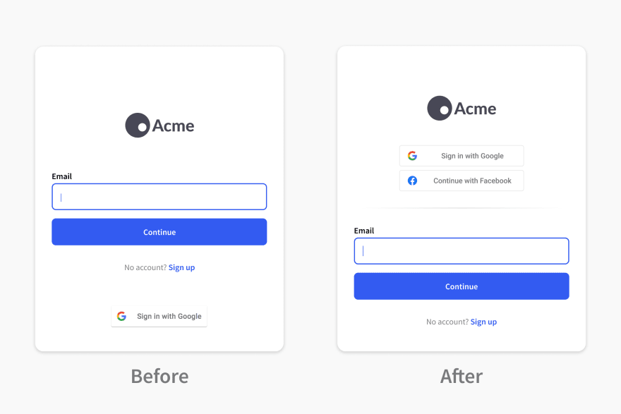
After much qualitative debate - Clerk originally launched with Google and Facebook sign in buttons below the option to sign in by email.
After collecting a few months of data, we realized we should make an adjustment. There was a near 50/50 split of users who preferred Social Sign In vs email and password. But, Social Sign In was also faster: ~5 seconds on average compared to ~8 seconds for email and password. So we made the switch:

In the months since making this change, Social Sign In usage has started to outpace email and password, with the last month seeing a 52/48 split.
As expected, since more users are now using a faster authentication strategy, that shift has also resulted in a faster overall speed of Sign In.
The passwordless concept has existed in authentication systems for decades. If a user forgets their password, a code or link sent to their email address can be used to authenticate instead.
Recently, there has been a lot of buzz about promoting passwordless flows to the primary authentication mechanism. While we allow developers to configure Clerk in this manner, we recommend against it, and instead suggest leaving it as a fallback.
On average, we see passwordless flows take ~35 seconds to complete. Despite using Sendgrid to deliver our emails quickly and with high inbox rates, the process of checking email is just slow in comparison to Social Sign In or email and password.
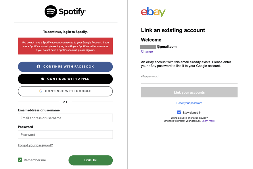
While building Clerk, we cataloged any frustrating user experiences we encountered across the web and made sure to fix them. The source of many screenshots was Social Sign In - even among the web's biggest properties, it's common to stop users from using a Social Sign In if they didn't originally Sign Up that way:

While it's obvious that roadblocks like these slow the sign in process, handling them elegantly takes a lot of development time. Many developers are comfortable pushing off a proper solution because these scenarios feel like edge cases.
In practice, we've learned that these "edge cases" are surprisingly common. In fact, 15.9% of users who have used Social Sign In have also used another method. Of those:
2 in 3 originally signed up with a password then later chose Social Sign In
1 in 3 originally signed up with Social Sign In, then later tried signed in without (they were sent a code to their email)
At Clerk, we've invested heavily in handling these scenarios as elegantly and quickly as possible. Regardless of a user's choice of sign in strategy, they will always be linked to the same underlying account.
Clerk's prebuilt Sign In UI
Clerk enables developers to add beautiful, high-conversion Sign In form to their application in minutes. Our prebuilt UI can easily be themed to match any company's brand and style guidelines.
We're constantly analyzing the data in search of better user experiences, as well as evaluating new technologies for addition to our product. If you have questions or ideas for improvement, reach out to us on Twitter @ClerkDev, or through support.
This article was originally published on Clerk.dev by Colin Sidoti, CEO and Co-Founder of Clerk.
16
