31
Create an advanced scroll lock React Hook
Written by Luke Denton ✏️
Scroll lock is a technique used on websites when we don’t want a user to scroll the page. This sounds counterintuitive; why would we ever want to prevent a user from scrolling our web page to see content!?
In this article, we’ll explore scroll lock, and attempt to create a cross-device React Hook that will handle layout shift caused by applying it. As we go through demonstrations of web pages that don’t have scroll lock, it will become clear when and why we would want to prevent a user from scrolling our pages.
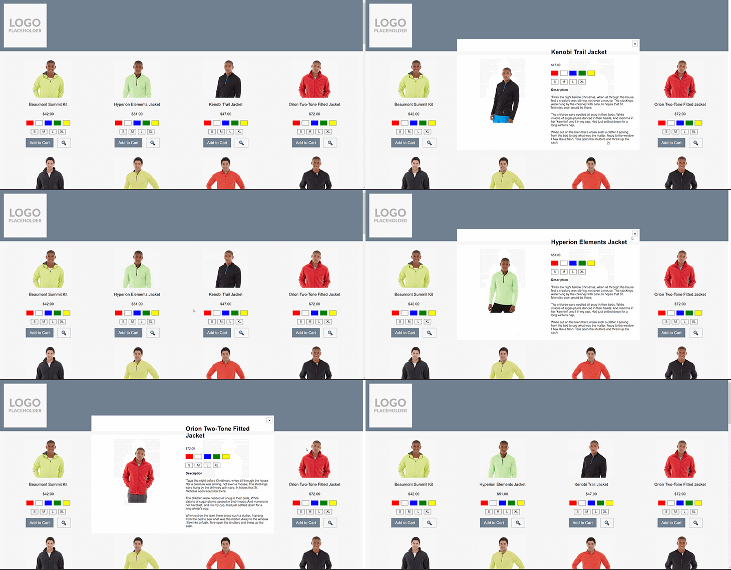
The best way to get an appreciation for scroll lock is to demonstrate the experience that a user will get when scroll lock isn’t considered:

In the image above, we can see a user opening a quick view modal. When the modal opens, the user places their cursor over the modal content and scrolls their mouse wheel; the background page moves! This can be very disorienting to a user as it’s not what they would expect to happen.
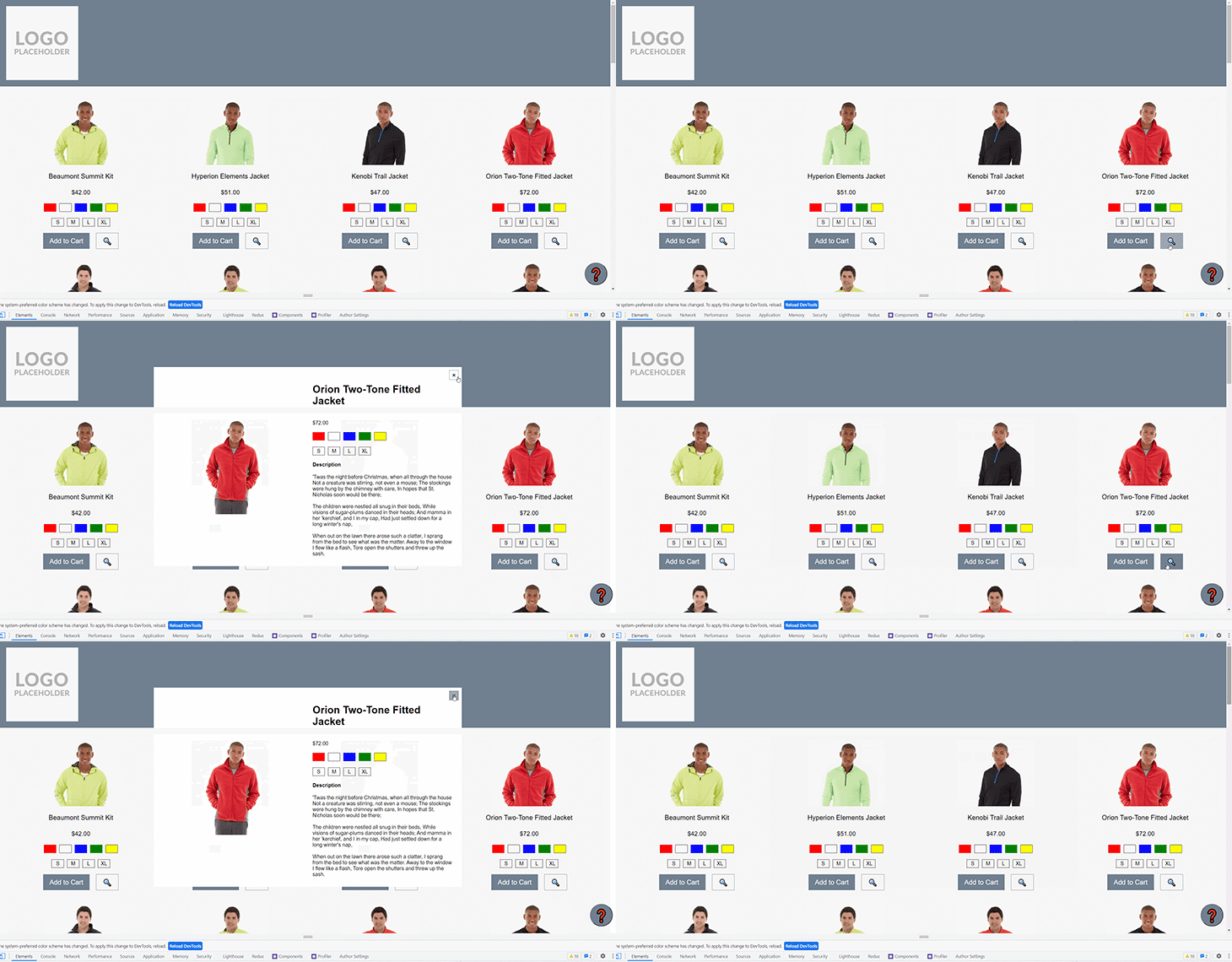
What happens if the quick view container has some long content itself, and has its own scrollbar?:

In the capture above, we can see that the modal gets opened, and the scrollable content within that modal is scrolled. When we get to the bottom of that content, the background page then starts to scroll.
Attempting to scroll back up only scrolls the background page up, not the content that the mouse is hovering over. It’s not until scrolling pauses for a second, that the browser will allow the cursor to scroll the content in the modal.
A scrolling background is also a nuisance when dealing with a mobile menu. Oftentimes the mobile menu will sit completely over the top of the content, or take up 90 percent of the viewport.
As we demonstrated above, the browser will still allow a page underneath an element to scroll, which means it’s very easy for a user to open the menu, accidentally scroll the background page, close the menu without making any selections, and be shown completely different content.
Lets update our application to account for users scrolling when we wouldn’t expect them to scroll. We’ll start by creating a Hook, importing it into our component, and then setting up the scroll lock implementation.
First, the structure of our Hook:
import React from 'react';
export const useScrollLock = () => {
  const lockScroll = React.useCallback(() => {
    /* ... */
  }, [])

  const unlockScroll = React.useCallback(() => {
    /* ... */
  }, []);

  return {
    lockScroll,
    unlockScroll
  };
}
Next, lets import that Hook into our component:
const PLP = () => {
  const [quickViewProductId, setQuickViewProductId] = React.useState(0);
  const { lockScroll, unlockScroll } = useScrollLock();

  const displayQuickView = (productId) => {
    lockScroll();
    setQuickViewProductId(productId);
  }

  const hideQuickView = () => {
    unlockScroll();
    setQuickViewProductId(0);
  }

  return (
    /* Products list and conditionally rendered quickview modal */
  );
};
Now that we have the bones of our application, lets implement the lockScroll and unlockScroll functions:
const lockScroll = React.useCallback(() => {
  document.body.style.overflow = 'hidden';
}, [])

const unlockScroll = React.useCallback(() => {
  document.body.style.overflow = '';
}, [])
That’s it! Our scroll lock functions are set up and working as expected. We could call it done and start using it in our app. But there are still a few details that need to be addressed.

Above, you might notice a slight issue when the lockScroll function is called. Take a close look at the right side of the image below, and you’ll notice the scrollbar disappears. Nothing wrong with it disappearing, this is exactly what we want, as that tells the browser that the user can’t scroll.
However, with the scrollbar disappearing, the width of the page has increased, so any centered content is no longer centered and needs to shift across slightly. This slight shift is very noticeable to a user.
In order to prevent the layout shift from happening, let’s compensate for the width of the browser scrollbar.
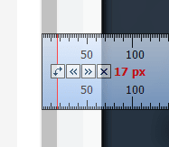
Start by measuring the width of our browser scrollbar. We’ll pull out a pixel ruler and check just how wide that scrollbar is:

My browser window is giving me a width of 17px. Great, lets make use of this value in our Hook:
const lockScroll = React.useCallback(() => {
  document.body.style.overflow = 'hidden';
  document.body.style.paddingRight = '17px'
}, [])

const unlockScroll = React.useCallback(() => {
  document.body.style.overflow = '';
  document.body.style.paddingRight = ''
}, [])
And the result:

Looking pretty good! We can see that the scrollbar disappears, and the content isn’t shifting at all.
Lets just run a quick check in another browser, in this case, Opera:

Ah, it seems this doesn’t work in Opera, the content is shifting again, the other way! That must mean the scrollbar width isn’t consistent between browsers even on the same OS. I’m sure most people would have already known this, but it’s still worth demonstrating the point.
Now when I mention that macOS, iOS, and Android are likely going to have very different default scrollbar widths, it can be more easily appreciated that we can’t just hard code a value for compensation. We will need to calculate the scrollbar’s width and use that result as the padding value on the body element.
To dynamically calculate the width of the scrollbar, we can use the inner width of the browser window (inner because we need to allow for a user who is browsing with a viewport that isn’t maximized to their monitor), and the width of the body element. The difference between these two widths will be the width of the scrollbar itself:

Let’s update our Hook to use this value for the padding applied to the body element, and then recheck our app in Opera:
const lockScroll = React.useCallback(
  () => {
    const scrollBarCompensation = window.innerWidth - document.body.offsetWidth;
    document.body.style.overflow = 'hidden';
    document.body.style.paddingRight = `${scrollBarCompensation}px`;
  }, [])
That’s much better! The different width of the scrollbar used by default in Opera is now being appropriately compensated for. I’ve checked Chrome too, and it’s working as before. You’ll have to take my word for it, or you can download the code from GitHub and test it out yourself!
This Hook is looking great, we’re pretty much ready for production! However, there are a couple more things we’ll want to consider, like iOS Safari and sticky elements.
Ecommerce websites use sticky elements all the time: headers, promo bars, filters, modals, footers, and the live chat or floating action buttons (FAB).
Lets look at the FAB to extend our scroll lock implementation. First, how is the FAB positioned?
.button--help {
  position: fixed;
  right: 10px;
  top: 90vh;
  /* ... */
}
We’ve placed the FAB in the bottom right corner of the viewport. We want it always to be visible, because we want our users to be able to access help as quick as possible.
What happens to this button when we open our quick view modal and enable scroll lock?

It appears the button is shifting when scroll lock is applied! As the element is no longer placed within the document flow of the body element, the scrollbar compensation doesn’t have any effect.
At this point, we need to branch out from just our Hook in order to prevent this layout shift, and the layout shift that would occur for any sticky elements.
To do that, we’re going to use our Hook to set a CSS custom property on the body element, which will be used within the styling of any element that we give a fixed position, as an offset on the ride side.
Some code will make that description clearer:
export const useScrollLock = () => {
  const lockScroll = React.useCallback(
    () => {
      // ...
      document.body.style.paddingRight = 'var(--scrollbar-compensation)';
      document.body.dataset.scrollLock = 'true';
    }, [])

  const unlockScroll = React.useCallback(
  () => {
    // ....
    delete document.body.dataset.scrollLock;
  }, []);

  React.useLayoutEffect(() => {
    const scrollBarCompensation = window.innerWidth - document.body.offsetWidth;
    document.body.style.setProperty('--scrollbar-compensation', `${scrollBarCompensation}px`);
  }, [])

  // ...
}
We’ve added a useLayoutEffect to our Hook that will set the CSS custom property on the body element, and seeing as though we now have that compensation value available, we’re making use of it when adding padding to the body, rather than calculating it again. We’re also adding a data property onto the body element that we can use as a trigger to conditionally use the --scrollbar-compensation variable.
There is the potential for the --scrollbar-compensation value to be set on the body element multiple times if there are multiple components being rendered that make use of the useScrollLock Hook, but setting a CSS custom property on an element doesn’t appear to cause a browser repaint, so there should be minimal performance drawbacks.
Now that we have --scrollbar-compensation available to any element that is a child of the body element (which is every element), we can use it when styling those elements!
Here is our styling for the FAB again, with the CSS custom property being put to use, and the result when applying scroll lock:
[data-scroll-lock] .button--help {
  margin-right: var(--scrollbar-compensation);
}
The FAB isn’t going anywhere! Our modal is opening, scroll lock is being applied, and none of the UI is shifting at all. We’re very close to the finish line now! We’ve done a cross-browser check, now we have to do a quick cross-device check.
It appears that the scroll lock function isn’t working on iOS.

Opening the modal does apply our scroll lock that we’ve developed thus far, but that scroll lock doesn’t have any effect in iOS.
As with all browser quirks we’ve had to hack around over the years, there are many ways to solve for iOS. We’re going to handle iOS specifically, with a user agent sniff and an adaption of an approach originally presented by Markus Oberlehner:
const lockScroll = React.useCallback(
  () => {
    document.body.dataset.scrollLock = 'true';
    document.body.style.overflow = 'hidden';
    document.body.style.paddingRight = 'var(--scrollbar-compensation)';

    if (isiOS) {
      scrollOffset.current = window.pageYOffset;
      document.body.style.position = 'fixed';
      document.body.style.top = `-${scrollOffset.current}px`;
      document.body.style.width = '100%';
    }
  }, [])

const unlockScroll = React.useCallback(
  () => {
    document.body.style.overflow = '';
    document.body.style.paddingRight = '';

    if (isiOS) {
      document.body.style.position = '';
      document.body.style.top = ``;
      document.body.style.width = '';
      window.scrollTo(0, scrollOffset.current);
    }
    delete document.body.dataset.scrollLock;
  }, []);
The idea of the approach is to set the body to position = 'fixed' and then programmatically offset the body to match the current scroll distance, which will compensate for the browser wanting to display the top of the body content at the top of the viewport.
When scroll lock is disabled, we use the scroll offset value to jump the browser window down to the same place that it was before the user opened the modal. All of these changes result in an effect that mimics the scroll lock that is much easier in other browsers.

There we are, we now have our completed Hook, and we’ve tried our best to ensure it will work on as many devices as possible. Hopefully now you’ll have a better appreciation for the times that we want to prevent a user from being able to scroll our web page - to avoid that user getting disoriented.
We might think that users wouldn’t try to keep scrolling a section of a modal when the scrollbar is clearly at the end, or try scrolling a menu when there is clearly no indication that there is more content to scroll to. However, users use our websites in weird and wonderful ways, and the best we can do is to help them not get into a situation where they’re lost, disoriented, or frustrated, as that could directly lead to them leaving the website and finding another.
Debugging React applications can be difficult, especially when users experience issues that are hard to reproduce. If you’re interested in monitoring and tracking Redux state, automatically surfacing JavaScript errors, and tracking slow network requests and component load time, try LogRocket.

The LogRocket Redux middleware package adds an extra layer of visibility into your user sessions. LogRocket logs all actions and state from your Redux stores.
Modernize how you debug your React apps — start monitoring for free
31
