37
Choose the correct color palette for your next project!
Hello guys,🙋♂️
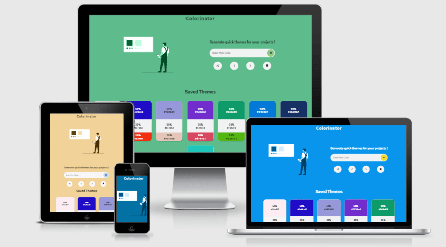
this short article is about my recent side project called
this short article is about my recent side project called

It is a quick color palette generator based on the 60-30-10 rule of UI design. You can use the color palettes generated by this website for any kind of project; apps, website, ppts and almost everywhere.
One of the main highlight is that you can see the real time preview of the theme colors! This will help you to get an idea of which color combination works best for your project.
I used to get confused about what color scheme should I use for my projects. There are numerous colour palette generators available, but the problem is that most of those provide too many possibilities, and many of them just produce random colours that may or may not work well together.
To minimize this ambiguity, I developed this simple solution, which selects a primary color based on user input or at random, and then derives secondary and accent colors depending on the contrast ratio.
To explain you in short, use a main/primary color on 60% of your elements as a theme color. Out of remaining 40%, you can use a secondary color on 30% elements which need user attention or provide valuable information to user. The rest 10% will be action elements which can be colored with Accent color to give them a distinct look from the rest of the elements.
If you observe carefully, the primary color is used as background color. Secondary color is almost white with slight tint of primary color...which is used for elements that require user focus like the user input field. The Accent color is used to highlight the website footer.
On inverting the theme, the primary and secondary colors are swapped and applied the same way.
With this type of theming, you can get an idea of how you can use the colors in your project.
On inverting the theme, the primary and secondary colors are swapped and applied the same way.
With this type of theming, you can get an idea of how you can use the colors in your project.
The user can provide a main color which is intended to be used as a primary color for the project or the user can go for a random color as primary color using the random button.
On getting the primary color, the app calculates the font color for the website and the secondary and accent colors that go with the primary color.
How does it calculate secondary and accent colors ? The answer lies in this article
On getting the primary color, the app calculates the font color for the website and the secondary and accent colors that go with the primary color.
How does it calculate secondary and accent colors ? The answer lies in this article
Apart from this, the accent color is either calculated based on the logic mentioned in the article or the color opposite to the primary color is picked from the color wheel.
Get a primary color of your choice from anywhere on the net. Paste the primary color hex code in the input field and voila! You will get the most suitable secondary and accent color combination for your primary color.
Also, if you hit enter for the same hex code, you will get slight variations for secondary and accent colors too.
I have very well documented everything on in my github readme. If still you have any doubts/ suggestions you can comment them below and I'll get back to you😉
Also, if you hit enter for the same hex code, you will get slight variations for secondary and accent colors too.
I have very well documented everything on in my github readme. If still you have any doubts/ suggestions you can comment them below and I'll get back to you😉
Do use this app for your upcoming projects and let me know what better can be done. Thank you!
37

