45
Create a pure CSS sphere
Css spheres may sound impossible (or at least very tedious) considering that we need to position hundreds of divs and everything but that is not actually the truth. In fact, we can make a realistic CSS sphere using only one div and minimal CSS! In fact, we don’t even need to make a real sphere, we can just make a div that looks like a sphere using a radial gradient.
We will start slow. We will just add a simple div and give it a class “sphere”.
<div class = 'sphere'></div>Now we will add a bit of CSS (below is the styling for the sphere)
.sphere {
  border-radius: 50%; /* to make it a circle */
  background:
    radial-gradient(
      circle at 30% 30%,
      #ffff00,
      #774400
    ); /* this is the radial gradient I was talking about */
}
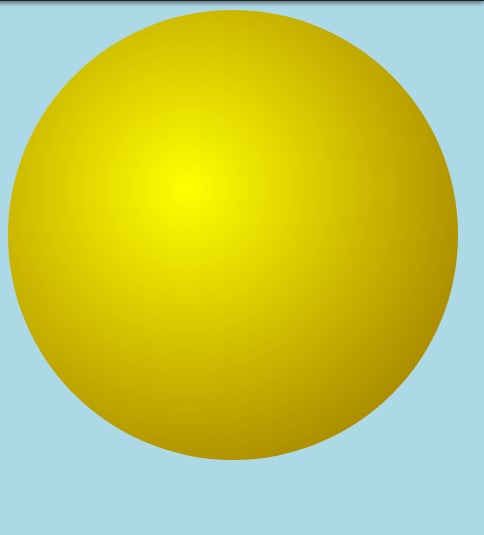
Looks great, right? We will have a yellow sphere with the light coming from the top right corner, at least that is what we think. After seeing this codepen, we see the world’s most perfect, glorious and annoying white space. Why? What mistake did we make? It turns out that we forgot to set a width and height for the div meaning that it will be 0px X 0px since there is no content inside it.

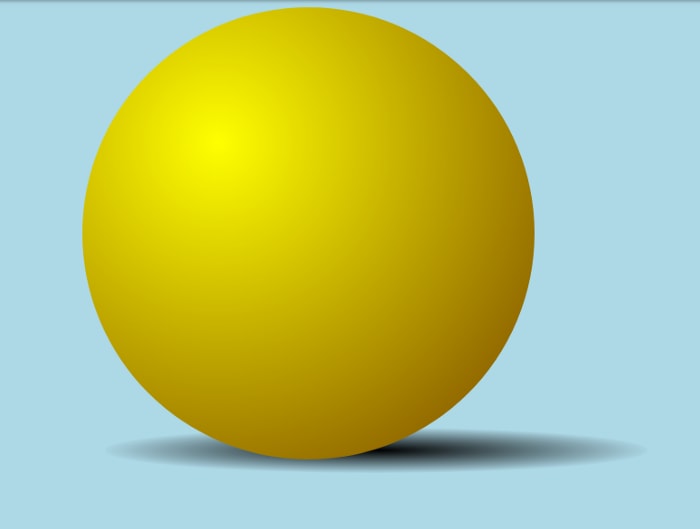
Looks pretty realistic, but It looks like it is floating in the middle of nowhere. Not the best way to make something realistic, is it? What do we do? We add a shadow. This will give the illusion that the sphere is on a surface. For now, we will add just one shadow which will be slightly transparent (in case we want to add another shadow later). The link to the codepen is here. We still haven’t succeeded in putting it on the ground. What we did succeed in is making it look even more like it is floating. We can use a new div to do this. We play around with the margins and background and get this:

Ok now it looks realistic, but how do we rotate it? Transforms don’t work, as we can see here.
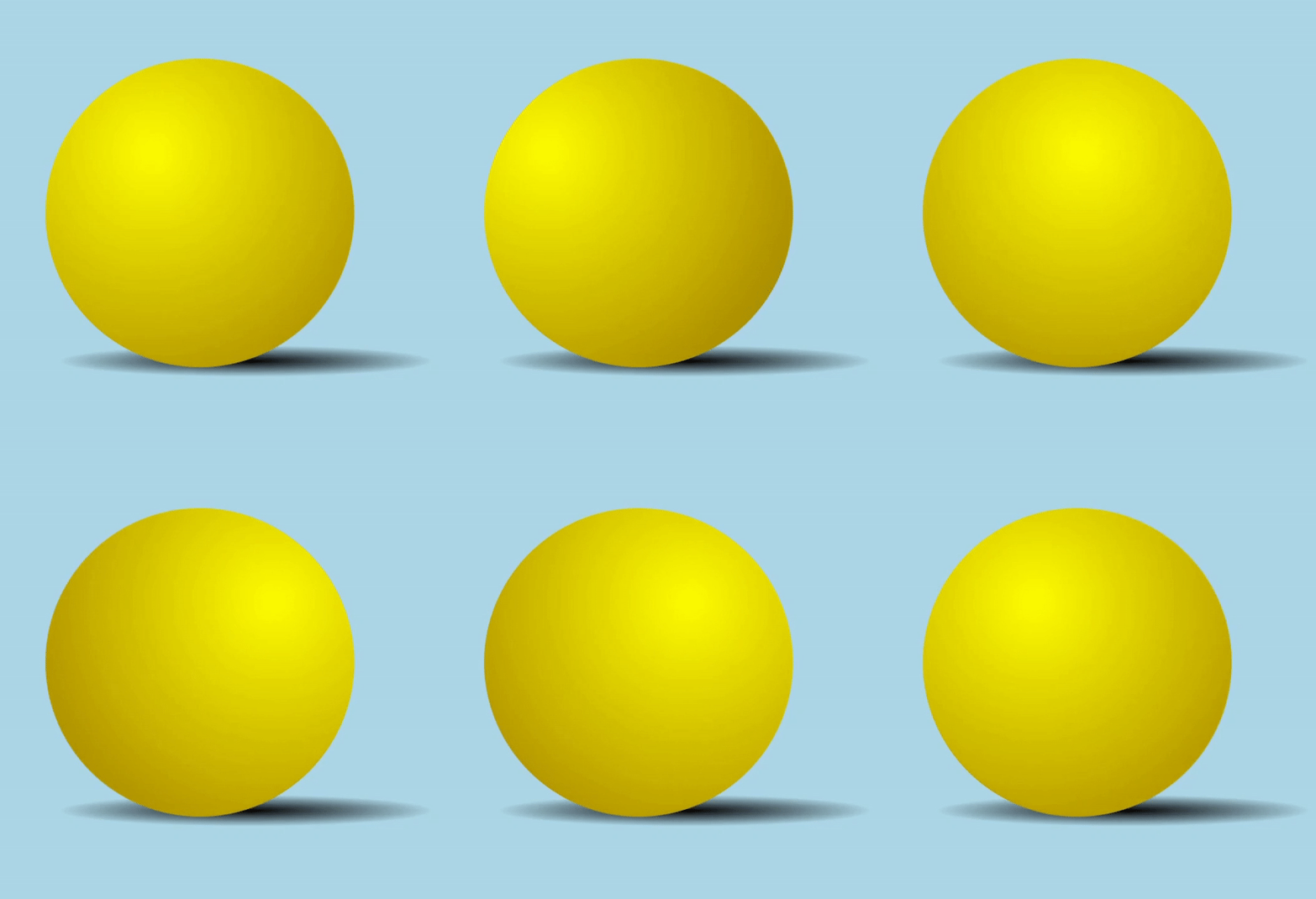
If you remember that this is not an actual sphere, then you might remember why. We used a gradient for the 3d look so transforms won’t do much. Instead, we will have to change the center of the gradient. Now we use background position as shown here, which doesn’t work either. It is because of the way that browsers process background-position. What can we do to fix this. You can just make background-size 200%. Now the rotation works!
Time to animate it. For now, we want a ball rotating from left to right. A change in the location of the light source will also work. If we play around a bit with some CSS animations, we can get the below result.

Looks good, right? The light is moving from left to right and back again, but something is off. The shadow is refusing to move. To fix this, we need to add a new animation for the shadow. We will only need to change the margin-left property and voilà, we will get a perfect rotating sphere animation. The link to the codepen is here.
You can view the snippets on github here.
45
