31
How to Build a Bookmark app using Tailwind, React and Strapi
This tutorial will build a Bookmarking app using React and style it with Tailwind CSS, and the backend will be built using Strapi.
These API endpoints can then be consumed from clients (mobile, desktop, web). The APIs are created in Strapi in the form of collection or single-type. A collection in Strapi contains the endpoints:
/endpoints: This endpoint adds new content./endpoints: Returns all data./endpoints/:id: Returns data by its id./endpoints/:id: Deletes a specific content./endpoints/:id: Edits a specific content.What do we mean by Headless CMS?
A headless CMS is a CMS with only a backend. The CMS provides only the backend to the users, not the frontend. CMS like WordPress is "headful" because we can build our backend - APIs and their content on it and build the frontend on it. The frontend is the HTML page the displays content that users will see.
A CMS has:
Headless CMS removes the last part. It does not provide any frontend for the users. It only provides the backend with the APIs for the users to use. So the "head" is chopped off, hence the term "headless."
So the "headless" is what Strapi gives us. It separates our content from the tech stack of our website and provides the content as data over an API. So we build the backend and the frontend separately without depending on each other.
Typically, during website design, CSS classes are created for each HTML element to style them. These CSS classes are mostly inline initially, but later on, they are extracted and held in CSS files. That's a general practice.
Now, this will ultimately lead to huge CSS files with our styling. So Tailwind does away with CSS files.
Now, this will ultimately lead to huge CSS files with our styling. So Tailwind does away with CSS files.
But what is Tailwind?
According to tailwindcss:
A utility-first CSS framework packed with classes like
A utility-first CSS framework packed with classes like
flex, pt-4, text-center, and rotate-90 that can be composed to build any design directly in your markup.Unlike other CSS frameworks like Bootstrap, Foundation, Bulma, Material Design, etc. does not contain components like
Buttons, Cards, BottomSheets, etc. Instead, Tailwind only has low-level CSS classes. You then use these classes to build your components.We will build a bookmarking app to demonstrate how we can use Tailwind CSS framework and Reactjs to design and develop the app and learn how to consume our Strapi APIs from Reactjs.
The bookmark app will let users store links to websites, notes, save social media posts, etc., for easy retrieval. Just like the bookmark feature of most modern browsers, it allows users to store.
We will start by scaffolding a Strapi project.
Create a central folder
strapi-tailwind: mkdir strapi-tailwind. Move into the folder: cd strapi-tailwind.This
strapi-tailwind folder will contain our Strapi backend and our Reactjs frontend.Now run the below command to generate a Strapi project:
npx create-strapi-app strapi-api --quickstart
    # OR
    yarn create strapi-app strapi-api ---quickstart
This command will create a Strapi project in
Strapi will serve the project on
strapi-app folder.Strapi will serve the project on
localhost:1337. It will launch the Strapi admin UI panel on localhost:1337/admin.Fill in your details and click on the "LET'S START" button. Then, we will begin to build our bookmark collection.
In our app, a bookmark will have a title, content, and synopsis. The Bookmark model will be this:
Bookmark {
        title
        content
        synopsis
    }
The
title field will be the title of the bookmark. The content will be the content of the bookmark, and it can be links, notes, etc. Finally, the synopsis holds a preview of the bookmark's content.On the Strapi admin UI, click on the"> CREATE YOUR FIRST CONTENT-TYPE" button.

A modal will show up, type in
bookmark and click on the Continue button.
Insert the fields:
Text field, type in "title".Text field, type in "content" and select "Long text".Text field, type in "synopsis"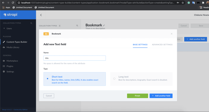
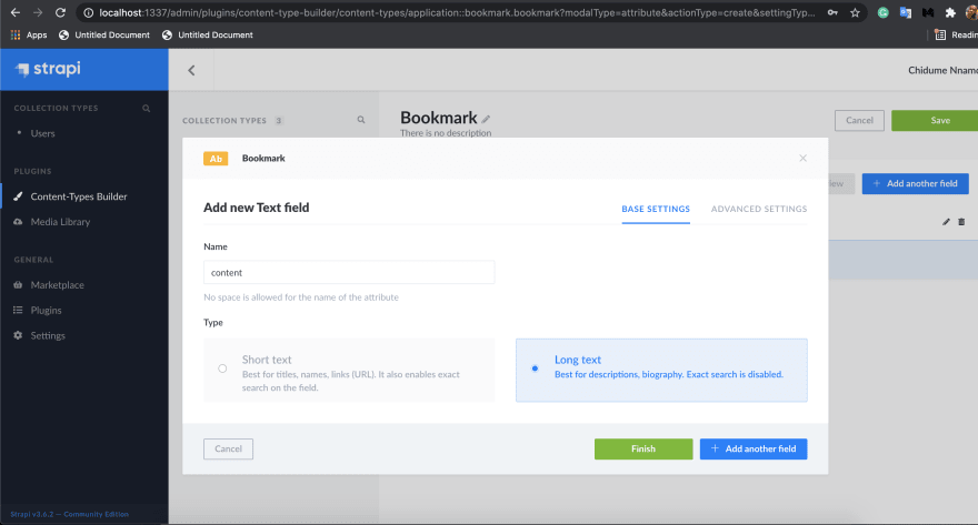

Click on the
Finish button. On the page that appears click on the "Save" button on the top-right section of the page.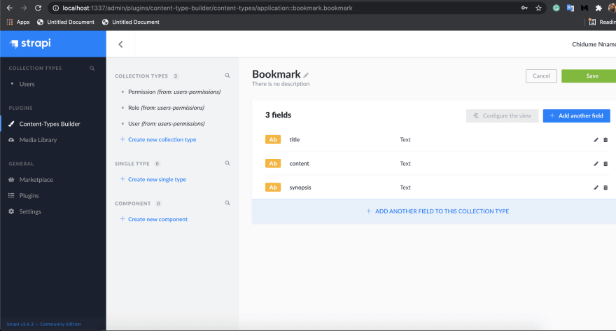

We will now have the below endpoints in our Bookmark collection:
/bookmarks: Create a new bookmark/bookmarks: Get all bookmarks/bookmarks/:id: Get a bookmark/bookmarks/:id: Delete a bookmark/bookmarks/:id: Update a bookmark.Let's insert some content in our
Bookmark collection. First, click on the Bookmarks item on the sidebar, click on the + Add New Bookmarks button on the top-right page.Type in the below data:
"title" -> Become a qualified dev

    "content" -> https://raddevon.com/5-projects-to-become-qualified-as-a-web-developer/?ck_subscriber_id=1287376433

    "synopsis" -> https://raddevon.com/5-projects-to-become-qua...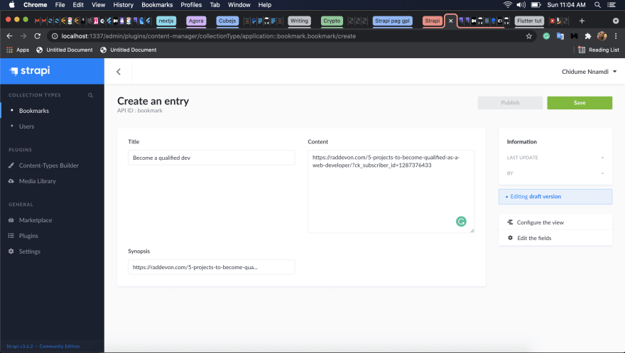
See that we are bookmarking a link so we can retrieve it easily.
Click on the "Save" button on the top-right section of the page, then click on the "Publish" button.
Let's add another data:
"title" -> A Shadaya post

    "content" -> When they hit their 30s, the pressure won't be about iphones, clothes, cars, it will be about who got a lovely home, a stable marriage & a happy family. Jealous, bitterness & regrets for the "woke" ones & happiness, joy & fulfilment for the "lame" ones.

    "synopsis" -> When they hit their 30s, the pressure won't be about iphones...
This is a post from social media we want to bookmark.
Click on the "Save" button and then on the "Publish" button. This time let's bookmark a Twitter post link:
"title" -> Twitter post

    "content" -> https://twitter.com/Drwhales_/status/1388404654342610944

    "synopsis" -> https://twitter.com/Drwhales_/status/138...
Click on "Save" and on "Publish".
Like this, only authenticated users can access our bookmark endpoints, but we want everybody to access them without restriction.
To do that, click on the
Scroll down to "Permissions," and on the
Click on the
Our
Settings item on the sidebar. Then on Roles on the right and Public. Scroll down to "Permissions," and on the
BOOKMARK section, check the Select allClick on the
Save button on the top-right. This will save these changes.Our
Bookmark collection endpoints are now openly accessible by the Public.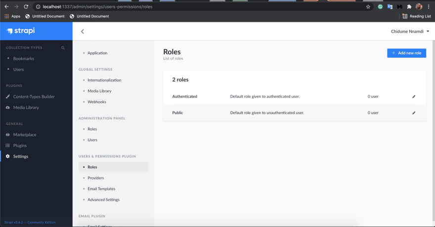

Now we build our frontend.
First, we scaffold a Reactjs app. Run the below command to do that:
npx create-react-app strapi-tailwindMove into the folder
cd strapi-tailwind.Install the dependencies:
axios: HTTP library, we will use it to make HTTP requests to the collection's endpoints.react-router-dom: React library for adding routing system to React apps.
yarn add axios react-router-domLet's set up Tailwind in our project.
Install the dependencies:
yarn add --dev tailwindcss@npm:@tailwindcss/postcss7-compat postcss@^7 autoprefixer@^9We installed the PostCSS because create-react-app does not support PostCSS 8 yet.
Next, we install Craco:
yarn add @craco/cracoThis dependency helps us configure Tailwind.
Next, we will update the
scripts in our package.json to use craco instead of react-scripts.Next create a
craco.config.js file in the root folder and paste the below code in it:// craco.config.js
module.exports = {
style: {
postcss: {
plugins: [require("tailwindcss"), require("autoprefixer")],
},
},
};Initialize Tailwind in our project by running the command:
npx tailwind initThis command will create a
tailwind.config.js in our root folder. Open it and paste the below code:module.exports = {
purge: ["./src/**/*.{js,jsx,ts,tsx}", "./public/index.html"],
darkMode: false, // or 'media' or 'class'
theme: {
extend: {},
},
variants: {
extend: {},
},
plugins: [],
};Now, we include Tailwind in our CSS. Paste the below CSS code in your
src/index.css file:@tailwind base;
@tailwind components;
@tailwind utilities;
...We are good to go.
Our app will have a single route
The page will look like this:
/, this index route will render the bookmarks in the system.The page will look like this:

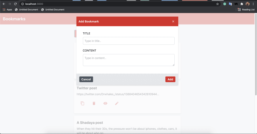


It will have a
We will have the components:
Header: This will contain the header of our app and will display on every page.BookmarkCard: This component will display a bookmark title and synopsis on the index page.AddBookmarkDialog: This is a dialog where new bookmarks are added to the system.EditBookmarkDialog: This is a dialog where an existing bookmark will be edited.ViewBookmarkDialog: This is a dialog that will display a bookmark's content.BookmarkList: This component displays all the bookmarks in our system.The above components will reside in a
components folder. Let's begin to create them:mkdir src/components
cd src/components
mkdir Header
touch Header/index.js
mkdir BookmarkCard
touch BookmarkCard/index.js
mkdir AddBookmarkDialog
touch AddBookmarkDialog/index.js
mkdir EditBookmarkDialog
touch EditBookmarkDialog/index.js
mkdir ViewBookmarkDialog
touch ViewBookmarkDialog/index.js
mkdir BookmarkList
touch BookmarkList/index.js
mkdir CloseIcon
touch CloseIcon/index.jsLet's start with the
Header component:Header
This component will hold a simple UI of the header section. Paste the below code to
This component will hold a simple UI of the header section. Paste the below code to
src/components/Header/index.js:export default function Header() {
return (
<section class="p-4 text-2xl font-bold bg-red-600 text-white mb-4">
<div>Bookmarks</div>
</section>
);
}See how we styled our header by applying Tailwind utility classes. We didn't use React's own
className, everything is done in the class attribute.The
p-4 applies padding of 4px to all the corners(top, bottom, left, and right). The text-2xl gives it a font size of 1.5rem. The font-bold sets the text to be bold. The bg-red-600 sets the background color of the header to be red in color with a darker opacity. The text-white sets the text color to be white. The mb-4 sets the bottom margin of the header to be 4px.CopyIcon
We will add a
We will add a
CopyIcon component. This component will render an svg icon representation of the copy symbol.Paste the below code to
src/components/CloseIcon/index.js:export default function CloseIcon() {
return (
<svg
width="12px"
height="10px"
xmlns="http://www.w3.org/2000/svg"
style={{ cursor: "pointer" }}
fill="white"
>
<path
d="M10.0719417,0.127226812 C10.1612888,0.127226812 10.2403266,0.161591074 10.3090551,0.230319596 L10.3090551,0.230319596 L10.8245191,0.745783513 C10.8932476,0.814512036 10.9276118,0.893549837 10.9276118,0.982896916 C10.9276118,1.07224399 10.8932476,1.1512818 10.8245191,1.22001032 L10.8245191,1.22001032 L6.77297267,5.27155671 L10.8245191,9.3231031 C10.8932476,9.39183162 10.9276118,9.47086942 10.9276118,9.5602165 C10.9276118,9.64956358 10.8932476,9.72860138 10.8245191,9.79732991 L10.8245191,9.79732991 L10.3090551,10.3127938 C10.2403266,10.3815223 10.1612888,10.4158866 10.0719417,10.4158866 C9.98259466,10.4158866 9.90355686,10.3815223 9.83482834,10.3127938 L9.83482834,10.3127938 L5.92809485,6.40509433 C4.98802554,7.34516364 3.68545904,8.64773014 2.02039535,10.3127938 C1.95166683,10.3815223 1.87262903,10.4158866 1.78328195,10.4158866 C1.69393487,10.4158866 1.61489707,10.3815223 1.54616855,10.3127938 L1.03070463,9.79732991 C0.961976106,9.72860138 0.927611845,9.64956358 0.927611845,9.5602165 C0.927611845,9.47086942 0.961976106,9.39183162 1.03070463,9.3231031 L5.08225102,5.27155671 L1.03070463,1.22001032 C0.961976106,1.1512818 0.927611845,1.07224399 0.927611845,0.982896916 C0.927611845,0.893549837 0.961976106,0.814512036 1.03070463,0.745783513 L1.54616855,0.230319596 C1.61489707,0.161591074 1.69393487,0.127226812 1.78328195,0.127226812 C1.87262903,0.127226812 1.95166683,0.161591074 2.02039535,0.230319596 L5.92761184,4.13822681 L9.83482834,0.230319596 C9.88637473,0.178773204 9.94372009,0.146556709 10.0068644,0.133670111 Z"
fillRule="nonzero"
></path>
</svg>
);
}We render an svg code of the copy symbol above. We made the icon to be 12px wide and 10px high. Also, we used the styling
style={{ cursor: "pointer" }} to make the cursor transform to a hand icon when the mouse cursor hovers above the copy icon, it gives the users hint that the copy icon is clickable.BookmarkCard
This component will receive a bookmark in its props and then proceed to display its title and synopsis.
This component will receive a bookmark in its props and then proceed to display its title and synopsis.
Paste the below code on
src/components/BookmarkCard/index.js:import axios from "axios";
import ViewBookmarkDialog from "./../ViewBookmarkDialog";
import EditBookmarkDialog from "./../EditBookmarkDialog";
import { useState } from "react";
export default function BookmarkCard({ bookmark }) {
const { id, title, content, synopsis } = bookmark;
const [edit, setEdit] = useState(false);
const [view, setView] = useState(false);
const [showCopy, setShowCopy] = useState(false);
var timeout;
function copyBookmark() {
navigator.clipboard.writeText(content).then(
function () {
/* clipboard successfully set */
setShowCopy(true);
clearTimeout(timeout);
timeout = setTimeout(() => {
setShowCopy(false);
}, 1000);
},
function () {
/* clipboard write failed */
setShowCopy(false);
}
);
}
function viewBookmark() {
setView(true);
}
function editBookmark() {
setEdit(true);
}
async function deleteBookmark() {
if (window.confirm("Do you want to delete this bookmark?")) {
await axios.delete("http://localhost:1337/bookmarks/" + id);
window.location.reload();
}
}
return (
<div
style={{ width: "600px" }}
class="border border-gray-200 rounded-md m-3 p-4 shadow-md bg-white hover:shadow-xl"
>
{showCopy ? <Message /> : null}
<div class="py-2">
<h4 class="text-xl font-bold">{title}</h4>
</div>
<div>{synopsis}</div>
<div class="py-2 my-3 flex">
<span
class="cursor-pointer inline mx-1 text-white font-bold py-2 px-4 rounded"
onClick={copyBookmark}
>
<CopyIcon />
</span>
<span
class="cursor-pointer inline mx-1 text-white font-bold py-2 px-4 rounded"
onClick={deleteBookmark}
>
<DeleteIcon />
</span>
<span
class="cursor-pointer inline mx-1 text-white font-bold py-2 px-4 rounded"
onClick={viewBookmark}
>
<ViewIcon />
</span>
<span
class="cursor-pointer inline mx-1 text-white font-bold py-2 px-4 rounded"
onClick={editBookmark}
>
<EditIcon />
</span>
</div>
{view ? (
<ViewBookmarkDialog
bookmark={bookmark}
closeModal={() => setView(false)}
/>
) : null}
{edit ? (
<EditBookmarkDialog
bookmark={bookmark}
closeModal={() => setEdit(false)}
/>
) : null}
</div>
);
}
function DeleteIcon() {
return (
<svg
xmlns="http://www.w3.org/2000/svg"
width="24"
height="24"
viewBox="0 0 24 24"
fill="#e73d52"
>
<path d="M6 19c0 1.1.9 2 2 2h8c1.1 0 2-.9 2-2V7H6v12zM19 4h-3.5l-1-1h-5l-1 1H5v2h14V4z" />
</svg>
);
}
function CopyIcon() {
return (
<svg
xmlns="http://www.w3.org/2000/svg"
width="24"
height="24"
viewBox="0 0 24 24"
fill="#e73d52"
>
<path d="M16 1H4c-1.1 0-2 .9-2 2v14h2V3h12V1zm3 4H8c-1.1 0-2 .9-2 2v14c0 1.1.9 2 2 2h11c1.1 0 2-.9 2-2V7c0-1.1-.9-2-2-2zm0 16H8V7h11v14z" />
</svg>
);
}
function ViewIcon() {
return (
<svg
xmlns="http://www.w3.org/2000/svg"
width="24"
height="24"
viewBox="0 0 24 24"
fill="#e73d52"
>
<path d="M12 4.5C7 4.5 2.73 7.61 1 12c1.73 4.39 6 7.5 11 7.5s9.27-3.11 11-7.5c-1.73-4.39-6-7.5-11-7.5zM12 17c-2.76 0-5-2.24-5-5s2.24-5 5-5 5 2.24 5 5-2.24 5-5 5zm0-8c-1.66 0-3 1.34-3 3s1.34 3 3 3 3-1.34 3-3-1.34-3-3-3z" />
</svg>
);
}
function EditIcon() {
return (
<svg
xmlns="http://www.w3.org/2000/svg"
width="24"
height="24"
viewBox="0 0 24 24"
fill="#e73d52"
>
<path d="M3 17.25V21h3.75L17.81 9.94l-3.75-3.75L3 17.25zM20.71 7.04c.39-.39.39-1.02 0-1.41l-2.34-2.34c-.39-.39-1.02-.39-1.41 0l-1.83 1.83 3.75 3.75 1.83-1.83z" />
</svg>
);
}
function Message() {
return (
<div class="z-50 fixed flex p-3 bg-blue-200 rounded-md border-2 border-blue-600 font-bold opacity-90">
<div class="mr-2">
<svg
xmlns="http://www.w3.org/2000/svg"
width="24"
height="24"
viewBox="0 0 24 24"
fill="#e73d52"
>
<path d="M19 3H5c-1.11 0-2 .9-2 2v14c0 1.1.89 2 2 2h14c1.11 0 2-.9 2-2V5c0-1.1-.89-2-2-2zm-9 14l-5-5 1.41-1.41L10 14.17l7.59-7.59L19 8l-9 9z" />
</svg>
</div>
<div>
<span class="text-red-600">Copied!</span>
</div>
</div>
);
}See the component destructures the passed in bookmark object from its props.
Next, we destructured the bookmark's
Next, we destructured the bookmark's
id, title, content, and synopsis from the bookmark object.We have states
edit, view and showCopy,the edit and view states toggles the EditBookmarkDialog and ViewBookmarkDialog visibility respectively. The showCopy toggles a message component when a bookmark's content is copied.The
The UI of this component displays the title and the synopsis of the bookmark. We used several Tailwind classes to design this component.
timeout will hold a setTimeout id, we will use this to clear out timeouts.The UI of this component displays the title and the synopsis of the bookmark. We used several Tailwind classes to design this component.
cursor-pointer: This makes the mouse take the shape of a hand.rounded-md: This makes the element's border-radius to be 0.25rem.inline: This makes the element to be an inline element.flex: This sets display:flex; on the element.hover: shadow-xl: This sets the box-shadow to be deeper when the element is hovered with a mouse.border: The border width is 1pxborder-gray-200: The border color is darker gray.py-2: This sets the top and bottom padding of the element to be 2px.m-3: This sets the margin of the element to be 3px.shadow-md: This sets the box-shadow of the element to be 0 4px 6px -1px rgba(0, 0, 0, 0.1), 0 2px 4px -1px rgba(0, 0, 0, 0.06);.z-50: The element has a z-index of 50. This controls the stack order of elements.fixed: Makes the element a positioned element, in this case, a fixed element.opacity-90: Makes the element have an opacity of 0.9Also, we have icons to copy, delete, edit, and view the bookmark. We used svg code to display the icons. Each icon has its component:
DeleteIcon - has svg code that renders a delete icon.ViewIcon - has svg code that renders an eye icon that denotes viewing an item.CopyIcon - this renders an svg code that renders a copy icon.EditIcon - renders svg code that renders an edit icon.We enclosed each icon in
span element with an onClick attribute. The copyBookmark function triggered by the copy icon, uses the Clipboard API to copy the contents of the bookmark.The
viewBookmark sets the view state to true which causes the ViewBookmarkDialog to show up. The bookmark and a closeModal function are sent to the component so the component can respectively access the bookmark and close itself using the closeModal function.The
editBookmark function sets the edit state to true which displays the EditBookmarkDialog component.The
deleteBookmark function deletes the current bookmark from the db. It makes a DELETE HTTP request to localhost:1337/bookmarks/+id. The id will be the id of the bookmark, after the request the page is reloaded.AddBookmarkDialog
This component is where we add new bookmarks. Paste the below code to
This component is where we add new bookmarks. Paste the below code to
src/components/AddBookmarkDialog/index.js:import axios from "axios";
import { useRef } from "react";
import CloseIcon from "./../CloseIcon";
export default function AddBookmarkDialog({ closeModal }) {
const formRef = useRef();
async function addBookmark() {
var { title, content } = formRef.current;
title = title.value;
content = content.value;
await axios.post("http://localhost:1337/bookmarks", {
title,
content,
synopsis: content.slice(0, 100) + "...",
});
window.location.reload();
}
return (
<div class="modal fixed -top-0 left-0 w-full h-full flex flex-col z-0 items-center">
<div
class="modal-backdrop opacity-70 bg-gray-50 fixed w-full h-full z-10"
onClick={closeModal}
></div>
<div class="modal-content z-20 w-2/5 mt-5 bg-white shadow-md">
<div class="modal-header flex justify-between items-center bg-red-600 p-3 text-white">
<h3 class="text-white font-bold">Add Bookmark</h3>
<span
style={{ padding: "10px", cursor: "pointer" }}
onClick={closeModal}
>
<CloseIcon />
</span>
</div>
<div className="modal-body content m-2 p-5 z-50">
<form ref={formRef}>
<div class="w-full">
<div class="pl-2">
<span>TITLE</span>
</div>
<input
type="text"
class="border-gray-200 border-2 w-full m-2 p-2 rounded-md"
placeholder="Type in title.."
name="title"
/>
</div>
<div class="w-full">
<div class="pl-2 mt-3">
<span>CONTENT</span>
</div>
<textarea
type="text"
class="border-gray-200 border-2 w-full m-2 p-2 rounded-md"
placeholder="Type in content.."
name="content"
></textarea>
</div>
</form>
</div>
<div className="modal-footer flex justify-between p-4 bg-gray-200">
<button
class="bg-gray-600 hover:bg-gray-700 text-white font-bold py-1 px-3 rounded"
onClick={closeModal}
>
Cancel
</button>
<button
class="bg-red-600 hover:bg-red-700 text-white font-bold py-1 px-3 rounded"
onClick={addBookmark}
>
Add
</button>
</div>
</div>
</div>
);
}See it has input boxes where the title and content of the bookmark are to be typed. The
Add button calls the addBookmark function, this function retrieves the values of the bookmark's title and content from the input boxes. Then it makes a POST HTTP request to
localhost:1337/bookmarks with the synopsis, title, and content retrieved from the UI as payload. The synopsis is generated by slicing off 100 words from the content to get a preview of the content. This request adds the bookmark to our Strapi backend. The page is reloaded which displays the newly added bookmark on the UI.BookmarkList
This component gets the list of bookmarks from the Strapi endpoint
localhost:1337/bookmarks and displays them.Add the below code to
src/components/BookmarkList/index.js:import BookmarkCard from "./../BookmarkCard";
import axios from "axios";
import { useEffect, useState } from "react";
import AddBookmarkDialog from "./../AddBookmarkDialog";
export default function BookmarkList(params) {
const [bookmarks, setBookmarks] = useState([]);
const [showAddBookmarkDialog, setShowAddBookmarkDialog] = useState(false);
useEffect(async () => {
const data = await axios.get("http://localhost:1337/bookmarks");
setBookmarks(data?.data);
}, []);
return (
<div class="flex flex-col flex-wrap justify-center">
<div class="m-2 p-2">
<button
onClick={() => setShowAddBookmarkDialog(true)}
class="bg-red-600 hover:bg-red-700 text-white font-bold py-2 px-4 rounded"
>
Add Bookmark
</button>
</div>
<div>
{bookmarks
?.sort((a, b) => b.created_at.localeCompare(a.created_at))
.map((bookmark, i) => (
<BookmarkCard bookmark={bookmark} key={i} />
))}
</div>
{showAddBookmarkDialog ? (
<AddBookmarkDialog closeModal={() => setShowAddBookmarkDialog(false)} />
) : null}
</div>
);
}We have a state,
bookmarks. This is an array state that will hold the bookmarks fetched from our Strapi backend.We use the
useEffect hook to call the localhost:1337/bookmarks endpoint. The returned bookmarks are set to the bookmarks state. The bookmarks are then rendered using the Array#map method.The
Add Bookmark button displays the AddBookmarkDialog component when clicked.EditBookmarkDialog
This component is where we can edit a selected bookmark. Paste the below code in
This component is where we can edit a selected bookmark. Paste the below code in
src/components/EditBookmarkDialog/index.js:import axios from "axios";
import { useRef } from "react";
import CloseIcon from "../CloseIcon";
export default function EditBookmarkDialog({ closeModal, bookmark }) {
const formRef = useRef();
async function editBookmark() {
var { title, content } = formRef.current;
title = title.value;
content = content.value;
await axios.put("http://localhost:1337/bookmarks/" + bookmark?.id, {
title,
content,
synopsis: content.slice(0, 100) + "...",
});
window.location.reload();
}
return (
<div class="modal fixed -top-0 left-0 w-full h-full flex flex-col z-0 items-center">
<div
class="modal-backdrop opacity-70 bg-gray-50 fixed w-full h-full z-10"
onClick={closeModal}
></div>
<div class="modal-content z-20 w-2/5 mt-5 bg-white shadow-md">
<div class="modal-header flex justify-between items-center bg-red-600 p-3 text-white">
<h3 class="text-white font-bold">Edit Bookmark</h3>
<span
style={{ padding: "10px", cursor: "pointer" }}
onClick={closeModal}
>
<CloseIcon />
</span>
</div>
<div className="modal-body content m-2 p-5 z-50">
<form ref={formRef}>
<div class="w-full">
<div class="pl-2">
<span>TITLE</span>
</div>
<input
type="text"
class="border-gray-200 border-2 w-full m-2 p-2 rounded-md"
placeholder="Type in title..."
defaultValue={bookmark?.title}
name="title"
/>
</div>
<div class="w-full">
<div class="pl-2 mt-3">
<span>CONTENT</span>
</div>
<textarea
type="text"
class="border-gray-200 border-2 w-full m-2 p-2 rounded-md"
placeholder="Type in content..."
defaultValue={bookmark?.content}
name="content"
></textarea>
</div>
</form>
</div>
<div className="modal-footer flex justify-between p-4 bg-gray-200">
<button
class="bg-gray-600 hover:bg-gray-700 text-white font-bold py-1 px-3 rounded"
onClick={closeModal}
>
Cancel
</button>
<button
class="bg-red-600 hover:bg-red-700 text-white font-bold py-1 px-3 rounded"
onClick={editBookmark}
>
Save
</button>
</div>
</div>
</div>
);
}The selected bookmark to edit is sent via the component props. It is destructured to
The title and content of the bookmark are set in the input boxes. Here the user can then modify their contents.
bookmark.The title and content of the bookmark are set in the input boxes. Here the user can then modify their contents.
The
Save button calls the editBookmark function, this function collects the values of the bookmark's from the input boxes. It generates a synopsis from the content, then makes an HTTP PUT request to localhost:1337/bookmarks/+id. The
synopsis, title, and content are sent as payload. The id will be the id of the bookmark, this enables Strapi to edit the bookmark with the sent payload.Finally, the page is reloaded so we see the updated bookmark.
ViewBookmarkDialog
The component is used to view a bookmark. Paste the below code in the
The component is used to view a bookmark. Paste the below code in the
src/components/ViewBookmarkDialog/index.js:import CloseIcon from "./../CloseIcon";
export default function ViewBookmarkDialog({ closeModal, bookmark }) {
return (
<div class="modal fixed -top-0 left-0 w-full h-full flex flex-col z-0 items-center">
<div
class="modal-backdrop opacity-70 bg-gray-50 fixed w-full h-full z-10"
onClick={closeModal}
></div>
<div class="modal-content z-20 w-2/5 mt-5 bg-white shadow-md">
<div class="modal-header flex justify-between items-center bg-red-600 p-3 text-white">
<h3 class="text-white font-bold">View Bookmark</h3>
<span
style={{ padding: "10px", cursor: "pointer" }}
onClick={closeModal}
>
<CloseIcon />
</span>
</div>
<div className="modal-body content m-2 p-5 z-50">
<div class="w-full">
<div class="pl-2">
<span>TITLE</span>
</div>
<input
type="text"
class="border-gray-200 border-2 w-full m-2 p-2 rounded-md"
placeholder="Type in title.."
defaultValue={bookmark?.title}
disabled={true}
/>
</div>
<div class="w-full">
<div class="pl-2 mt-3">
<span>CONTENT</span>
</div>
<textarea
type="text"
class="border-gray-200 border-2 w-full m-2 p-2 rounded-md"
placeholder="Type in content.."
disabled={true}
defaultValue={bookmark?.content}
></textarea>
</div>
</div>
<div className="modal-footer flex justify-between p-4 bg-gray-200">
<button
class="bg-gray-600 hover:bg-gray-700 text-white font-bold py-1 px-3 rounded"
onClick={closeModal}
>
Close
</button>
</div>
</div>
</div>
);
}This component destructures the
bookmark object and closeModal function from its props. It displays the title and the content from the bookmark object. The closeModal function closes the component.App.js
We will add routing to our
We will add routing to our
App component, paste the below code to src/App.js:import "./App.css";
import { BrowserRouter, Route, Switch } from "react-router-dom";
import Header from "./components/Header";
import BookmarkList from "./components/BookmarkList";
function App() {
return (
<>
<Header />
<div class="container bg-gray-100">
<head>
<title>Bookmark</title>
<link rel="icon" href="/favicon.ico" />
</head>
<main class="flex justify-center mx-86">
<BrowserRouter>
<Switch>
<Route exact path="/">
<BookmarkList />
</Route>
<Route path="*">
<BookmarkList />
</Route>{" "}
</Switch>
</BrowserRouter>
</main>
</div>
</>
);
}
export default App;We have a single route which is the
/ index route. We used the Route component from react-touter-dom to render the BookmarkList component when the index route / is navigated.We see that the
Header component is outside the BrowserRouter, this makes it render on every page in our routing system.See that the
div element below the Header is set to have container in its class attribute. We want the div element to center its content. To do that we have to go to the tailwind.config.js file and make an addition to the theme.extend object.Add the below code to
tailwind.config.js:module.exports = {
purge: ["./src/**/*.{js,jsx,ts,tsx}", "./public/index.html"],
darkMode: false, // or 'media' or 'class'
theme: {
extend: {
container: {
center: true,
},
},
},
variants: {
extend: {},
},
plugins: [],
};The
div.container will center its content.Make sure your Strapi backend is running and your Reactjs is running too if not, start your Reactjs server with the below command:
yarn startTo start the Strapi server run the below command:
yarn developAdd bookmark
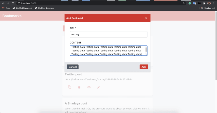

View bookmark

Copy bookmark

Edit bookmark


Delete bookmark
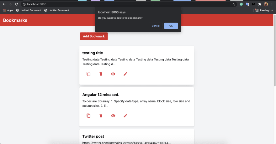

You can get the source code of the backend and frontend of this app below.
This was my very first time using Tailwind CSS, and I must say it blew my mind. It made my job very fast and easy. The fantastic thing is that I built this app without writing a single line of CSS code !!
Let's recap, we started by learning about Headless CMS and headless UI, then we proceeded to learn about Strapi and Tailwind CSS. They are examples of Headless CMS and Headless UI, respectively. Later on, we demonstrated how to use both Strapi and Tailwind CSS by building a Bookmarking app.
31
