

21
#P5 - Data Visualization
Data visualization is the graphical representation of information and data by means of various graphs, charts and diagrams that helps to understand and get relevant information from data. We will see how they help to get various informations.
In python, there are some libraries that provide data visualization utilities.
Matplotlib is a plotting library for the Python programming language and its numerical mathematics extension NumPy. It provides an object-oriented API for embedding plots into applications using general-purpose GUI toolkits like Tkinter, wxPython, Qt, or GTK. SciPy, Pandas and seaborn are another libraries that depends on Matplotlib.
Seaborn is just a wrapper library based on matplotlib. It provides a high-level interface for drawing attractive and informative statistical graphics. Means you can draw the graphs similar to seaborn with matplotlib, with just some extra piece of code. It provides various color schemes and themes.
Plotly is an interactive graphing library that provides you the ability to interact with the graph, such as getting x and y axis by hovering the objects, enlarging, reducing, highlighting an area etc.. It is the best analytical tool as compared to above two, but also slow and much more resource consuming.
You can check their well versed documentations for various customization in graph. This article contains very few code examples.
Almost everyday we see some analytics in a newspaper, TV, mobile application or on some website. Commonly we know about bar charts or pie charts, but there are many other types of visualization plots.
- Scatterplot visualize the scatter of data values of two features.
- It Used to find a relationship in a bivariate data, more commonly used to find correlations between two continuous variables.
import seaborn
import matplotlib.pyplot as pyplot
seaborn.scatterplot(data = df, x = 'col1' y = 'col2')
pyplot.show()
- Line Plot is a univariate analysis plot. It creates a line that connects all data points.
- It is very useful for the observation of trend and time series analysis.
sns.lineplot(data=df, x="year", y="passengers")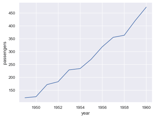
- Bar Plots use bars with different height to represent data values.
- They are used mainly for ranking values.
- They are mostly used with data having less distinct values.
sns.barplot(x="tips", y="day", data=df)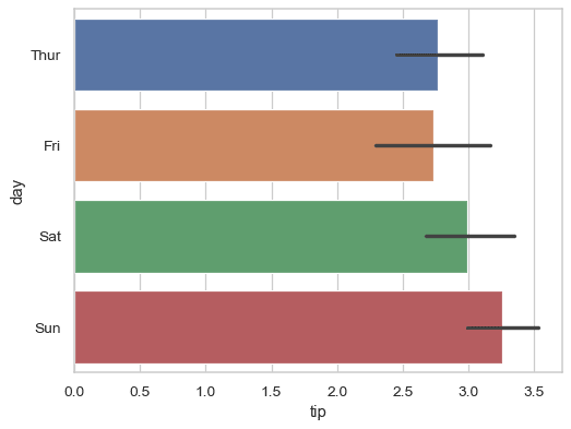
- histograms are used to observe the distribution for a single variable.
- They are used to identify the type of data distribution of a variable.
seaborn.histplot(data, x="distance")
- A box plot also called a Whisker and box plot displays the five-number summary of a set of data, including minimum, 25th quartile, median, 75th quartile, and maximum.
- It helps in various kind of analysis like outliers.
seaborn.boxplot(data, x = "day", y = "total bill")
- A violin plot is a more comprehensive box plot containing the KDE (kernel density estimation) lines alongsides the whiskers.
seaborn.violinplot(data, x = 'cat_var', y = 'num_var')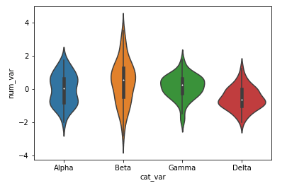
- A pair plot shows all numerical pair relations along with their frequency distribution at diagonals.
seaborn.pairplot(df, hue = 'species')
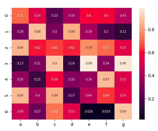
- The heatmap is already demonstrated in previous article of this series. It can take any 2d data and show it in form of grid of various color intensity.
There are many other type of visualizations which can be used as per the need, but above these are the most informative ones.
There is a good article on subplots, you can see it here
Or you can go with the subplot constructors
import matplotlib.pyplot as pyplot
import seaborn

fig = pyplot.figure(figsize= (12,5))
pyplot.subplot(1,3,1)
seaborn.violinplot(data = df, x = 'a', y = 'x')
pyplot.subplot(1,3,2)
seaborn.violinplot(data = df, x = 'b', y = 'y')
pyplot.subplot(1,3,3)
seaborn.violinplot(data = df, x = 'c', y = 'z')
21