
26
Visualize financial data with Sankey diagrams in python
For example, let's take a SaaS company(let's call it DatavizWRLD.com) and Josh, the CEO wants to see the company's monthly income, profit, expenses, and money management. We can give him an easy way of visualizing all those with a Sankey diagram:
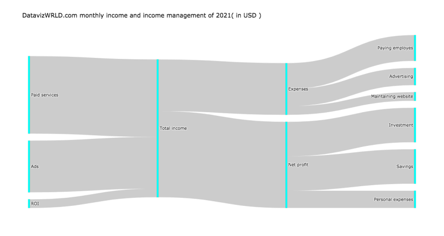


As you can see, this Sankey diagram gives Josh a simple and effective way of visualizing his company's monthly income, profit, expenses, and money management.
If you just want the code, voila( even though I advise that you stick around for the explanation because it might be difficult to understand from the beginning ):
import plotly.graph_objects as go

fig = go.Figure(data=[go.Sankey(
    node = dict(
    thickness = 5,
    label = ["Ads", "Net profit", "Total income", "ROI", "Paid services", "Investment", "Expenses", "Maintaining website", "Paying employes", "Advertising", "Personal expenses", "Savings"],
    color = "cyan"
    ),
    link = dict(

    # indices correspond to labels
    source = [0, 1, 4, 2, 3, 2, 6, 6, 6, 1, 1],
    target = [2, 5, 2, 1, 2, 6, 7, 8, 9, 10, 11],
    value = [60000, 40000, 90000, 100000, 10000, 60000, 10000, 30000, 20000, 20000, 40000]
))])

fig.update_layout(
    title="DatavizWRLD.com monthly income and income management of 2021( in USD )",
    font=dict(size = 12, color = 'black')
)

fig.show()
Let's make sense of all this
- First, we import "plotly.graph_objects" as "go".
- Define "fig", this will be our Sankey diagram.
- Characterize the parts of our Sankey diagram with: thickness, color, and labels.
- Next, we define how and where the labels should connect to or disconnect from, as well as the value of each label. (The numbers on "source" and "target" are indices of the labels array).
- Finally, we give our diagram a title colored black with a size of 12.
If you're a beginner who likes discovering new things about python, try my weekly python newsletter

Byeeeee👋
26