21
The Perfect Anatomy of An Email Template for 4th of July

Parades. Backyard Barbecues. Fireworks.
Breezy time along with family and friends.
The 4th of July brings about a lot of these vibes.
American citizens enjoy the day of freedom by not just spending time with their folks, but also splurging a bit on gifts - 4th of July goodies, apparel, food, merchandise, and more.
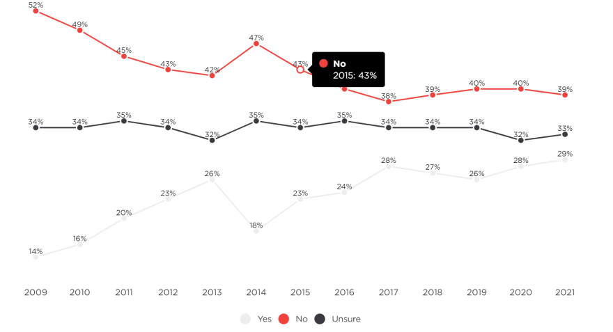
Look at the graph below to understand the spending patterns all through the years.

Source: NRF's Annual 2021 Independence Spending Survey, conducted by Prosper Insights & Analytics
Now, this something that an eCommerce store can significantly capitalize on. More so because of the current pandemic situation that has made eCommerce shopping more critical and convenient.
If your store has a sale or offer owing to the 4th of July celebration, then, you have to amp up your efforts in promoting the sale to drive better conversions.
Emails are a lucrative channel for eCommerce sales, particularly around the holidays.
Today, we’d be looking at creating a 4th of July email campaign - the complete anatomy of how to design a template that can help you skyrocket conversions.
Let’s begin.
The Anatomy of 4th of July email template
A good email template typically has six key components.
Before we go over each of these, let’s have a quick glance at a 4thof July email template and its key components.

Now that you have a fair idea, let’s dive right in!
1.Logo
Placing your logos on the top of your email design creates an instant familiarity with your brand. The recipients can get a quick understanding of who’s it from and what they can expect.
But, keeping the significance of it aside there are also other things that you need to consider on the design front.

Depending on what comes below your logo, you can determine where you want it to be placed - whether on the left side or in the middle. Following the hierarch of your template design would be ideal for the logo placement.
In our anatomy graphic, the template is center aligned, so placing the logo in the center would make it visually more compelling.
Another best practice for your logo design on your template would be to have alt tags, a pre-loader image that can still give the readers a good email viewing experience in case your email takes time to load.
Also, be mindful of the logo size optimization for mobile view - because it is no brainer that most of your recipients read emails on their mobile devices.
2.Navigation bar
Including a navigation bar in your email is the easiest way to help your readers explore other products and categories they could potentially be interested in.

There is no set rule as to where you want your navigation menu to be or how it should be designed. You can have them even in the middle of the email and redesign it in a way that best suits the rest of your email theme.
However, here are some best practices:
- Don’t overwhelm and confuse the readers with too many menus
- Remember to optimize the visuals for mobile and other devices
- Keep the categories relevant to your customers (think recipient gender, geography, interests, and other demographic data)
- Keep the names of the menus consistent (your website)
3.Email Banner/Header
This is the most crucial part of your email design because this is what your recipient is exposed to as soon as they open your email. If the header design fails to impress them, there’s a good chance of them not scrolling further at all.

So, it is very important to be tasteful with your banner design and the text that you decide to show here.
Here are some things to keep in mind for the header text:
Keep it short and simple
Make things clear and don’t fail to convey the core message
Let the recipient know what to expect
Keep the colors strategic (think background color, email theme)
Choose a themed font
Next comes the banner design which is another important piece.

Make sure that you add alt tags for images and your images are copyright-free. You can consider websites like Freepik, Shutterstock, GIPHY, and more for some free resources.
4.Products on Sale
Letting your customers know about the products on sale is the objective of your email campaign.
Also, this would essentially be the body of your email.
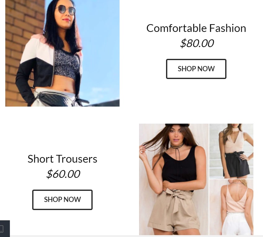
So, be mindful of the products that you decide to feature in your email and explain what the offer exactly is - a quantity gift, a price slash, a coupon, etc.
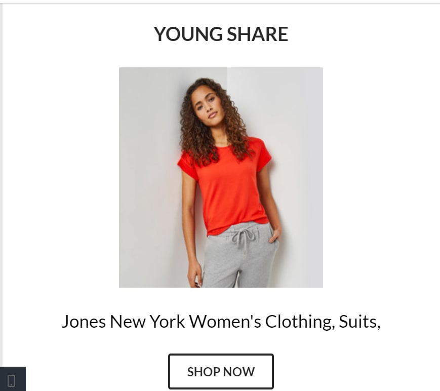
Keep the section minimal with the product image, title, price, and a CTA.

Don’t try to include too many products in your email as it can clutter the design and confuse the recipients.
Allowing them to explore more products would suffice - if the products you featured entices them, then you are sorted!

5.Contact information
Including contact information in your email footer has its perks.
Making it easier for the customer to contact you would be a great way to boost customer satisfaction and their experience with your brand.

For July 4th Sale, you can include a contact number or a support email the customer can reach out to.
6.Unsubscribe link
Including an unsubscribe link is important both by law and by picking the path of what’s good for your business.
You must include an unsubscribe link to help your users have the option of opting out of your emails if they don’t want to receive communications from you.

It is also imperative that you include them so that you can weed out those who’d not be benefitting from your emails: where there’s no opportunity to convert.
Wrapping Up
We’re only a week away from the 4th of July!
It would be the perfect time to plan your email campaigns. Now, this anatomy is a checkpoint that’d help you whether you are designing a template from scratch or editing a template.
Here’s a quick recap.

On that note, wishing y’all a Happy 4th of July and a profitable season 😀💥
21
