23
10 DevTools tricks to help you with CSS and UX design
Web development is much more fun now than ever. We have increasing opportunities with frameworks, libraries, communities, skills, and tools compared to what we had a decade ago. Today, there are hardly any web developers who want to limit themselves to write just the business logic. Instead, they want to explore design, look-and-feel, build a user experience end to end.
Many times, it is challenging without the support of proper tools. This article will learn about ten things you can do using the browser's DevTools to make yourself more productive with CSS and User Experience(UX) Design. I hope you enjoy learning it.
The modern browsers provide web developers with tools to help debug the source code, try out the changes early, and build the web page faster. The Google Chrome browser calls it
DevTools, Mozilla Firefox users know it as Web Dev Tools, and the Microsoft Edge browser lovers would know it as Developer Tools. For the sake of simplicity, we will refer to all of them as DevTools in this article.You can use the key combinations, Option + ⌘ + I (on macOS) or Shift + CTRL + I (on Windows/Linux), to launch the DevTools from your favorite browser. For example, the image below shows the DevTools of the Chrome browser.
Alright, let's dive into knowing the Tips & Tricks now 👇.
You can turn the design mode
on to edit any texts on your website. It is convenient to test how dynamic content(like texts) may impact your layout. To enable it, DevTools and go to the Console tab.document.designMode = "on" and press the enter key.Now you have the browser's document editable the way you want. For example, in the image below, we see some text changes and the notification count changes.
I had shared about this cool trick as Twitter tips a while back.
All the browsers support this, and it also works with iFrames. Great, let's move to the next one.
Color Picker is one of the most used tools in the DevTools set for web developers & designers. You can play with the color combinations, contrasts, accessibility all with this tool.Let us take a look at the Color Picker interface. The image below shows the Color Picker of the Chrome DevTools. It has primarily four sections,
Eye Dropper mode using the small dropper icon. The eye dropper mode helps you select a color from the document and use it elsewhere. The image below shows how to select a color from the color selector tool.
Here is a quick demonstration of how to check the color contrast ratio and make corrections.
When the
Eye Dropper mode is on, you can highlight and select the colors from the web page itself.The color picker tool interface may vary from one browser to another. All the examples we discussed so far are using the chrome browser's DevTools.
Using CSS
Flexbox container to achieve the Flexbox module is ubiquitous in web design. The flexible layout is the easy answer for many of the layout issues we had earlier..flex-container {
display: flex;
height: 600px;
flex-wrap: wrap;
align-content: space-between;
}The
Flexbox layout module has many properties that control the layout and position of the elements. The Google Chrome browser version 90 got us a super cool tool to edit and debug Flexbox properties. Whenever an HTML page element has the
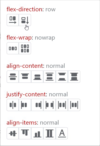
display: flex or display: inline-flex, you will get the flex badge near the element in the Elements panel. In addition, the Styles panel will show a new icon to open the Flexbox editor. Click on the icon to open the editor. Now, you will be able to select any of the flexbox properties as per your needs. As you chose the properties, they get added to the respective HTML element's style.
The CSS gradients allow you to show smooth transitions between two or more colors. Usually, there are two types of gradients you can create,
To create a gradient, we use parameters like directions, colors, positions. You may have to try out different values for each parameter to achieve the gradient you are looking for. The Google Chrome
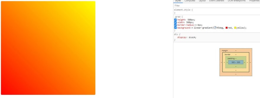
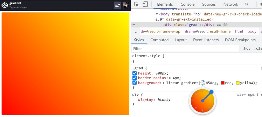
Devtools provides a Gradient Selector that helps you precisely with that. You can try and change the parameter values to get to your preferred gradient faster.The image below shows a linear gradient with a direction of 45 degrees and a couple of colors. Clicking on the direction value shows a direction selector. You can adjust the value to any direction using it.
See this tweet to know how easy it is to play with it(I had fun doing it).


Tapas Adhikary
@tapasadhikary

The CSS angle debugging tool is super cool. You can find it in the latest Chrome browser.
Now, I'm fully addicted to it...😂
#devcommunity #100DaysOfCode #devtools
Now, I'm fully addicted to it...😂
#devcommunity #100DaysOfCode #devtools
13:00 PM - 22 Jan 2021
CSS
clip-path is a great way to create shapes of your choice. The clip-path property creates a clipping region to decide the part of the element to show. The area outside of the clipping region will be hidden. Here is an example of a rectangular polygon using the clip-path CSS property,clip-path: polygon(10% 10%, 90% 10%, 90% 90%, 10% 90%);It is common for web developers to try out different combinations of the clip-path values to settle with a shape of their choice. However, it is a bit hard to remember and code for the clip-path property. It would be far easier if we get an editor to create a shape of our choice, which gives us the respective clip-path value. The
Mozilla Firefox DevTools provides a clip-path editor to create the shape with a few drag and drop.To use it, inspect the HTML element that has the clip-path CSS property in its style. You will notice a small shape in front of the clip-path value. Click on that tiny shape to select the clipped region of the element.
The image below shows the clipped area selected.
Now, you can drag-and-drop any of the points of the clipped shape and adjust it based on your need. As you do that, the clip-path property value gets changed as well. It is such a powerful tool to help to boost productivity.
Check out the demo below and notice how the clip-path property value gets adjusted when we drag and drop the clip points. It's magical.
We will now talk about an experimental feature in Google Chrome DevTools. You will love knowing about it. It is called
CSS Overview. Using this tool, you can gather information about the colors, fonts, unused declarations of styles, media queries of a web page in a single place. You can then make use of this information to copy any part of it and reuse it elsewhere.The
CSS Overview feature may not be enabled in your Chrome browser by default. To enable it, please click on the settings icon at the top-right corner of the DevTools interface.Next, select the
Experiments option from the left side. It will list a set of experimental features that are not available to use by default. Next, please select CSS Overview by clicking on the checkbox beside it.The browser may ask you to reload the DevTools for this newly enabled feature to take effect.
Now, you will see a new tab,
CSS Overview, beside the Console tab. Go to the CSS Overview and click on the Capture overview button.It will capture the overview of the website/app opened in the browser currently. The image below shows the
Colors information of my portfolio website. You can browse other information like the font info, unused declarations, and more.I would encourage you strongly to try out other experimental features of the DevTools. Who knows, you may find another treasure!
This one and the following two tricks are with Mozilla Firefox DevTools. You will find similar alternatives with Google Chrome DevTools as well. Fonts play a significant role in our web applications and websites. The font size, spacing, line height, weight, decorations all matter to make the website readable and presentable.
The
Font Editor tool provides you the control to adjust the font attributes. To open the font editor, please inspect an HTML element to edit the font properties. Then under the Inspector tab, you should find a sub-tab called Fonts.Now, you can adjust the font attributes by drag-drop and selections, as we see in the image below.
As you make styling changes in the DevTools, it captures the changes under the
Changes tab. You can find it just before the Fonts tab we have seen above.You can directly copy the code changes from the
Changes tab to your source code editor.Debugging animation issues could be challenging at times. The
Animations tool helps you with that. You will find the Animations sub-tab under the Inspector tab of Firefox DevTools.You can trace and track the animation property changes by time.
Do you want to pinpoint a particular time or duration to inspect the animation behavior? Yes, you can drag and drop the handle, as we see in the image below.
Here goes the last trick, and it is my most favorite. One of the website/web app development criteria is adhering to the Responsive Web Design(RWD) principles. The web page should be responsive enough to meet user satisfaction on different devices(PC, Laptop, Smart Phones, Tablets, many more).
When testing out the responsiveness, you may not have all the devices available to you. First, however, it is essential to test and certify that the page doesn't break on different devices, different resolutions. The Google Chrome browser's
Device Toolbar is to help you with it.To launch your page in the responsive mode, please activate the
Device Toolbar by clicking on the icon beside the inspector icon.Now you can select a device from the list to see how your webpage behaves to the responsiveness.
That brings us to the end of this article. I hope you enjoyed learning about these tricks. If you are aware of any other DevTools tricks to help with CSS, User Experience Design, please comment below. Let's learn together.
I hope you enjoyed this article or found it helpful. Let's connect. You can find me on Twitter(@tapasadhikary), sharing thoughts, tips, and code practices.
You may also like,
23


