22
App Framework tutorial: Building a custom reference app
I'm cross-posting this article for my Colleague David Fateh. Check out the original post over on the Contentful Blog.
Building an app on the App Framework as a developer requires an understanding of how editors --- the people who use the Contentful web app --- may want to manipulate and view entry data. We know that everyone has different use cases and so the customization allowed by the App Framework can be useful when trying to create an experience that will help solve these unique cases.
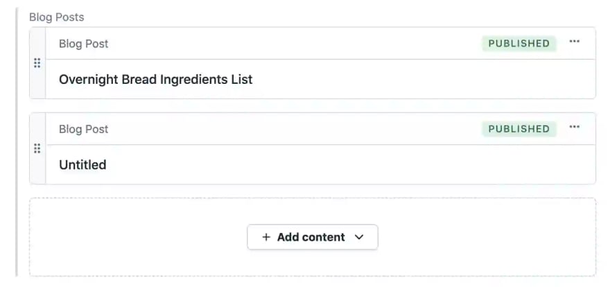
When you define fields in an entry, you are defining how data should be displayed. In the case of the reference field, data such as the title of the entry is displayed by default like in the screenshot below:

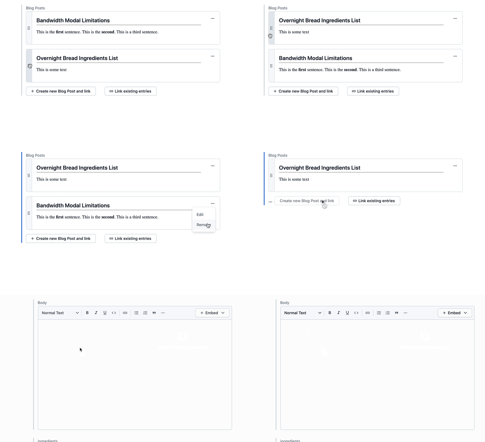
We can enhance this experience by creating a visually similar custom app using the App Framework that can show more data from the referenced entry such as the body of the post, not just the title.

To start, we used the create-contentful-app CLI tool. The tool is available for free to developers, and they can use it to quickly get an app up and running. The create-contentful-app CLI tool creates a React app project with Forma 36 (our design library) and our open source field editors for easy access.
We get all this by running the commands below:
npx @contentful/create-contentful-app init reference-field-app
cd reference-field-app
npm start
At this point our app is running on localhost:3000 but won't be accessible until we create the AppDefinition and select the locations where we want it to show up. Let's do this next.
An AppDefinition is the entity that represents an app in Contentful. You can think of it as a sort of blueprint for how your app will interact inside the Contentful experience.
You must have an admin or developer account in your Contentful organization. Many developers find it easiest to create a free Contentful organization for a developer environment. You can also develop an app in your primary organization if you prefer to develop in a space or environment which isn't production facing.
To create the AppDefinition, head to your organization settings and click on Apps in the top menu bar. Once on the AppDefinition page, click the button to create a new app.
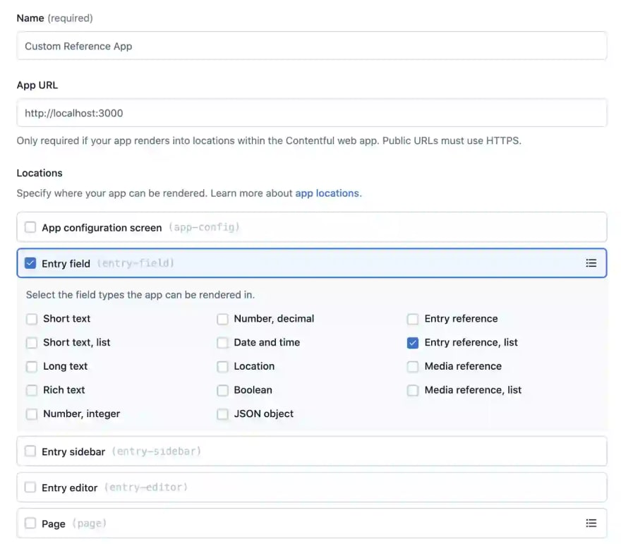
First, we are going to name our app: Custom Reference Field. Next, we will make its app URL http://localhost:3000. This is where our local app is currently running. Last, we are going to select the field location and pick the reference field (many) and click the confirm button to save this AppDefinition.

Let's now head over to a space where we want to see our app show up. In the top menu of our space or environment, click Apps then Manage apps. From here we can find our newly created Custom Reference Field app and install it into our space.
Since we are building an app that will take over a reference field, we must also have a content type that makes use of a reference field. For our purposes, we are going to use a blog post list content type as an example.
In our content model, we are going to adjust the field of our blog post list to use our app by editing the settings of the reference field and selecting appearance. Let's choose our newly created Custom Reference Field app.

Once the app is assigned to a field, we can head over to our entries section and find an entry to see how the app is displayed. In our example, we have a reference field which links to different blog posts. Each blog post has a rich text field which we'd like to use to display some more custom information --- something that will give us a bit more functionality than the default reference field experience.
Let's create some custom functionality. First, we are going to replace our Hello World component with components from Forma 36, as well as utilities from React and a Contentful rich text renderer for display use. We are also going to use the handy MultipleEntryReferenceEditor which is part of our open source editor package. We are using the rich text renderer in this situation because our referenced content model of blog posts uses a rich text field for its body. Depending on the content type, you are referencing in your custom reference field app, displaying this data through different custom or open source components is possible.
import React, { useEffect } from 'react';
import {
    Card,
    Typography,
    Heading,
    CardActions,
    DropdownList,
    DropdownListItem,
} from '@contentful/forma-36-react-components';
import { MultipleEntryReferenceEditor } from '@contentful/field-editor-reference';
import { documentToReactComponents } from '@contentful/rich-text-react-renderer';
import { FieldExtensionSDK } from '@contentful/app-sdk';
Next, let's replace the Field component with custom code using the MultipleEntryReferenceEditor. You'll notice that while this markup is not very complicated, we will have to implement a customRenderer for our MultipleEntryReferenceEditor to show properly.
const Field = (props: FieldProps) => {
    useEffect(() => {
        props.sdk.window.startAutoResizer();
    });

    return (
        <MultipleEntryReferenceEditor
            renderCustomCard={customRenderer}
            viewType="link"
            sdk={props.sdk}
            isInitiallyDisabled
            hasCardEditActions
            parameters={{
                instance: {
                    showCreateEntityAction: true,
                    showLinkEntityAction: true,
                },
            }}
        />
    );
};
Let's create the custom renderer function which will render some more React components:
const customRenderer = (props: any) => {
    if (props.contentType.sys.id !== 'blogPost') {
        return false;
    }
    const title = props.entity.fields?.title?.[props.localeCode] || 'Untitled';

    return (
        <Card style={{ flexGrow: 1 }} padding="none">
            <div style={{ display: 'flex' }}>
                <div>{props.cardDragHandle}</div>
                <div style={{ flexGrow: 1, padding: '1em' }}>
                    <Typography style={{ marginBottom: '20px' }}>
                        <Heading style={{ borderBottom: '1px solid gray' }}>
                            {title}
                        </Heading>
                        {props.entity.fields.body &&
                            documentToReactComponents(
                                props.entity.fields.body[props.localeCode]
                            )}
                    </Typography>
                </div>
                <div style={{ padding: '1em' }}>
                    <CardActions>
                        <DropdownList>
                            <DropdownListItem onClick={props.onEdit}>
                                Edit
                            </DropdownListItem>
                            <DropdownListItem onClick={props.onRemove}>
                                Remove
                            </DropdownListItem>
                        </DropdownList>
                    </CardActions>
                </div>
            </div>
        </Card>
    );
};
Now let's put it all together:
import React, { useEffect } from 'react';
import {
    Card,
    Typography,
    Heading,
    CardActions,
    DropdownList,
    DropdownListItem,
} from '@contentful/forma-36-react-components';
import { MultipleEntryReferenceEditor } from '@contentful/field-editor-reference';
import { documentToReactComponents } from '@contentful/rich-text-react-renderer';
import { FieldExtensionSDK } from '@contentful/app-sdk';

interface FieldProps {
    sdk: FieldExtensionSDK;
}

const customRenderer = (props: any) => {
    if (props.contentType.sys.id !== 'blogPost') {
        return false;
    }
    const title = props.entity.fields?.title?.[props.localeCode] || 'Untitled';

    return (
        <Card style={{ flexGrow: 1 }} padding="none">
            <div style={{ display: 'flex' }}>
                <div>{props.cardDragHandle}</div>
                <div style={{ flexGrow: 1, padding: '1em' }}>
                    <Typography style={{ marginBottom: '20px' }}>
                        <Heading style={{ borderBottom: '1px solid gray' }}>
                            {title}
                        </Heading>
                        {props.entity.fields.body &&
                            documentToReactComponents(
                                props.entity.fields.body[props.localeCode]
                            )}
                    </Typography>
                </div>
                <div style={{ padding: '1em' }}>
                    <CardActions>
                        <DropdownList>
                            <DropdownListItem onClick={props.onEdit}>
                                Edit
                            </DropdownListItem>
                            <DropdownListItem onClick={props.onRemove}>
                                Remove
                            </DropdownListItem>
                        </DropdownList>
                    </CardActions>
                </div>
            </div>
        </Card>
    );
};

const Field = (props: FieldProps) => {
    useEffect(() => {
        props.sdk.window.startAutoResizer();
    });

    return (
        <MultipleEntryReferenceEditor
            renderCustomCard={customRenderer}
            viewType="link"
            sdk={props.sdk}
            isInitiallyDisabled
            hasCardEditActions
            parameters={{
                instance: {
                    showCreateEntityAction: true,
                    showLinkEntityAction: true,
                },
            }}
        />
    );
};

export default Field;
We now have a working component that not only shows the title of the blog post but also the first line of the blog post. We have successfully transformed the default experience of the reference field to show data that is more conducive for our use-case. If you're interested in seeing the full code, check out the repo here.
For our purposes, changing the fields inside of an entry can be a very powerful tool. There are many cases for why you may want to either slightly modify existing functionality or totally recreate your own. For the cases where you'd like to simply modify the web app, we provide the default fields as a React component in our open source editor library. For cases where you'd like to create your own experience, Forma 36 can be an invaluable tool for achieving a very fluid look and feel of your UI without having to spend time messing with layout yourself.
That said, it is always interesting to see the different ways developers have come together and built their own components for the UI/UX they envision for their users. Many developers make use of our Slack Community where help and ideas are easily shared. I'm active on the channel and am always happy to help explore ideas or guide other developers through the app creation process.
If you'd like to join our community, you can take advantage of some of the cool things we are doing and discussing over there. If you are interested in seeing more video tutorials, check out our weekly streams on Twitch and YouTube where we code live and work through problems on the fly!
If you haven't signed up for a free Contentful account yet, register for a Community edition!
22
